France Télévisions – Global Redesign
France Télévisions – Global Redesign
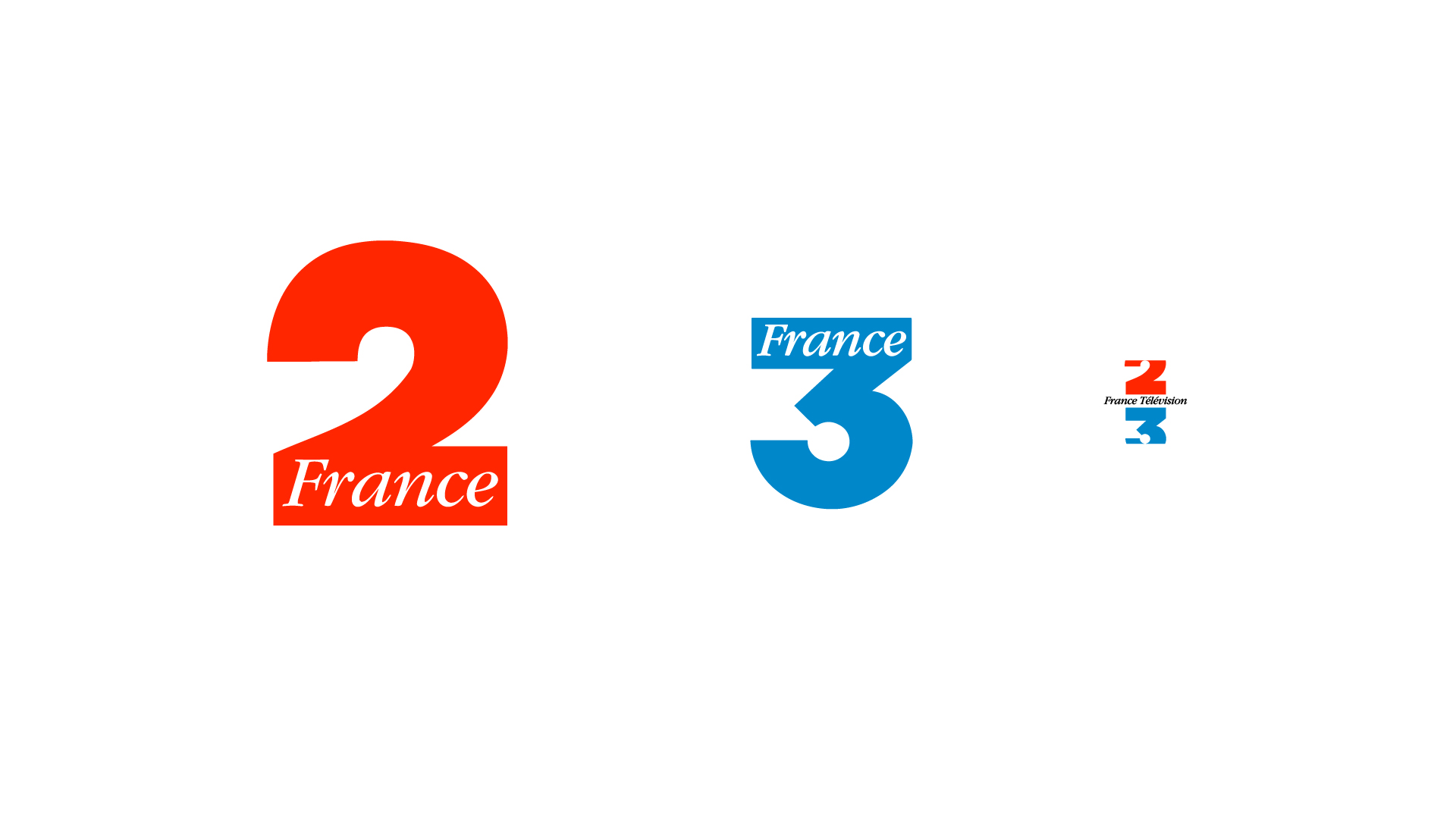
Gédéon has designed the global identity of the French public broadcasting service three times. In 1992, we created the logotypes for France 2, France 3 and France Télévision. In 2002 we launched a new version, now including France 5. The dynamic, geometrical motif that we created became the new logo for the rebranded France Télévisions. In 2008 we introduced the distinctive multicolored logo and created the digital brands and services francetvinfo, francetvsport and francetvpluzz.
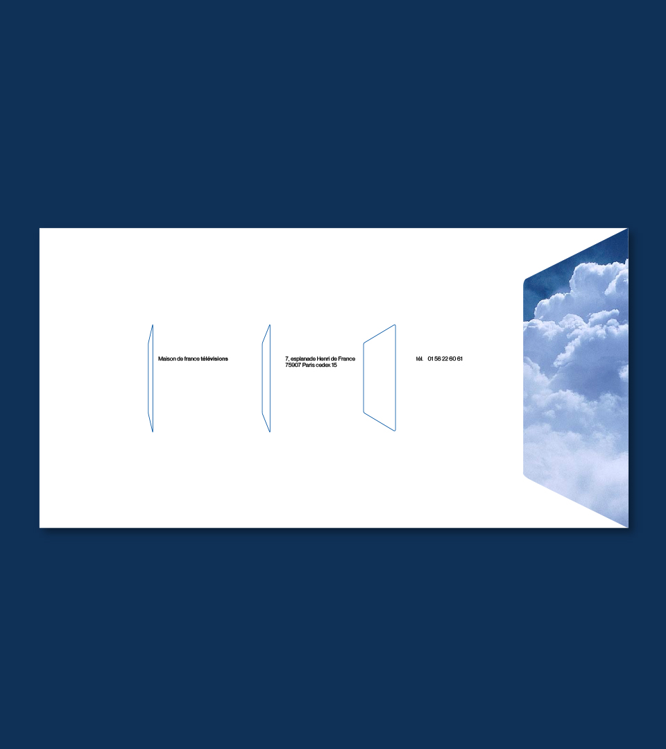
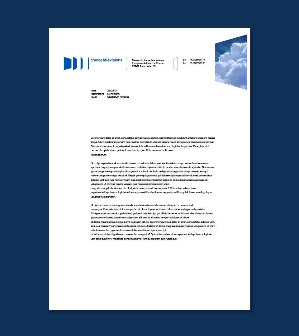
In 1992, Antenne 2 became France 2 and FR3 became France 3. Playing on the graphical similarity of the “2” and the “3”, we designed a smart typographical system that unified the France Télévision brands, creating a universal package for the new public TV service.
THE BIRTH OF A NATIONAL SERVICE
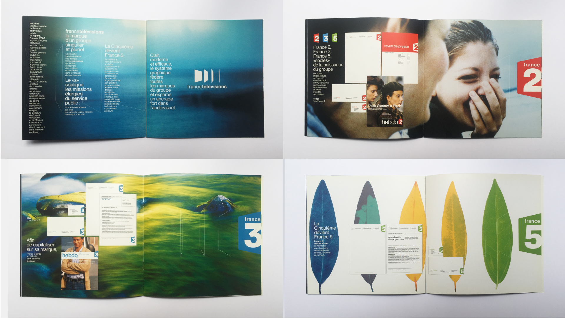
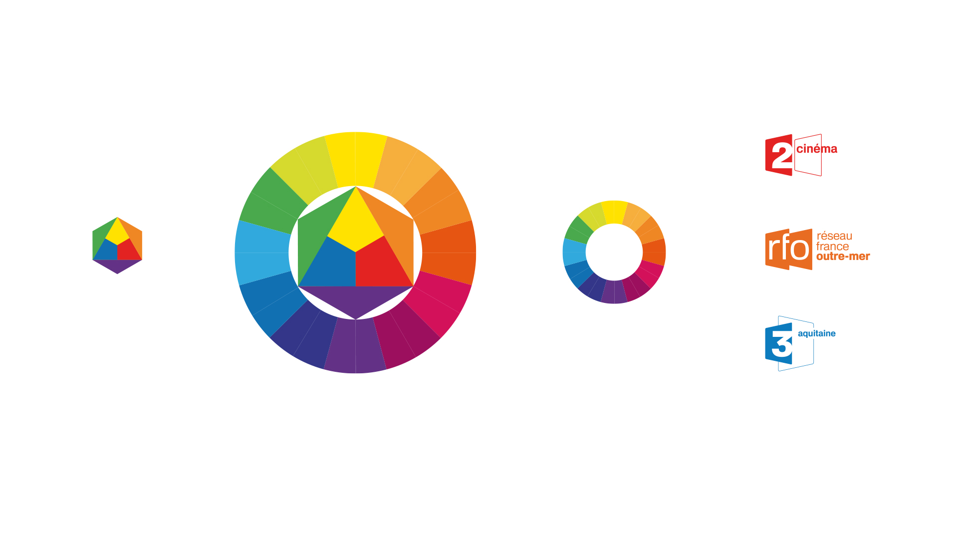
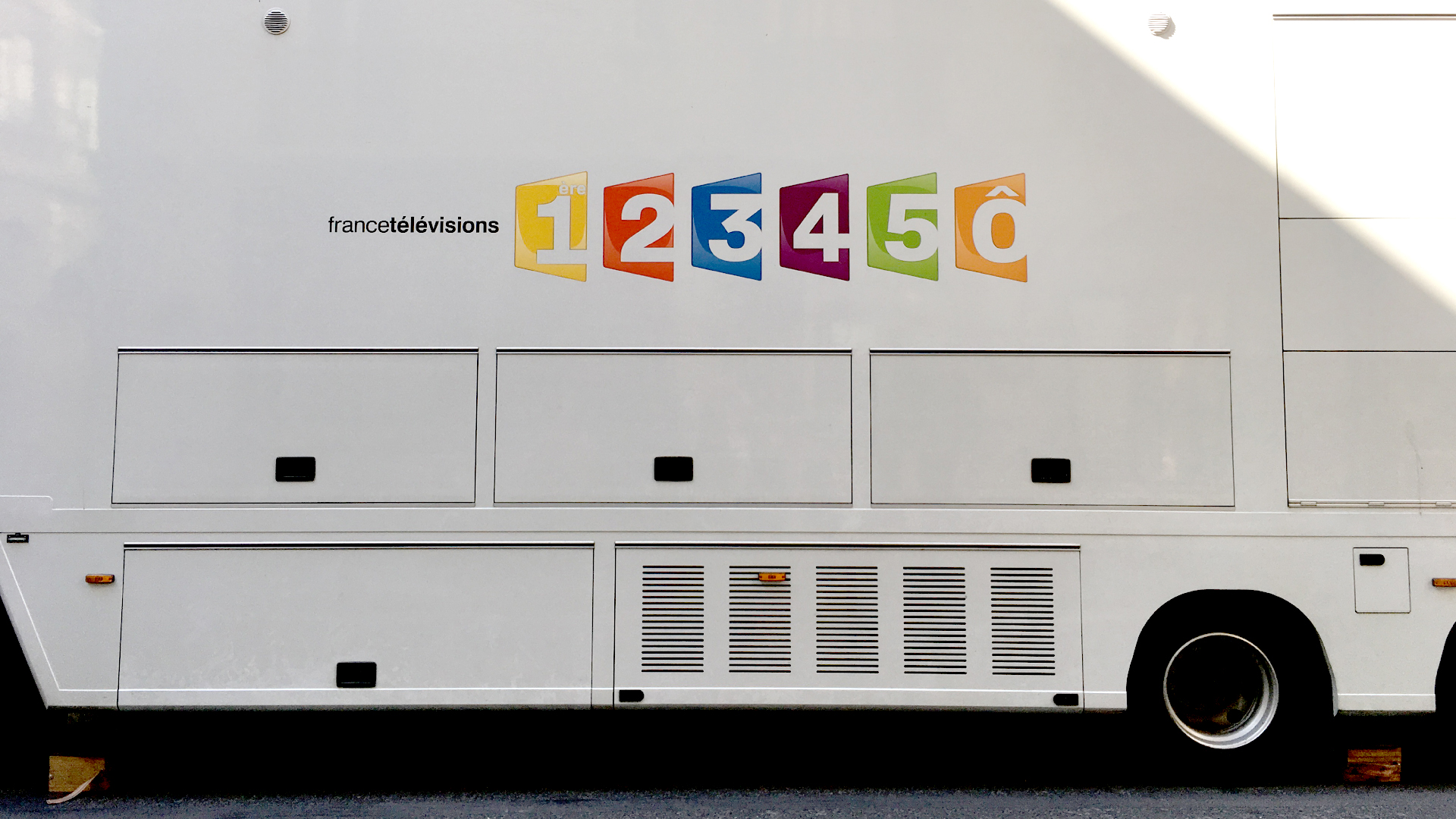
In 2002, “La Cinquième”, the documentary and education channel, joined the public broadcasting service, becoming “France 5”. This necessitated a fresh approach to accommodate new channels and services. We designed a dynamic, geometrical brand system, based on an arrangement of rectangular screen symbols. From this we derived both the overall France Télévisions logo and the individual channel logos, playing on the symmetry.
AN OPEN SYSTEM FOR THE FUTURE DEVELOPMENT OF THE BRAND
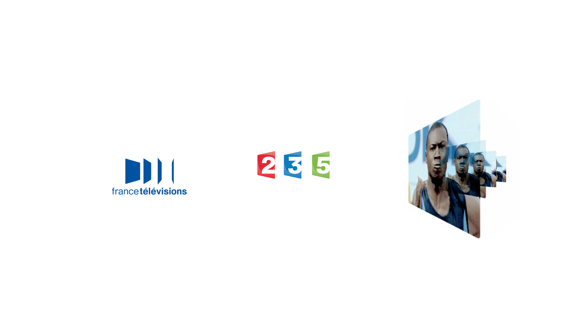
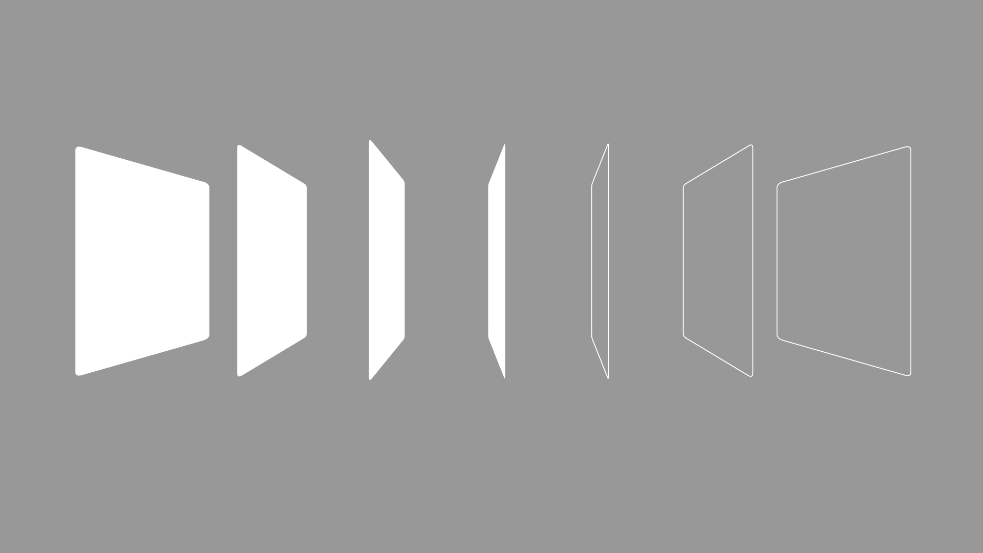
The logo was designed to adapt to subsequent developments in channels and subsidiaries. The dynamic screen symbols represent multiplicity, transformation and innovation.
The logo was designed to adapt to subsequent developments in channels and subsidiaries. The dynamic screen symbols represent multiplicity, transformation and innovation.
--:-- / --:--

--:-- / --:--
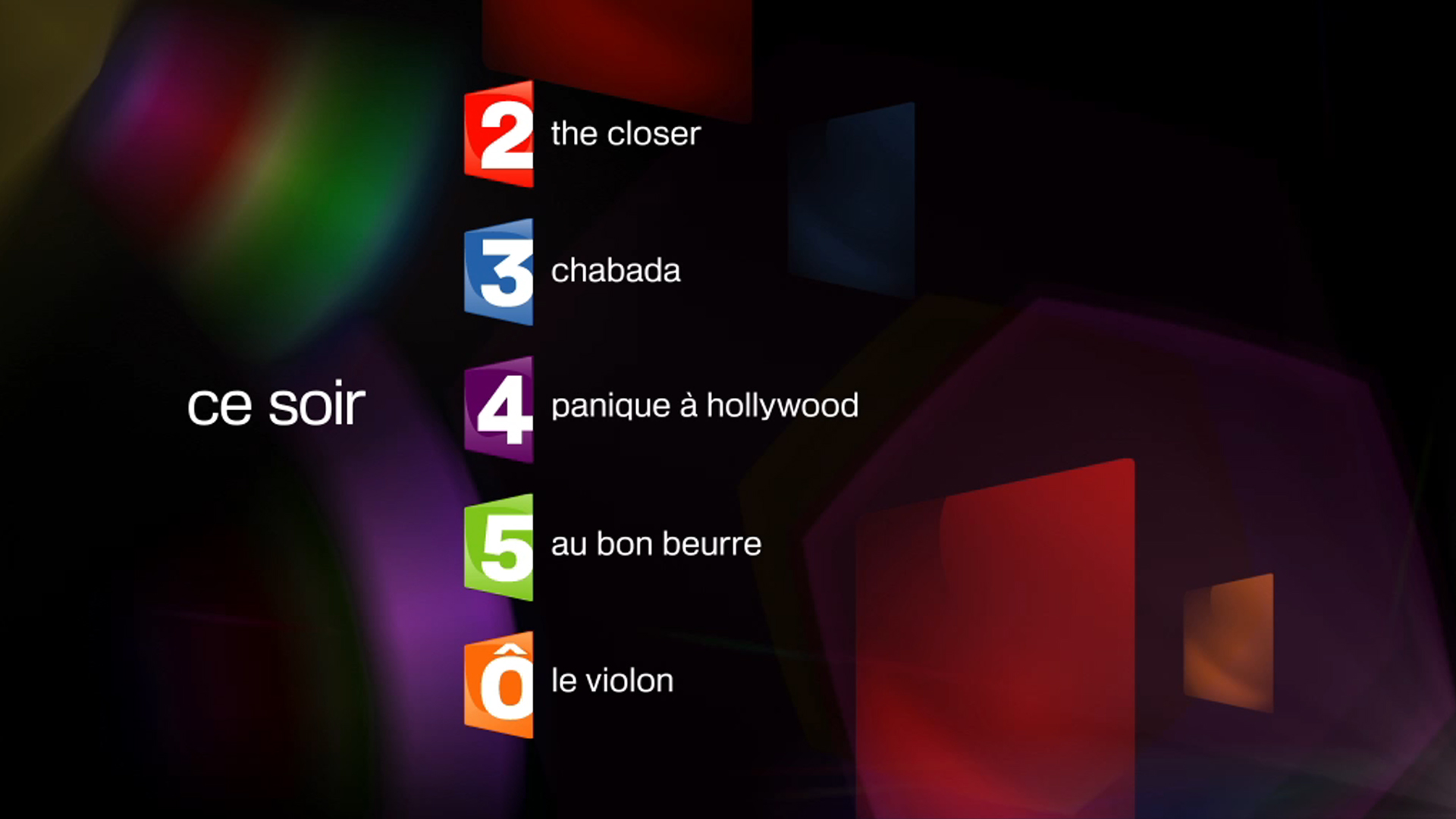
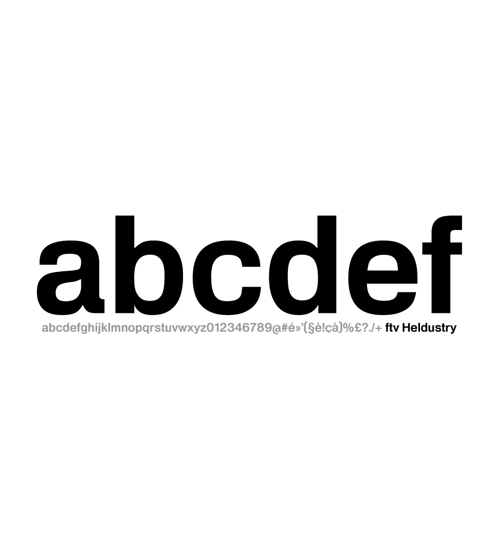
A specific version of the Heldustry font is designed to make promos, trailers, web pages and titles instantly recognizable.
--:-- / --:--
Sleek, modern and striking, our graphical system brings together the group’s brands and evokes its deep audiovisual roots.
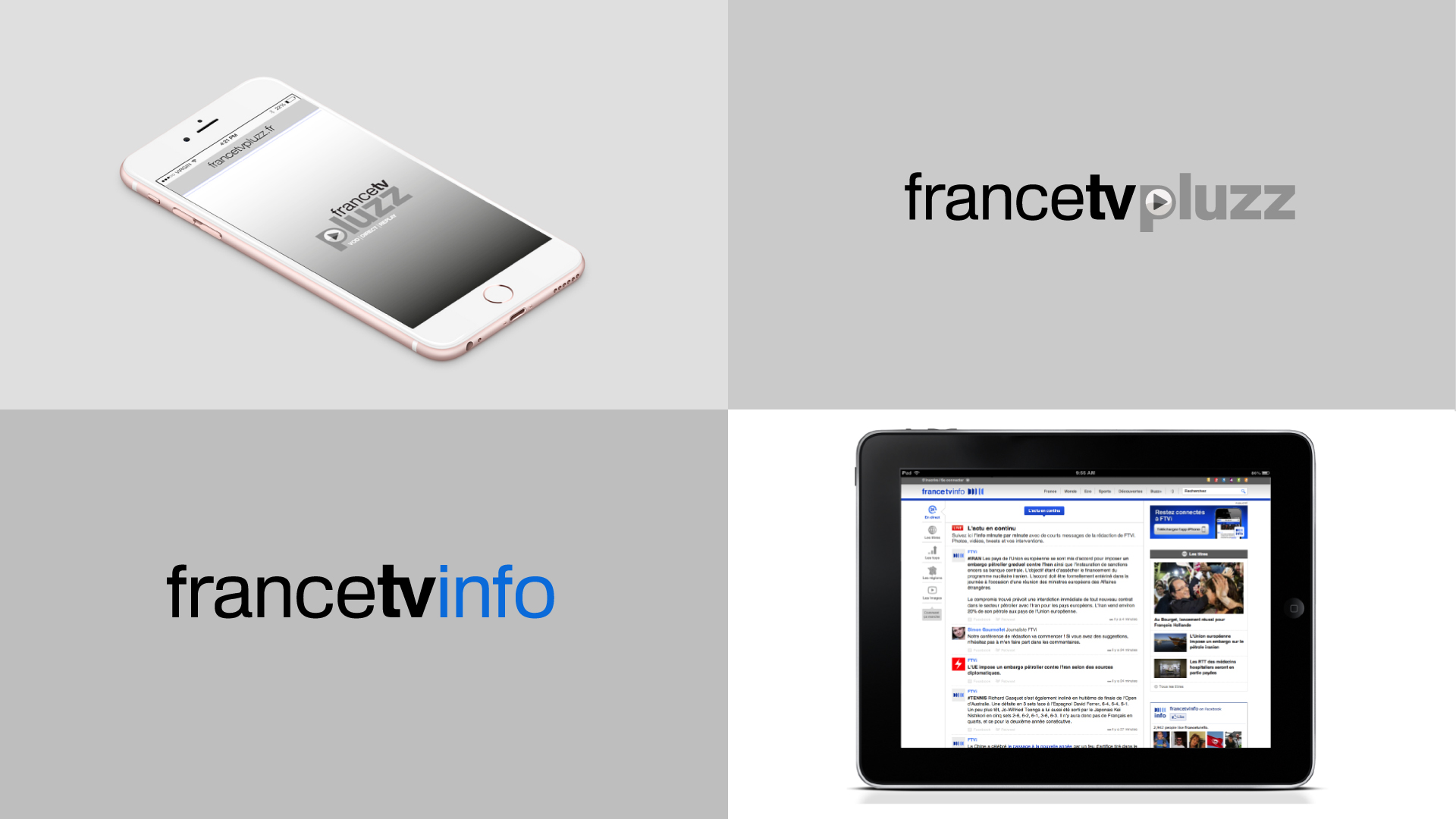
In 2010, France Télévisions entered the digital era, launching three new services to enhance its programming both on-air and online: francetvinfo, francetvpluzz and francetvsport. Gédéon designed the logos and visual framework for all of them, as well as a short film to launch francetvinfo.
THE DIGITAL ERA
A pattern using the lens flare motif formed the basis of the front cover design.
A pattern using the lens flare motif formed the basis of the front cover design.
A pattern using the lens flare motif formed the basis of the front cover design.
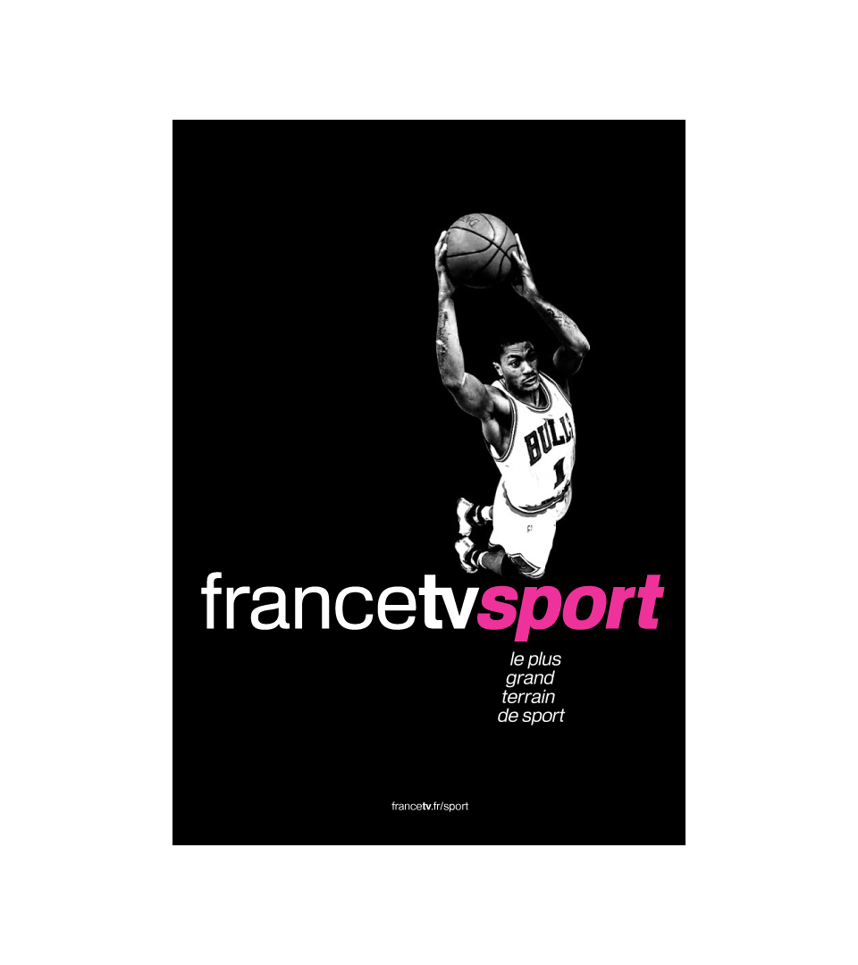
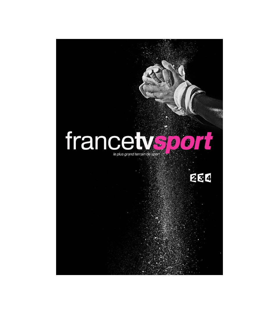
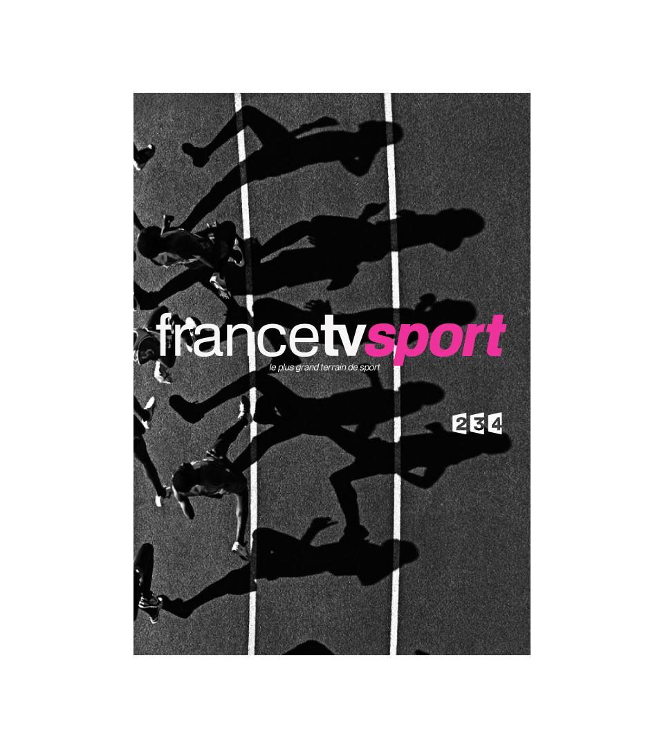
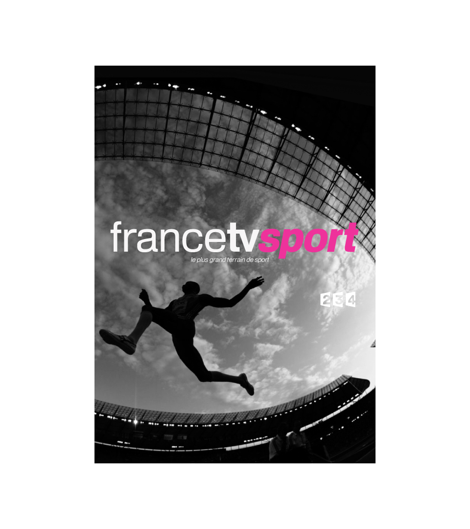
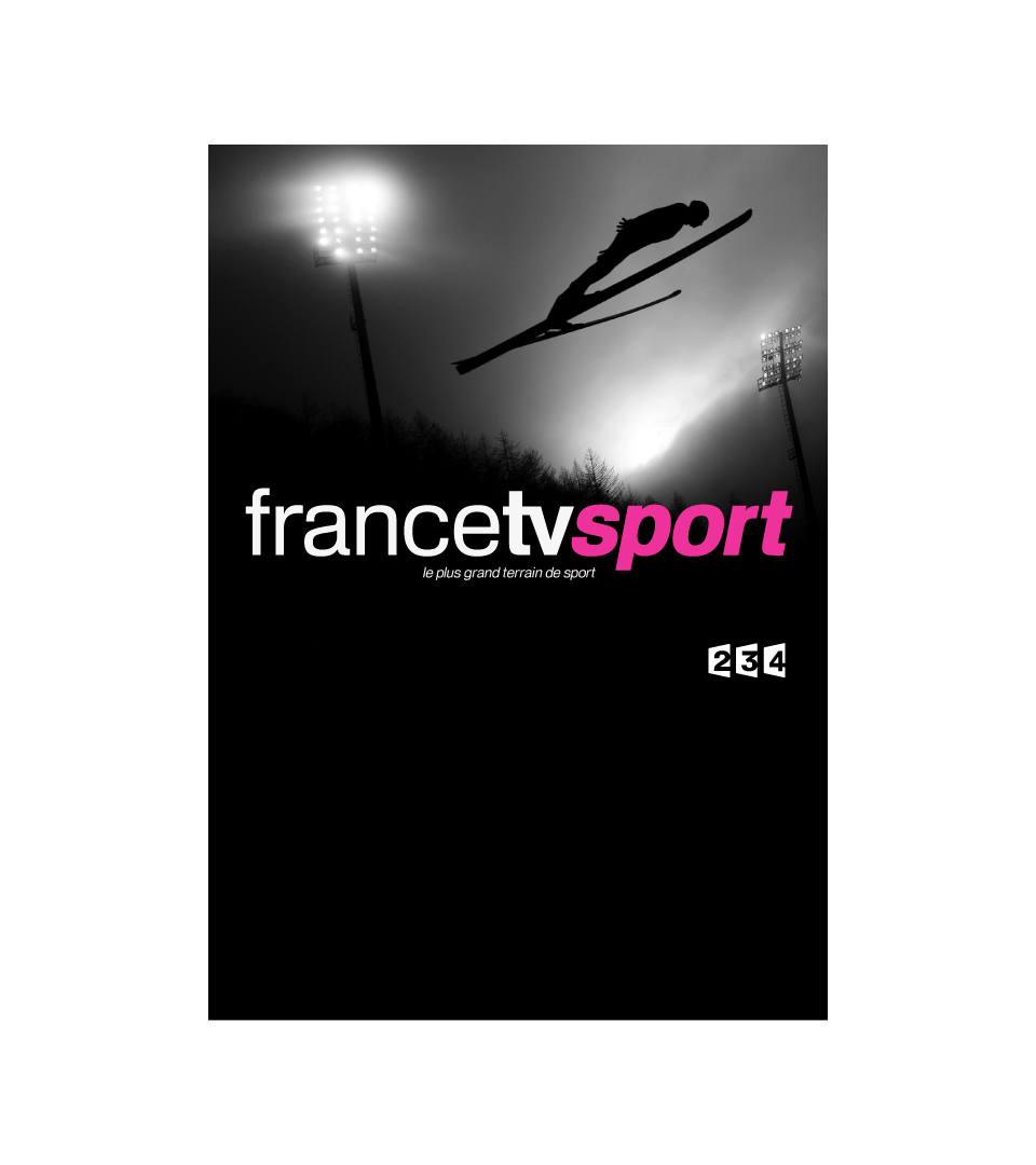
Bob Martin’s legendary photographs, turned black and white and electrified with a flash of magenta, bring home the breathtaking thrill of live sport.
Bob Martin’s legendary photographs, turned black and white and electrified with a flash of magenta, bring home the breathtaking thrill of live sport.
Bob Martin’s legendary photographs, turned black and white and electrified with a flash of magenta, bring home the breathtaking thrill of live sport.
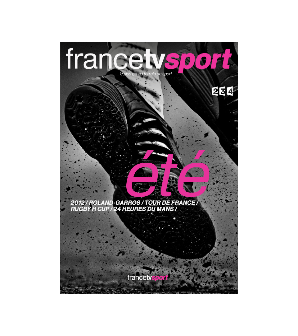
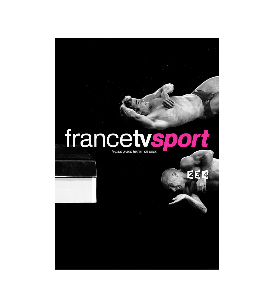
Bob Martin’s legendary photographs, turned black and white and electrified with a flash of magenta, bring home the breathtaking thrill of live sport.
Bob Martin’s legendary photographs, turned black and white and electrified with a flash of magenta, bring home the breathtaking thrill of live sport.
Bob Martin’s legendary photographs, turned black and white and electrified with a flash of magenta, bring home the breathtaking thrill of live sport.
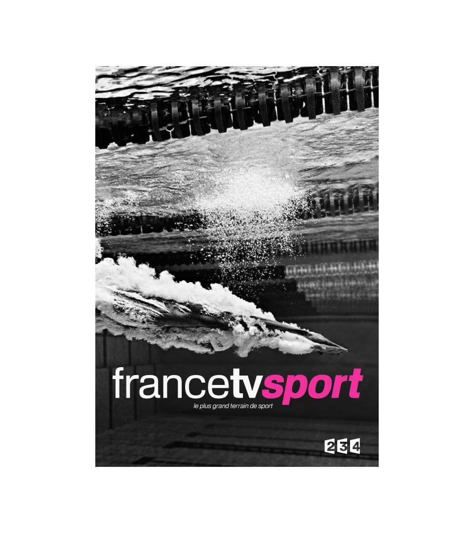
Bob Martin’s legendary photographs, turned black and white and electrified with a flash of magenta, bring home the breathtaking thrill of live sport.
Bob Martin’s legendary photographs, turned black and white and electrified with a flash of magenta, bring home the breathtaking thrill of live sport.
Bob Martin’s legendary photographs, turned black and white and electrified with a flash of magenta, bring home the breathtaking thrill of live sport.
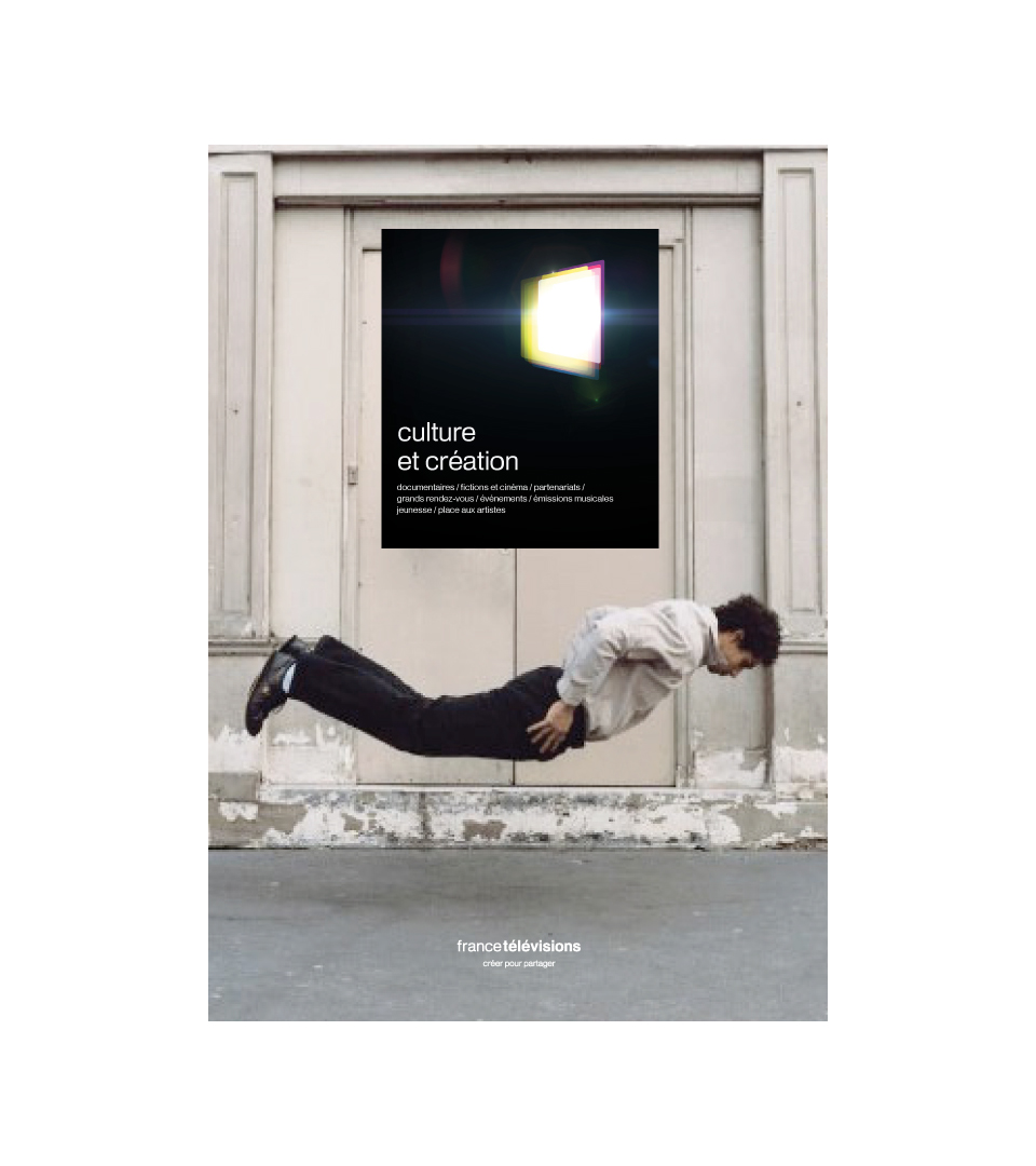
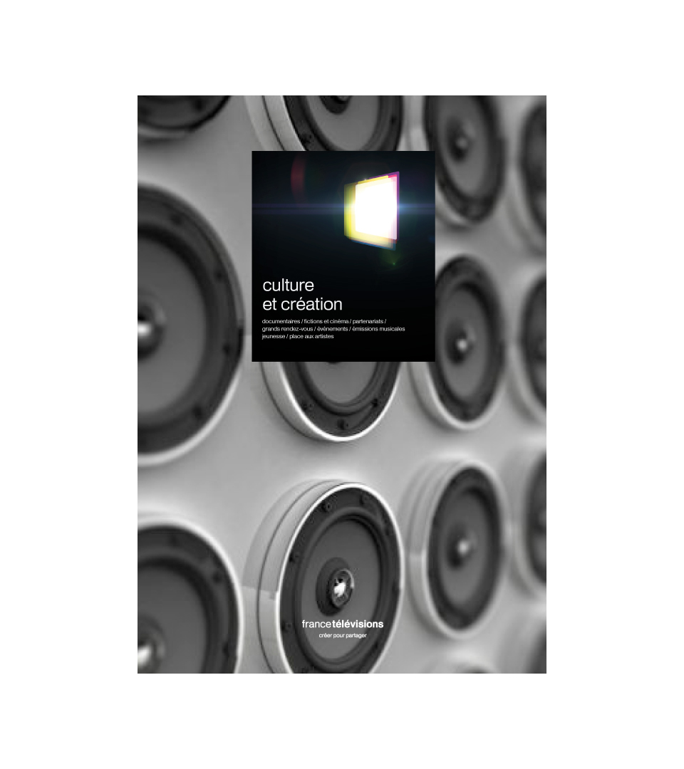
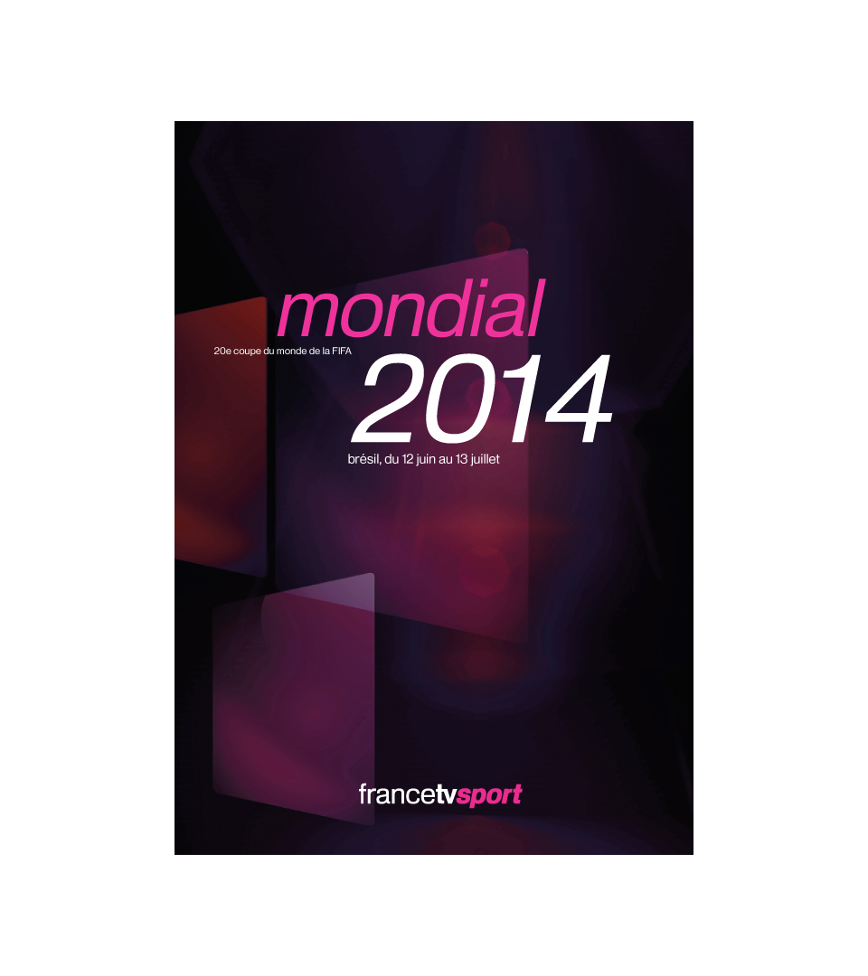
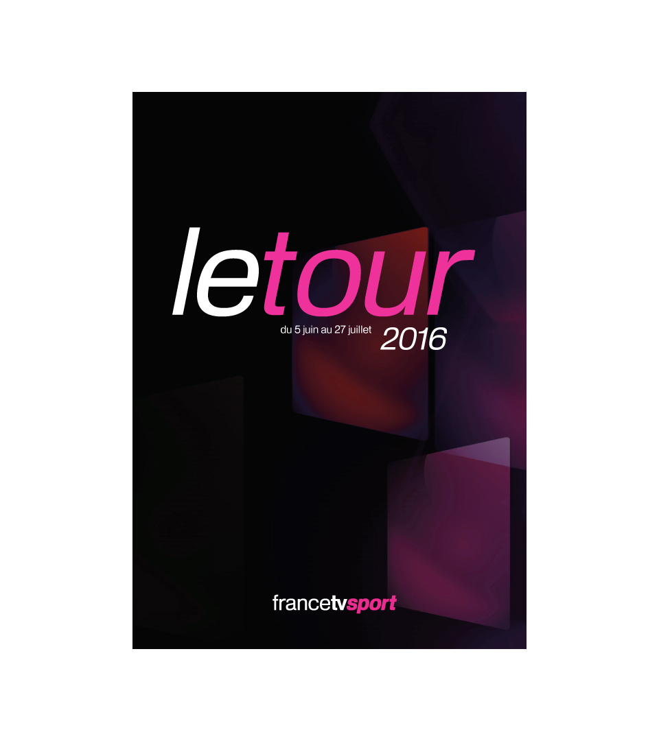
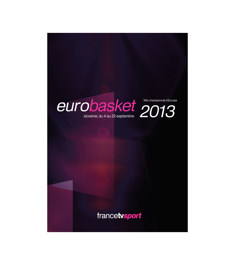
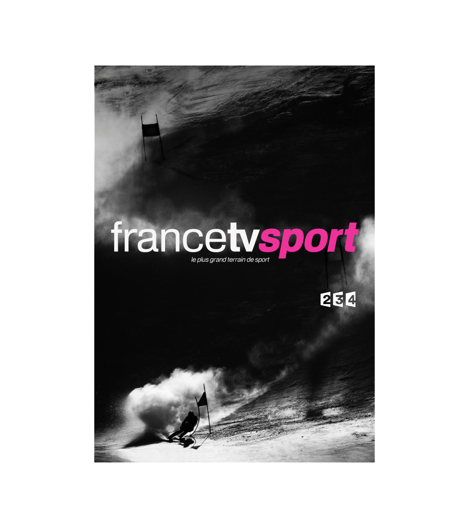
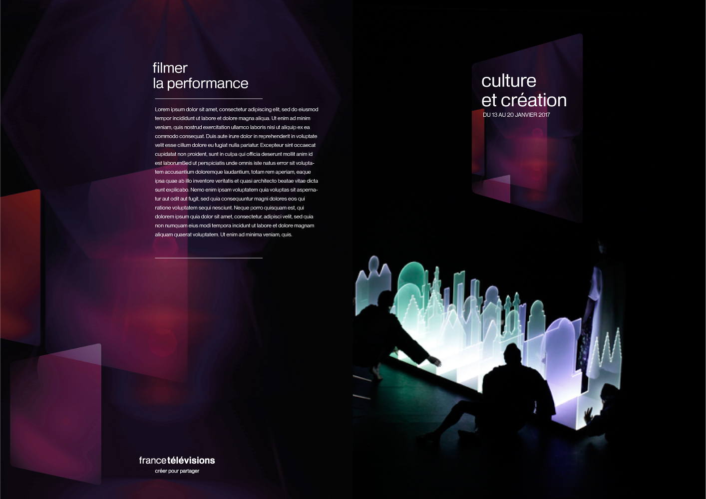
Our print products expressed motion design on paper. Maintaining the lens flare effect as the focal point of our global branding, we added a black rectangle onto the title picture, lit up by the glowing motif.
Our print products expressed motion design on paper. Maintaining the lens flare effect as the focal point of our global branding, we added a black rectangle onto the title picture, lit up by the glowing motif.
Our print products expressed motion design on paper. Maintaining the lens flare effect as the focal point of our global branding, we added a black rectangle onto the title picture, lit up by the glowing motif.
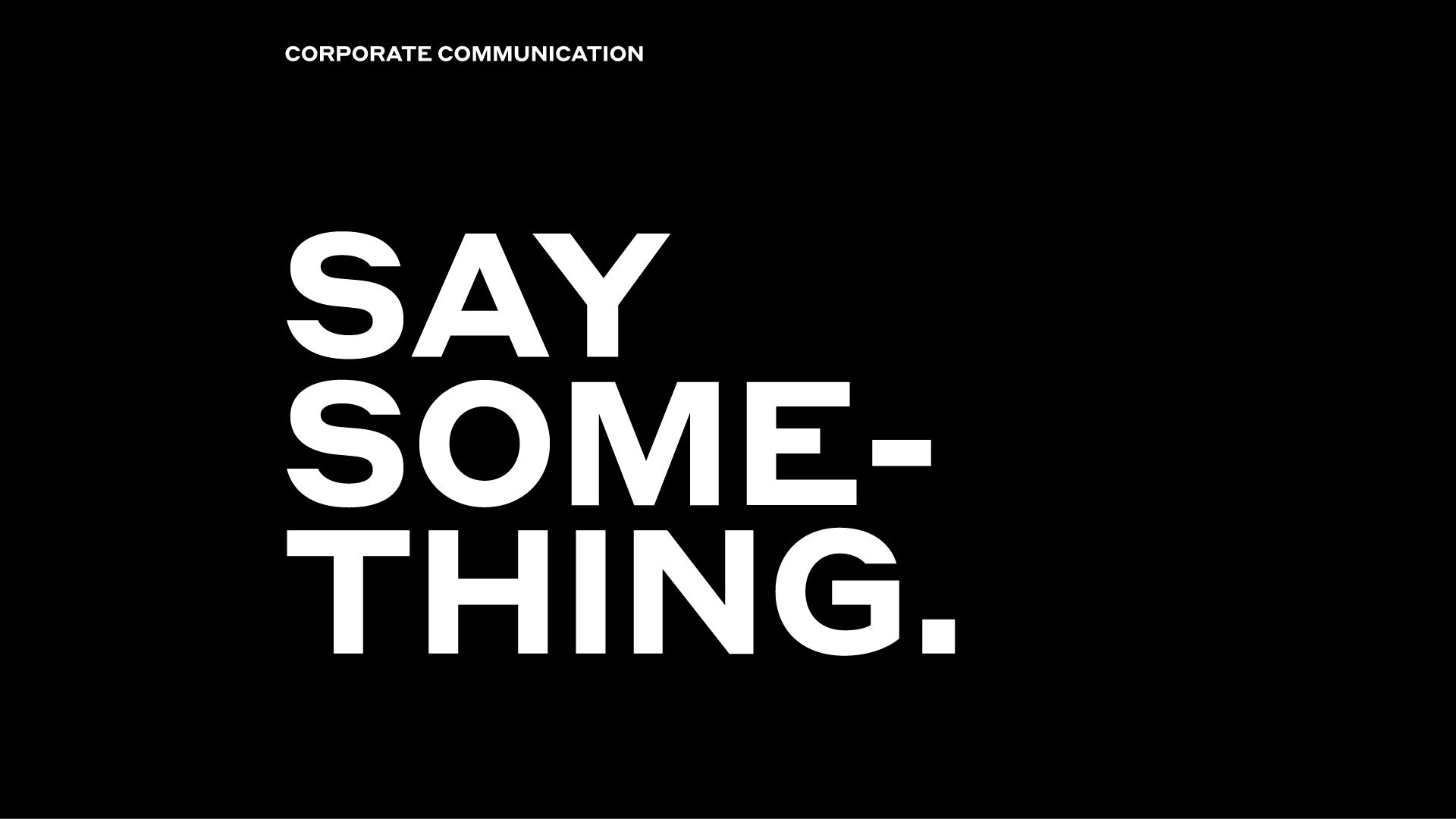
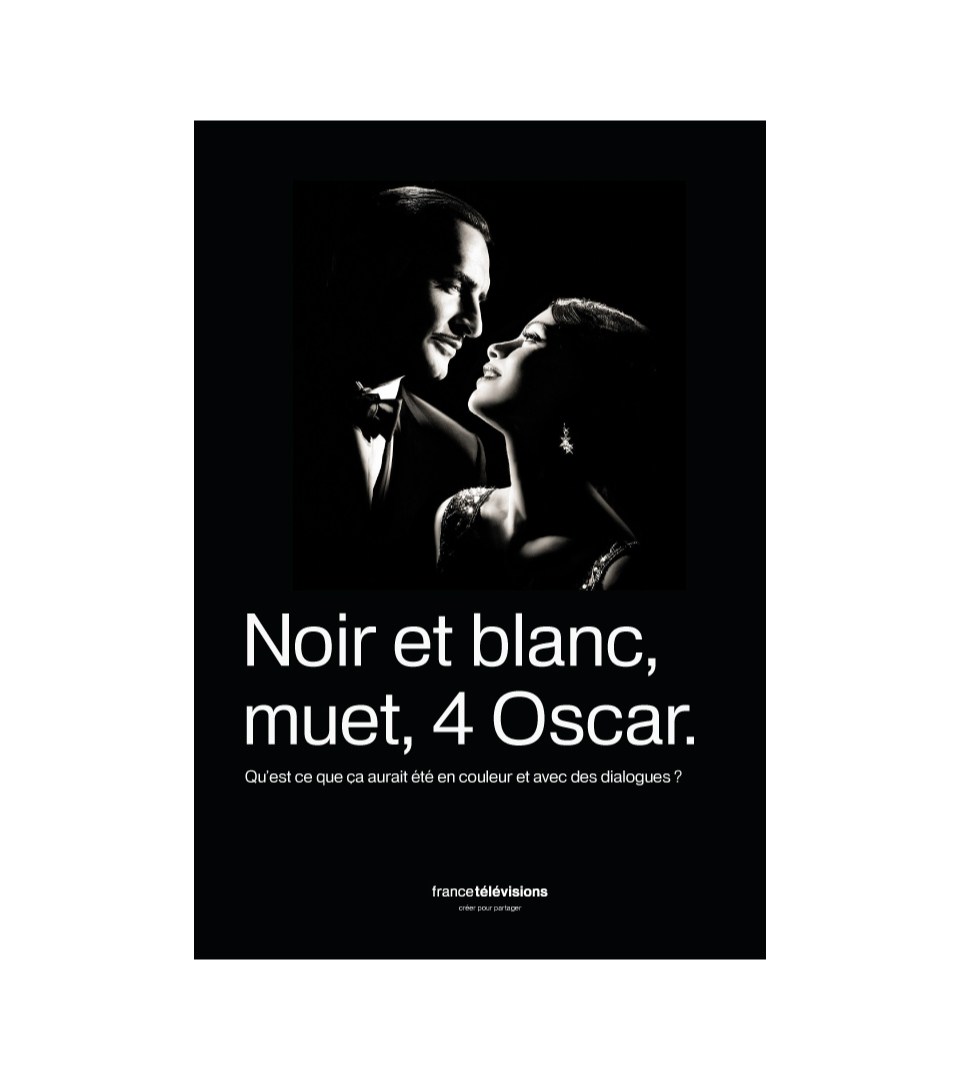
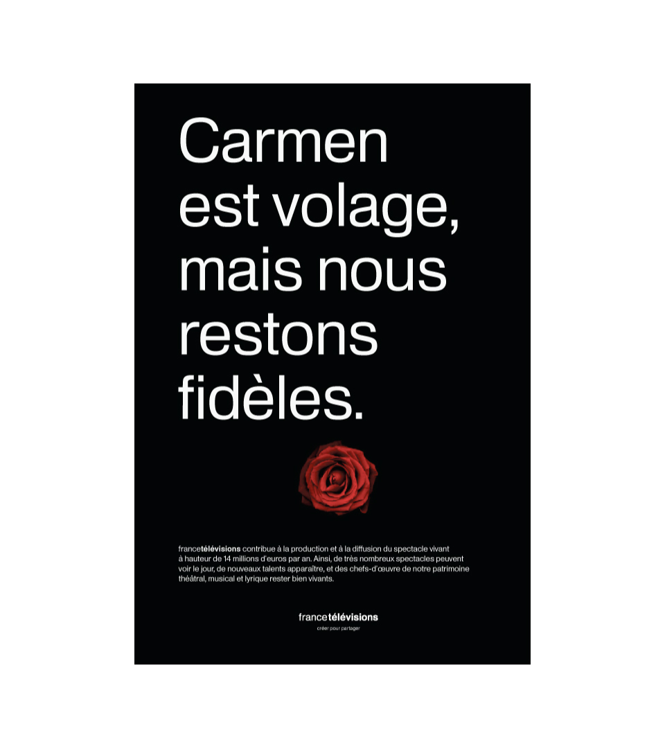
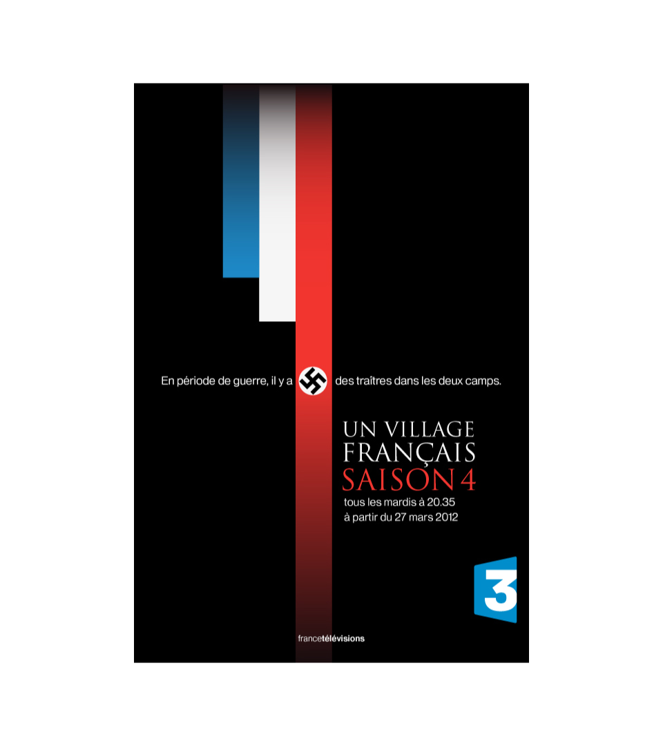
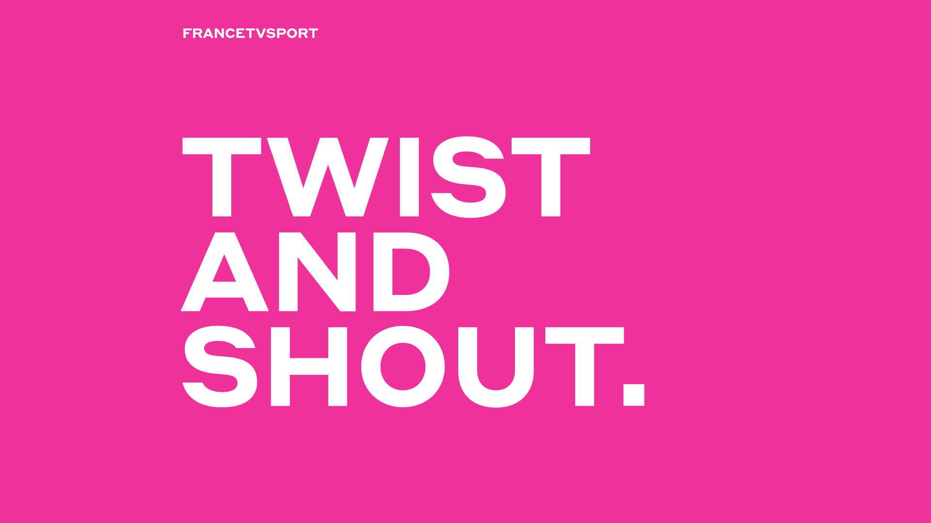
Rather than simply reproducing stills from a promoted show, our ad campaign really made a statement. The striking black and white, huge font and pithy text hammered home the importance of France Télévisions to global culture.
Rather than simply reproducing stills from a promoted show, our ad campaign really made a statement. The striking black and white, huge font and pithy text hammered home the importance of France Télévisions to global culture.
Rather than simply reproducing stills from a promoted show, our ad campaign really made a statement. The striking black and white, huge font and pithy text hammered home the importance of France Télévisions to global culture.
Art Directors
Clément Vauchez
Gordon
Arnaud Homann
Pippo Lionni (guest)
Philippe Apeloig (guest)
Producers
Emmanuelle Lacaze
Christophe Jarreau
François Bouchara
Motion Designer
Kino
Creative Director
Bernard Bréchet
Director
Nicolas Thépot
share