TIP!K – GLOBAL BRANDING
TIP!K – GLOBAL BRANDING
RTBF, the Belgian public-service broadcaster that delivers radio and TV to the country’s French-speaking community, gave Gédéon the mission of strategic consulting for and the creation of their new 360 media brand (TV, radio and digital) for young adults, TIP!K.
--:-- / --:--
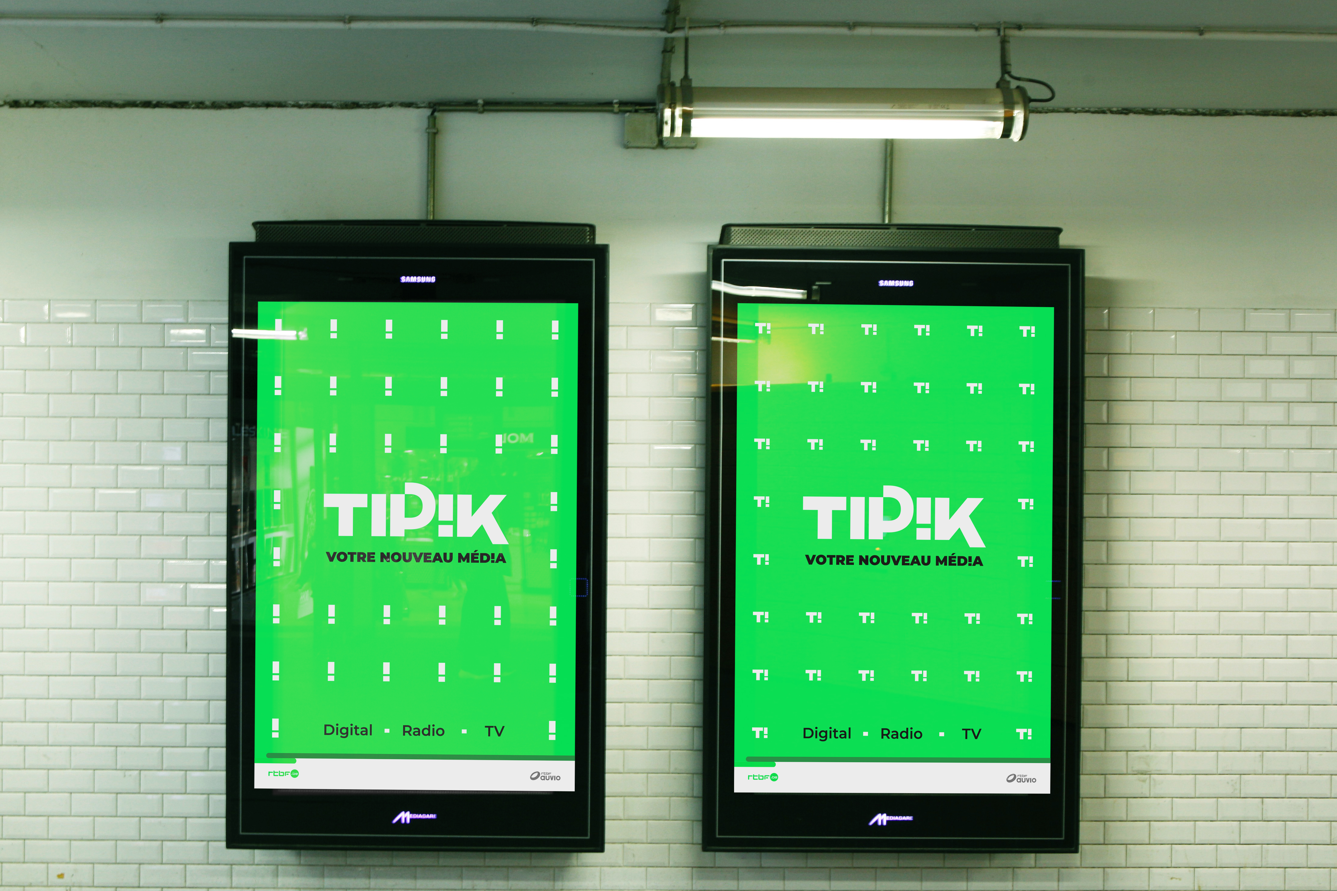
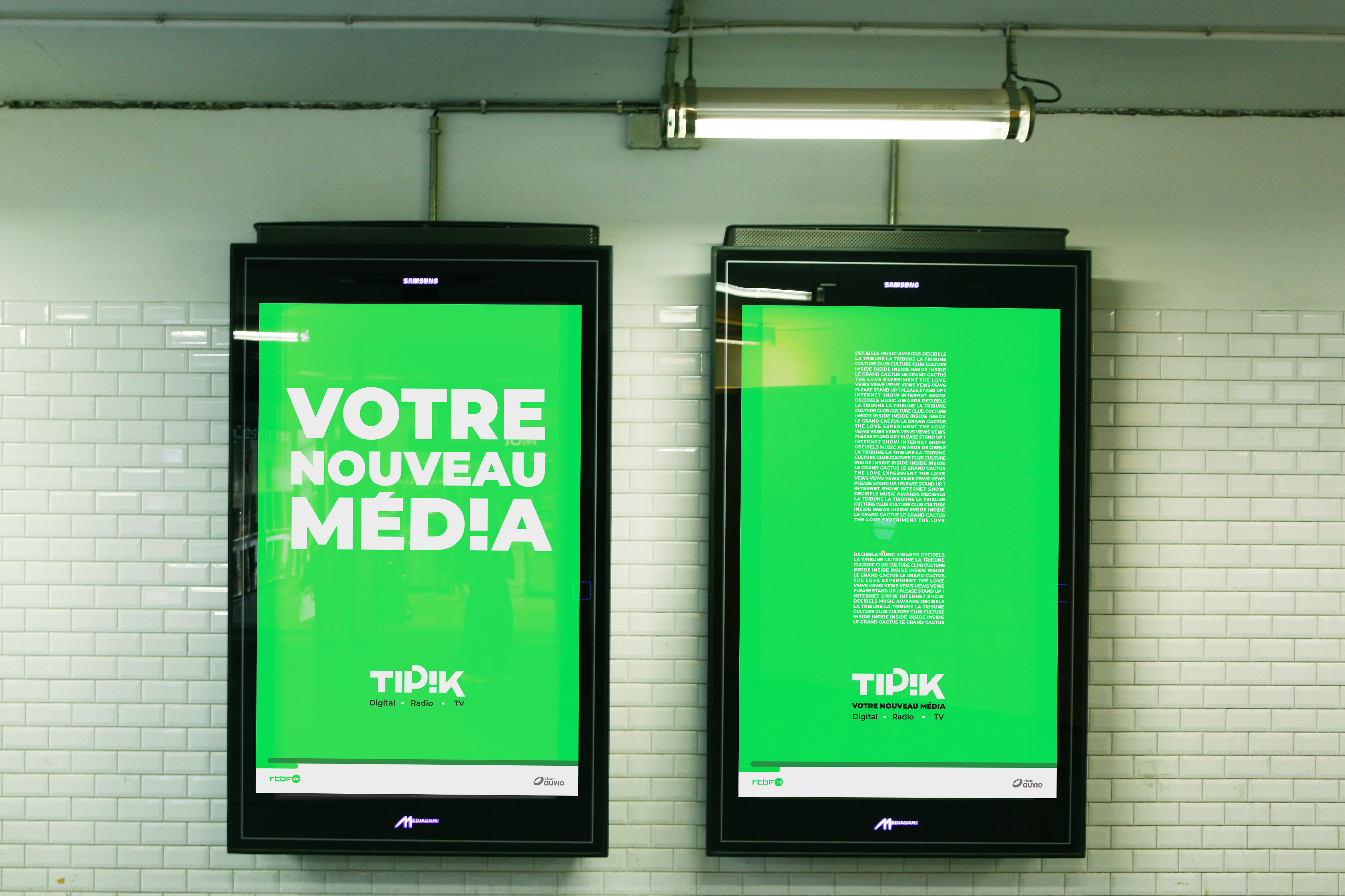
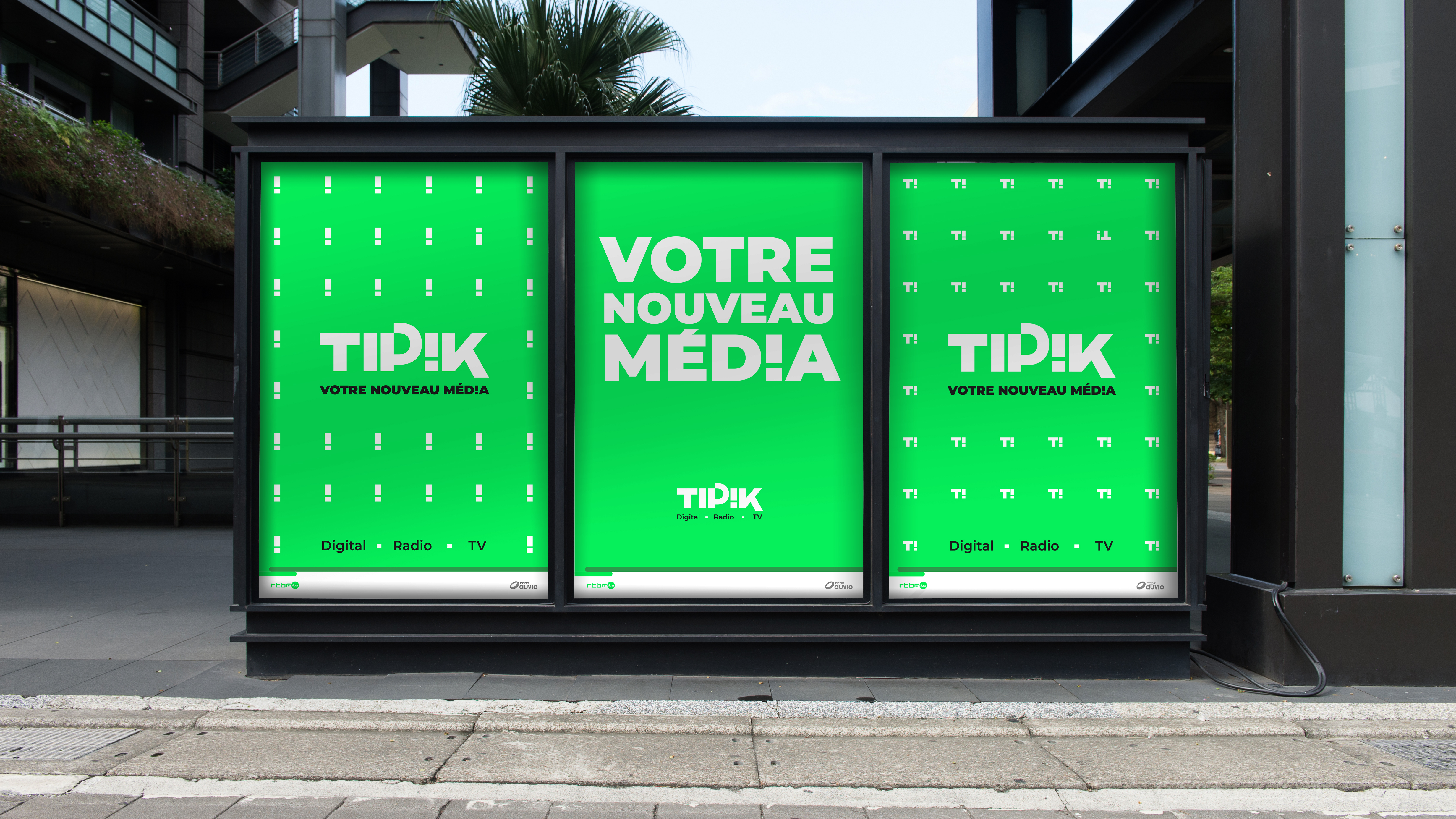
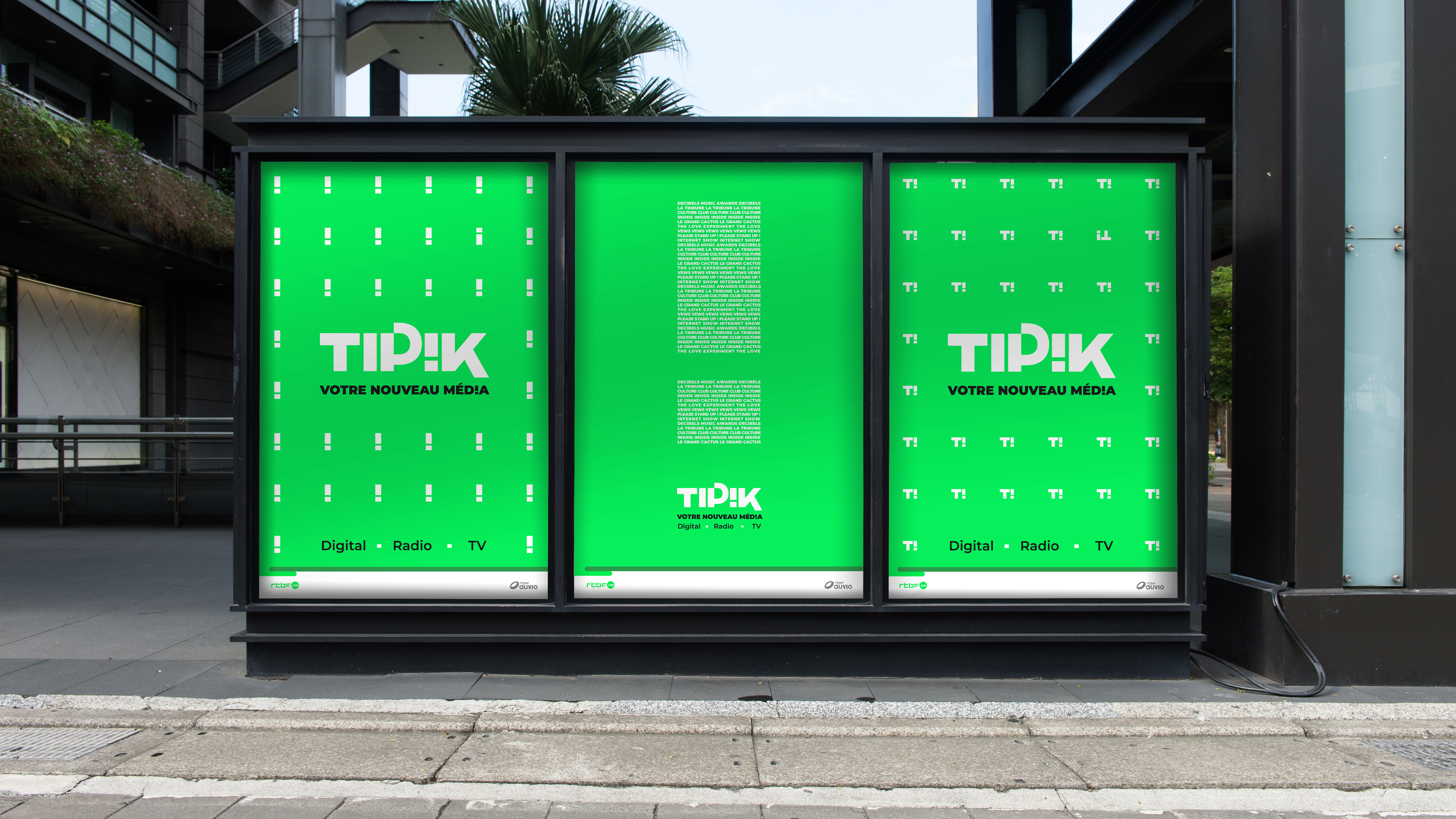
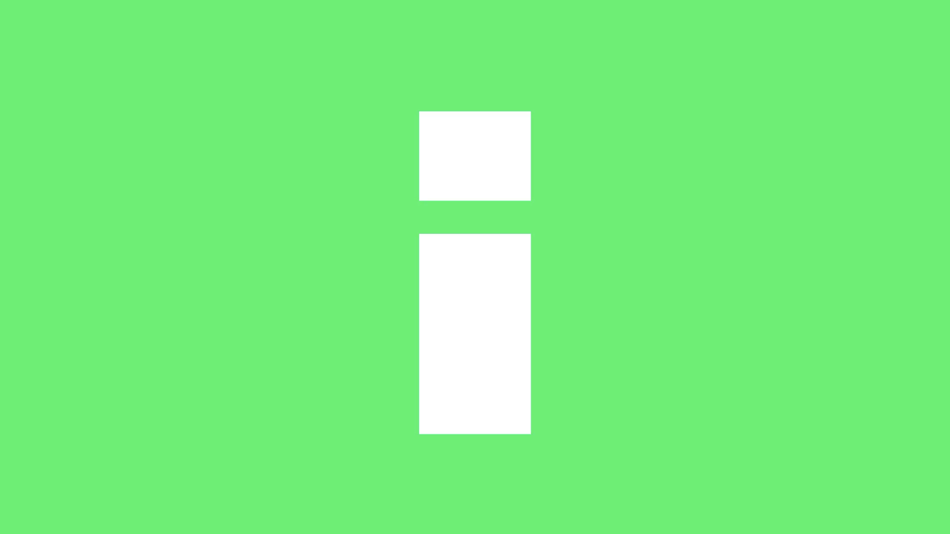
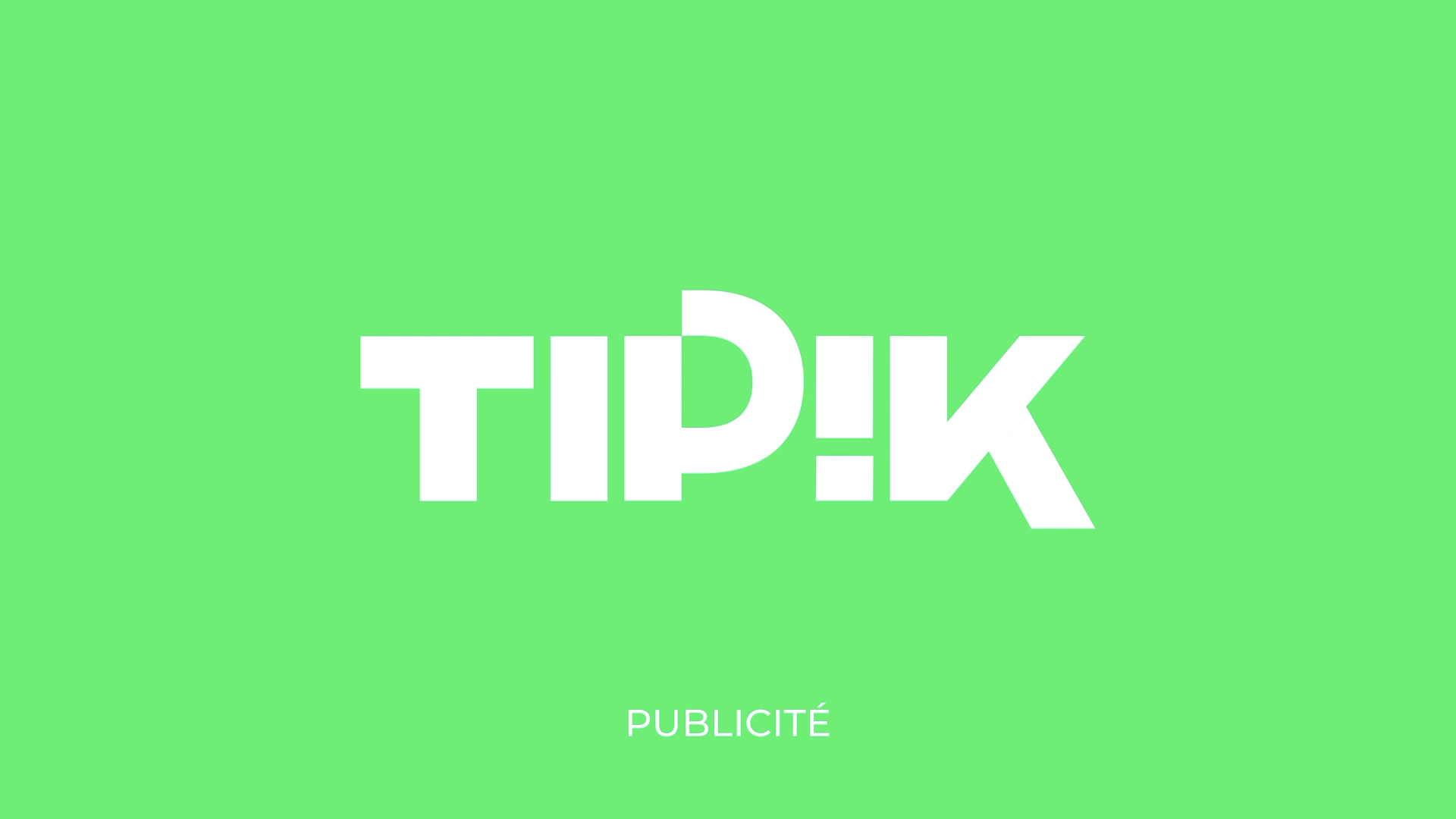
Since the name had already been chosen, the most important element of Gédéon’s mission was to create a logo that is simple, original and recognizable. The key visual element within the logo is the inversion of the ‘i’ in TIP!K into an exclamation mark ‘!’, incarnating the target audience’s youth, dynamism and creativity as well as reflecting a convivial brand. Being also a digital brand, we created an isologo and an animation that transforms the logo from its original size to a more condensed digital version.
--:-- / --:--
--:-- / --:--
It was from the logo that a comprehensive and vibrant graphic grammar could be created for the brand.
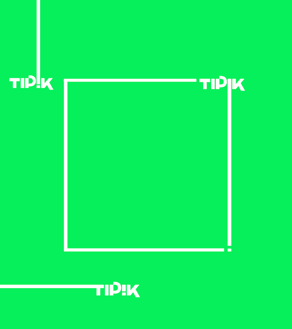
Indeed, we capitalized on the exclamation mark and we decided to develop the TIP!K identity around this symbol. It gives richness to the graphic identity and allows the brand to express itself in multiple different ways. It can be used in its original format or transformed into a frame, a line to underline specific words or it can be placed within words and sentences. Equally, it can be used as a window through which images and animations can emerge.
It was from the logo that a comprehensive and vibrant graphic grammar could be created for the brand.
Indeed, we capitalized on the exclamation mark and we decided to develop the TIP!K identity around this symbol. It gives richness to the graphic identity and allows the brand to express itself in multiple different ways. It can be used in its original format or transformed into a frame, a line to underline specific words or it can be placed within words and sentences. Equally, it can be used as a window through which images and animations can emerge.
--:-- / --:--
The guiding principle of the ad breaks is that the brand and logo are memorable and so we decided to play with them, putting them at the heart of our animations. We produced different full graphic animations that capture the spirit of the brand. These kinds of animation can easily be renewed and adapted by the in-house team to avoid becoming repetitive.
--:-- / --:--
--:-- / --:--
--:-- / --:--
--:-- / --:--
RTBF asked us to work on the branding strategy of the openers and of the programmes broadcasted on TIP!K. For this we started to determine the exact degree of relationship between the mother-brand and its sub-brands. The objective was to find the right balance between having programmes with their own identity and relating them to the mother brand. We created a guideline of inspiration to guide the RTBF in-house teams.
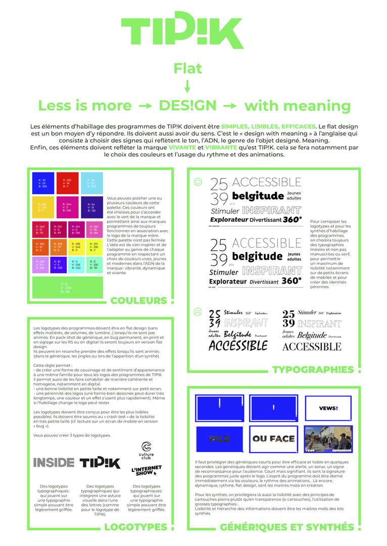
Nowadays, videos are spreading around the web and it is really important to know where the videos come from. That’s why we suggested that TIP!K digital videos be branded with TIP!K’s visual codes, such as the green outline.
Producers
Emmanuelle Lacaze & Pauline de Decker
Strategic Creative Director
Lieven Van Overbeke
Creative Director
Gordon
awards
Finalist at the Promax Europe 2021 with TIP!K in the category Channel Logo Design Across Multiple Media
share