RTL ADCONNECT – Brand Identity
RTL ADCONNECT – Brand Identity
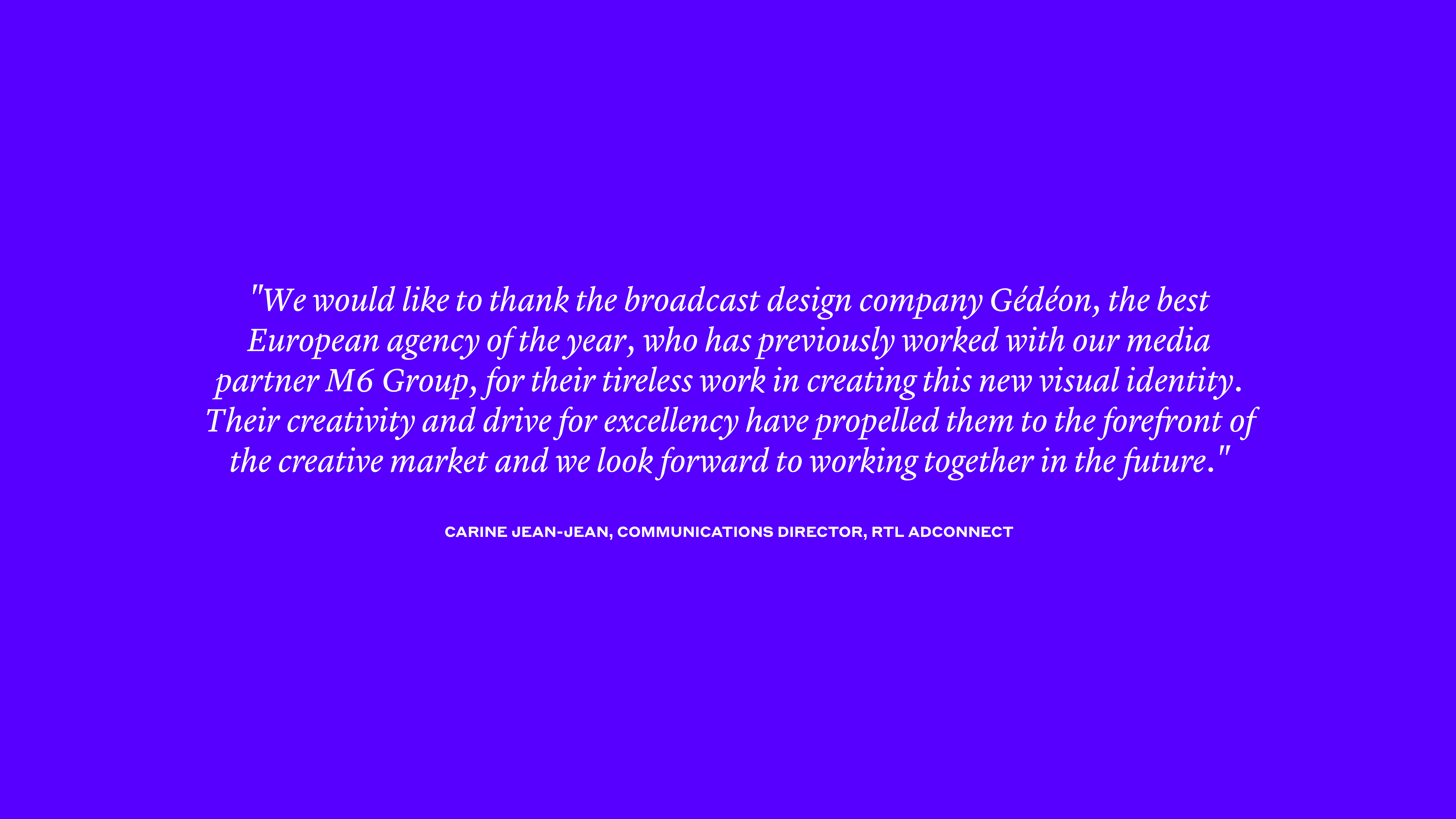
RTL AdConnect, the #1 European sales house, asked Gédéon to refresh its brand visual identity and tone of voice. At the same time as working on the wording and story-telling of the brand, we also developed their global and 360° identity. Since their current identity was already efficient, we decided to reinvent their graphic codes. The objectives were to increase RTL AdConnect’s notoriety and readability, to clearly express the richness of its offer, as well as its agility and modernity in a sector where these values are essential.
--:-- / --:--
--:-- / --:--
The first step of this challenging project was to work on the tone of their voice in order to adapt it to their new approach. We studied their language (semantic fields, punctuation…) to understand where and what were the levers we could work on. Thanks to Gédéon’s expertise, we found different ways to help RTL AdConnect have a more embodied, welcoming and emotional voice. We gave them tools and guidelines to get closer to their clients.
--:-- / --:--
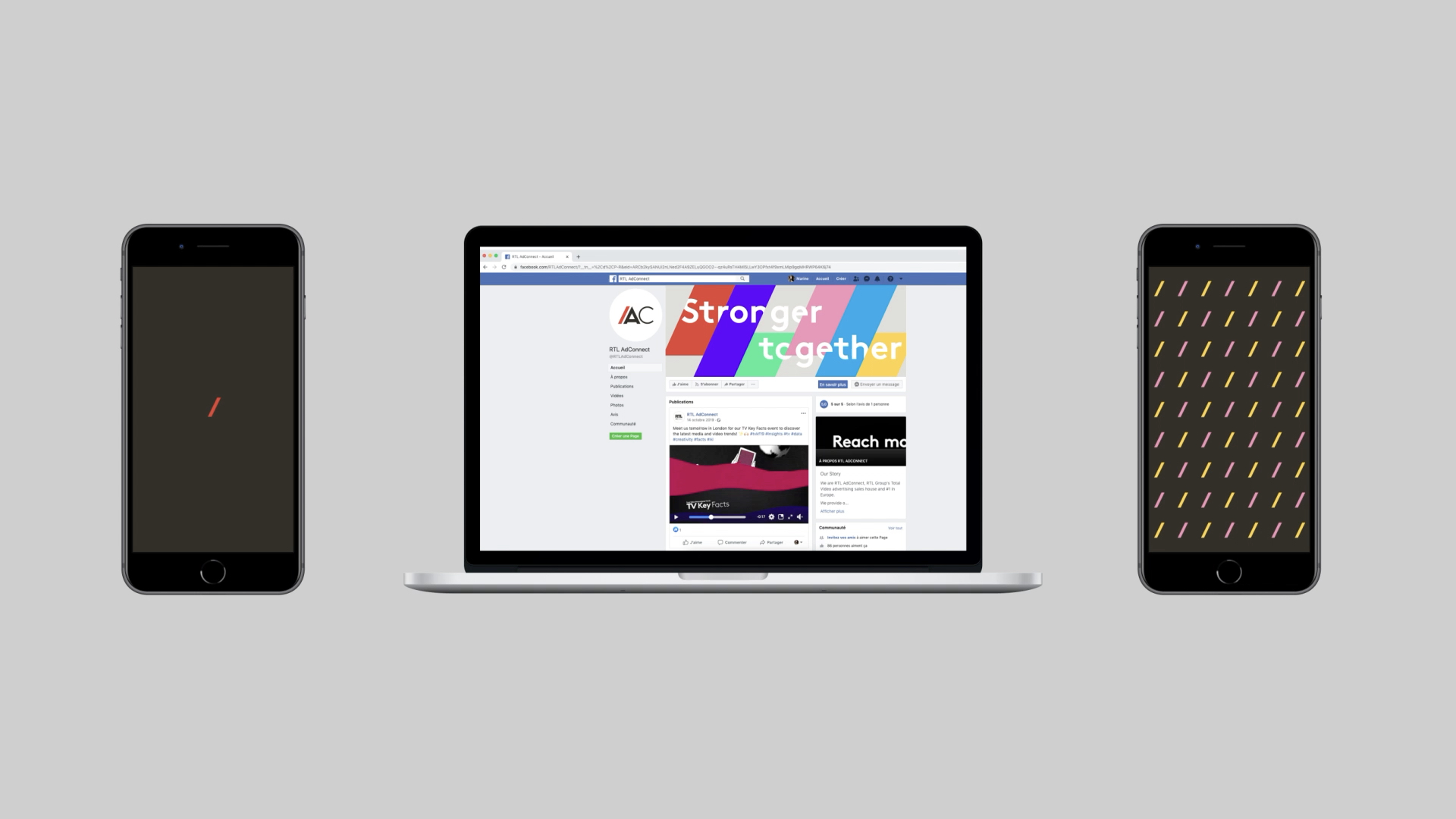
As RTL AdConnect communicates on different platforms such as corporate documents, social media (LinkedIn, Instagram, etc), newsletters or even through various events, we defined different moods of expression for their wording depending on the media and audience.
As RTL AdConnect communicates on different platforms such as corporate documents, social media (LinkedIn, Instagram, etc), newsletters or even through various events, we defined different moods of expression for their wording depending on the media and audience.
As RTL AdConnect communicates on different platforms such as corporate documents, social media (LinkedIn, Instagram, etc), newsletters or even through various events, we defined different moods of expression for their wording depending on the media and audience.
As RTL AdConnect communicates on different platforms such as corporate documents, social media (LinkedIn, Instagram, etc), newsletters or even through various events, we defined different moods of expression for their wording depending on the media and audience.
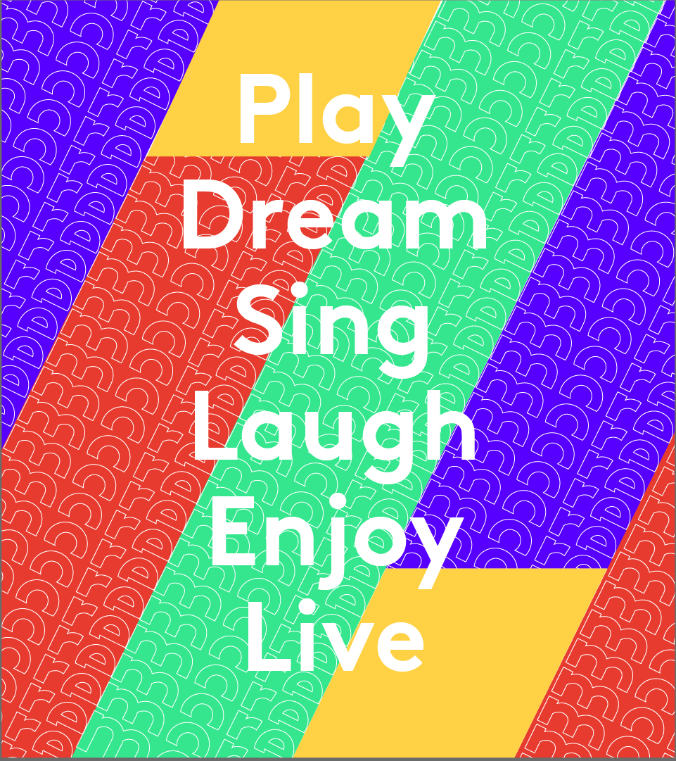
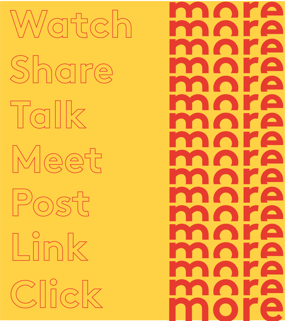
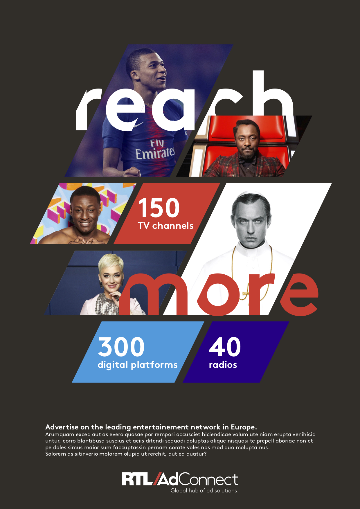
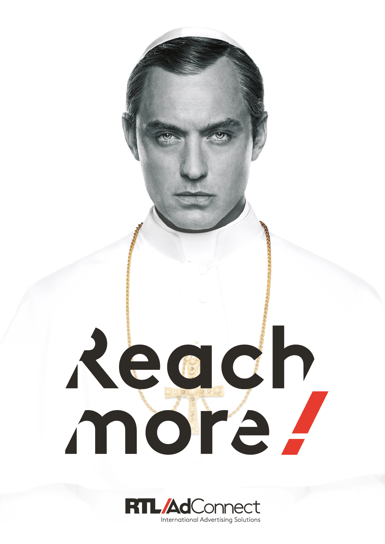
Following on from our work on the wording, RTL AdConnect asked us to challenge their claim “International Advertising Solutions”. With a size constraint, how could we say a lot in such few words? After highlighting the weaknesses and the strengths of the baseline we proposed different baselines to RTL AdConnect, which each highlighted different elements of their activity.
Following on from our work on the wording, RTL AdConnect asked us to challenge their claim “International Advertising Solutions”. With a size constraint, how could we say a lot in such few words? After highlighting the weaknesses and the strengths of the baseline we proposed different baselines to RTL AdConnect, which each highlighted different elements of their activity.
Following on from our work on the wording, RTL AdConnect asked us to challenge their claim “International Advertising Solutions”. With a size constraint, how could we say a lot in such few words? After highlighting the weaknesses and the strengths of the baseline we proposed different baselines to RTL AdConnect, which each highlighted different elements of their activity.
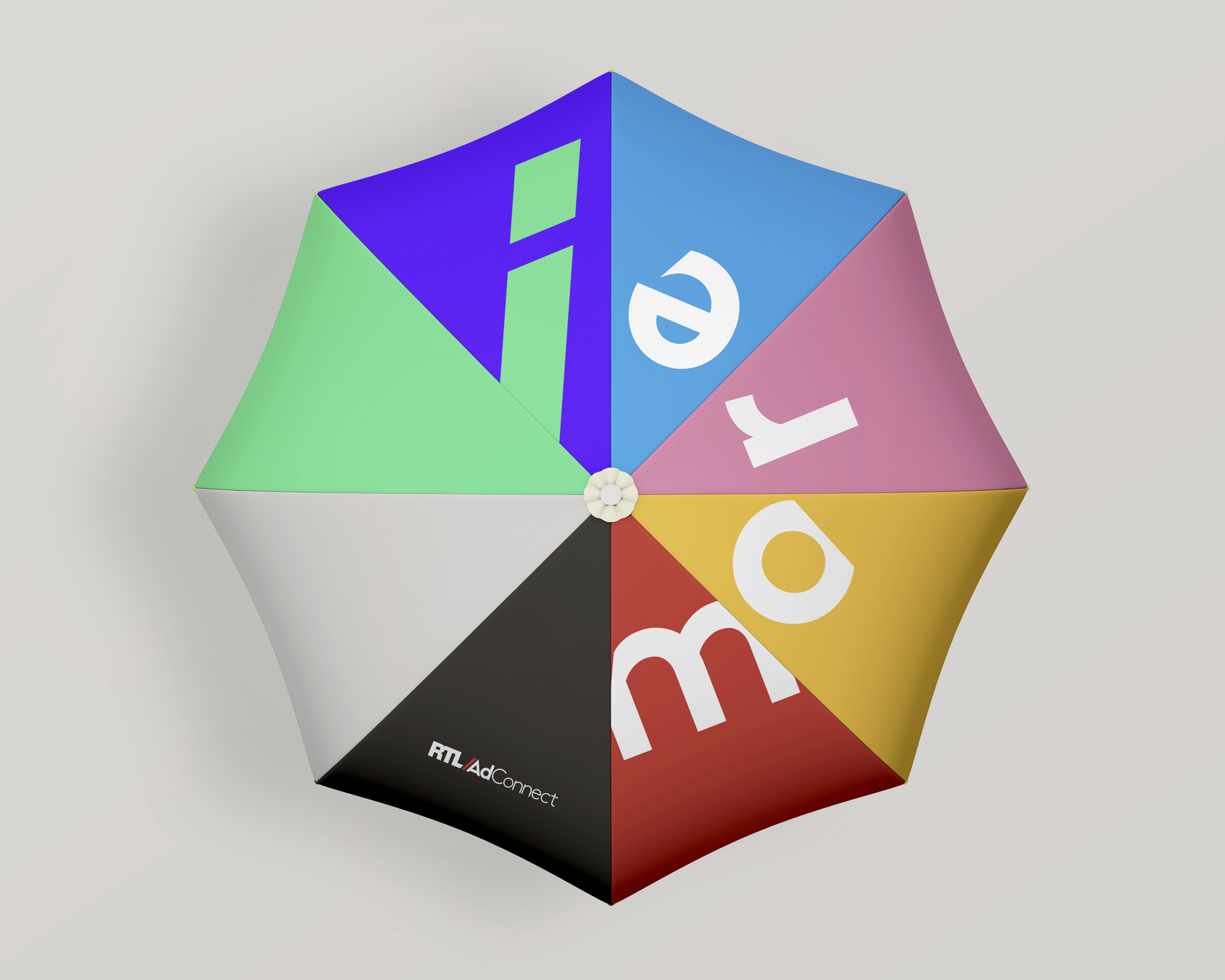
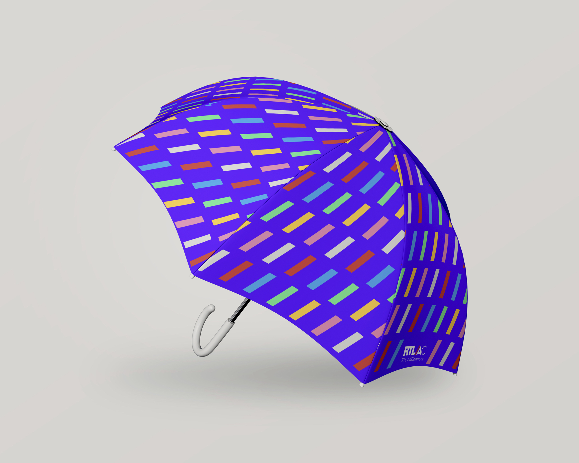
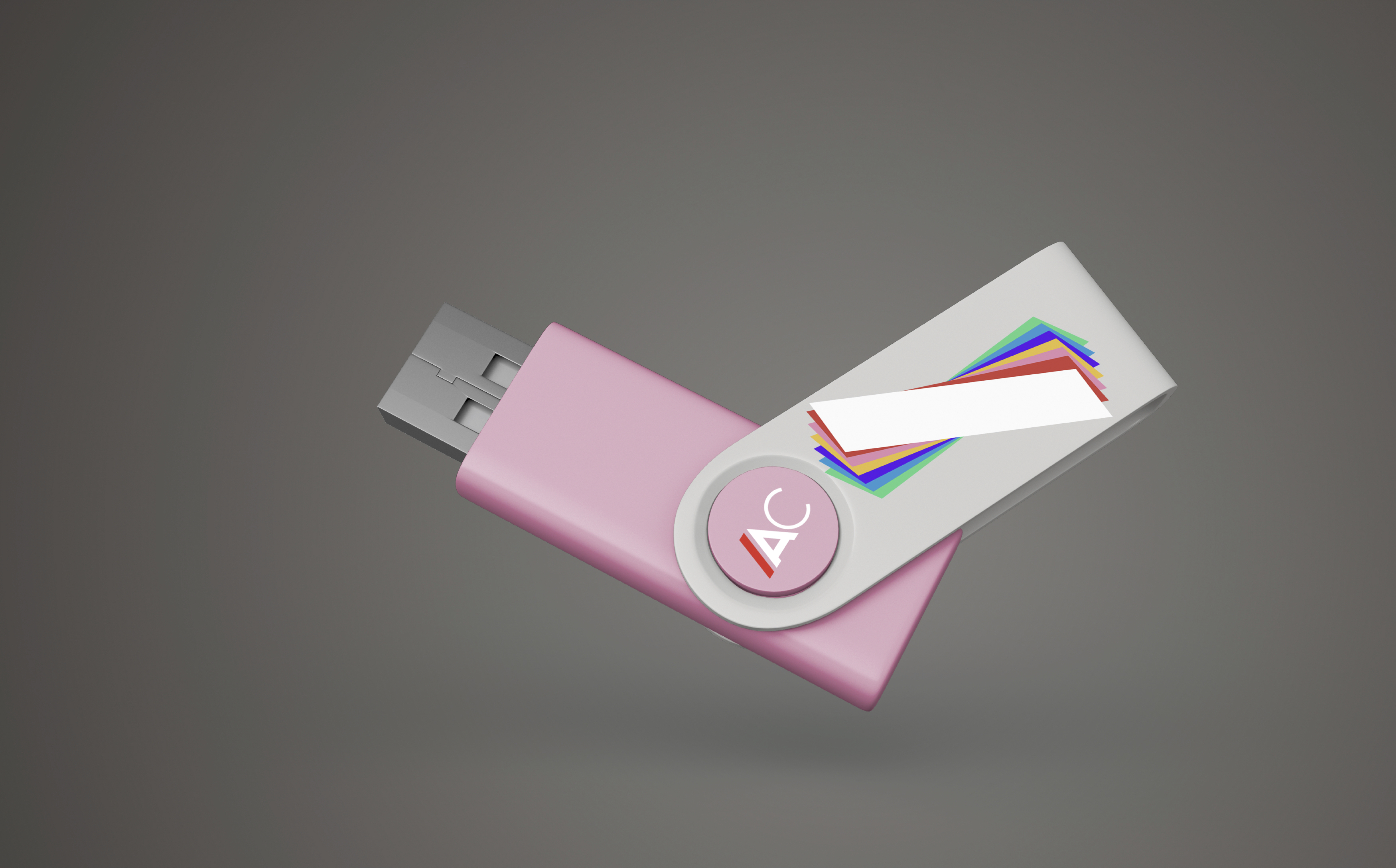
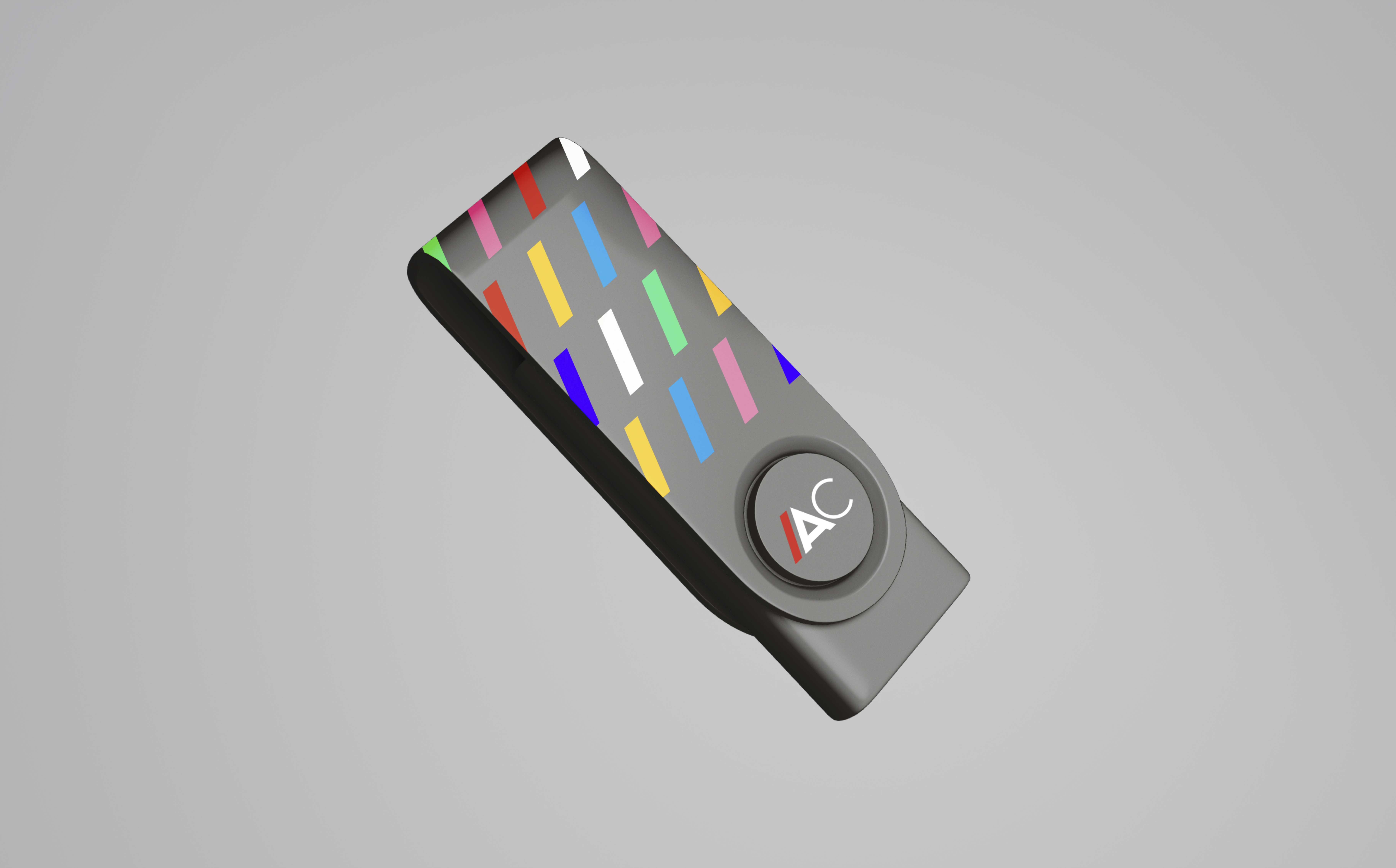
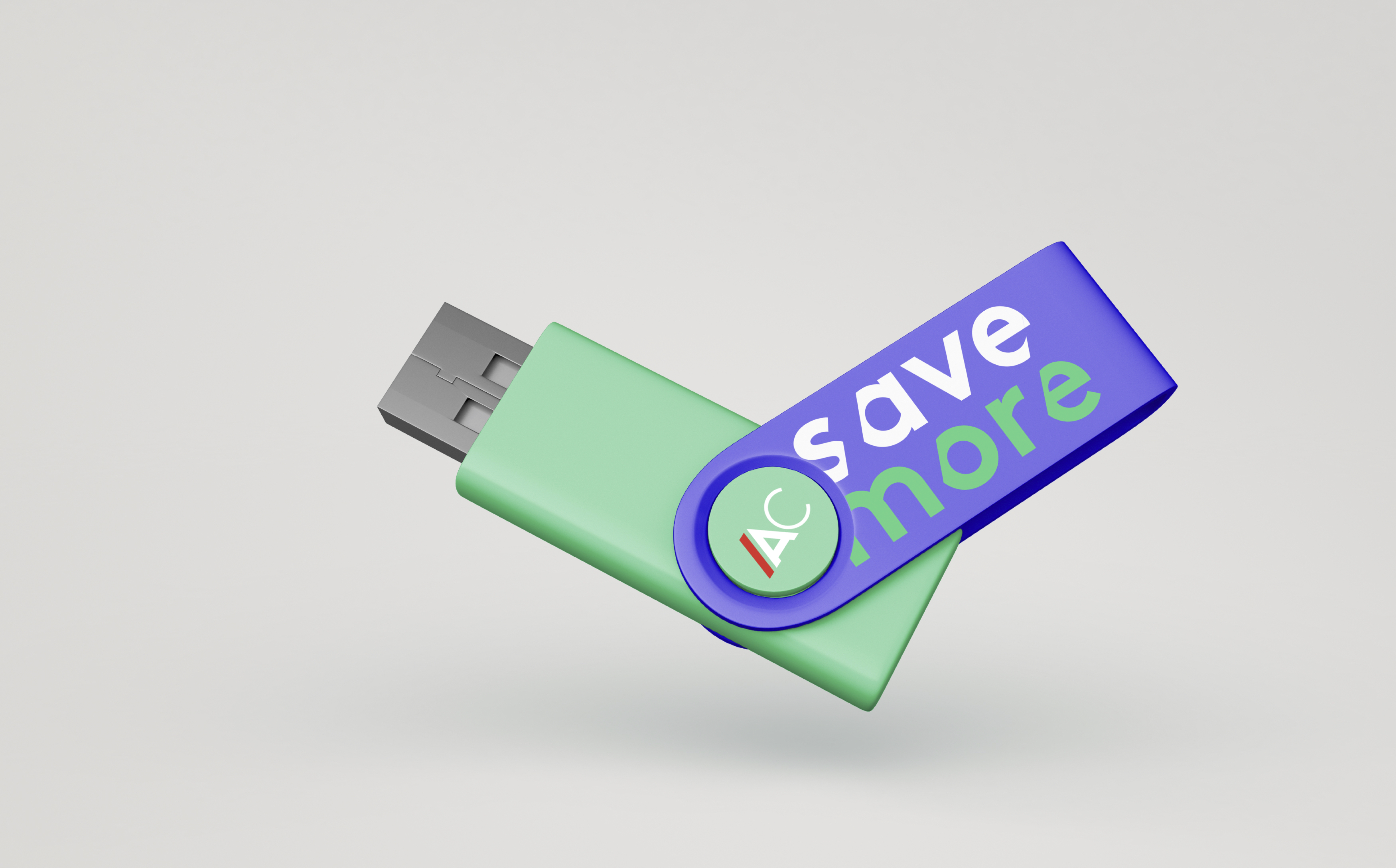
After having fine-tuned and harmonized all the logos (mother brand and sub-brands), RTL AdConnect asked us to refresh its brand identity. We wanted to reinterpret the existing graphic codes to make the brand more dynamic.
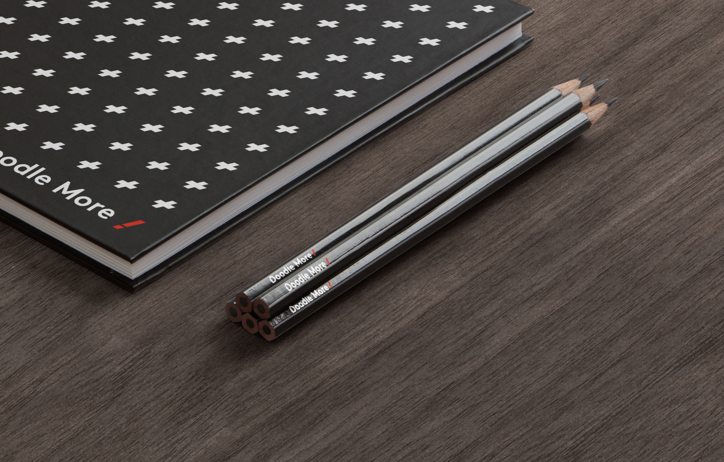
We created a graphic territory around the slash that both allows us to design punctuation markers that reflect the dialogue, the connection, the interactivity and its lively essence, and, more broadly, that allows us to design an iconography.
--:-- / --:--
We imagined this branding in motion in order to evoke a more lively, vibrant and human brand. The animation of the slash with a colored prism, reflecting the richness of the offer and content, reveals the logo, images and messages thanks to a variety of configurations: patterns, windows, supports, grids…
--:-- / --:--
--:-- / --:--
Producers
Emmanuelle Lacaze & Pauline de Decker
Art Directors
Nicolas Famery & Lazare Bessière
share