VTM NIEUWS – GLOBAL REDESIGN
VTM NIEUWS – GLOBAL REDESIGN
Once again, VTM, the leading Flemish channel, decided to entrust us with the artistic direction of their news brand alongside Simon Jago, our long-time partner in set design.
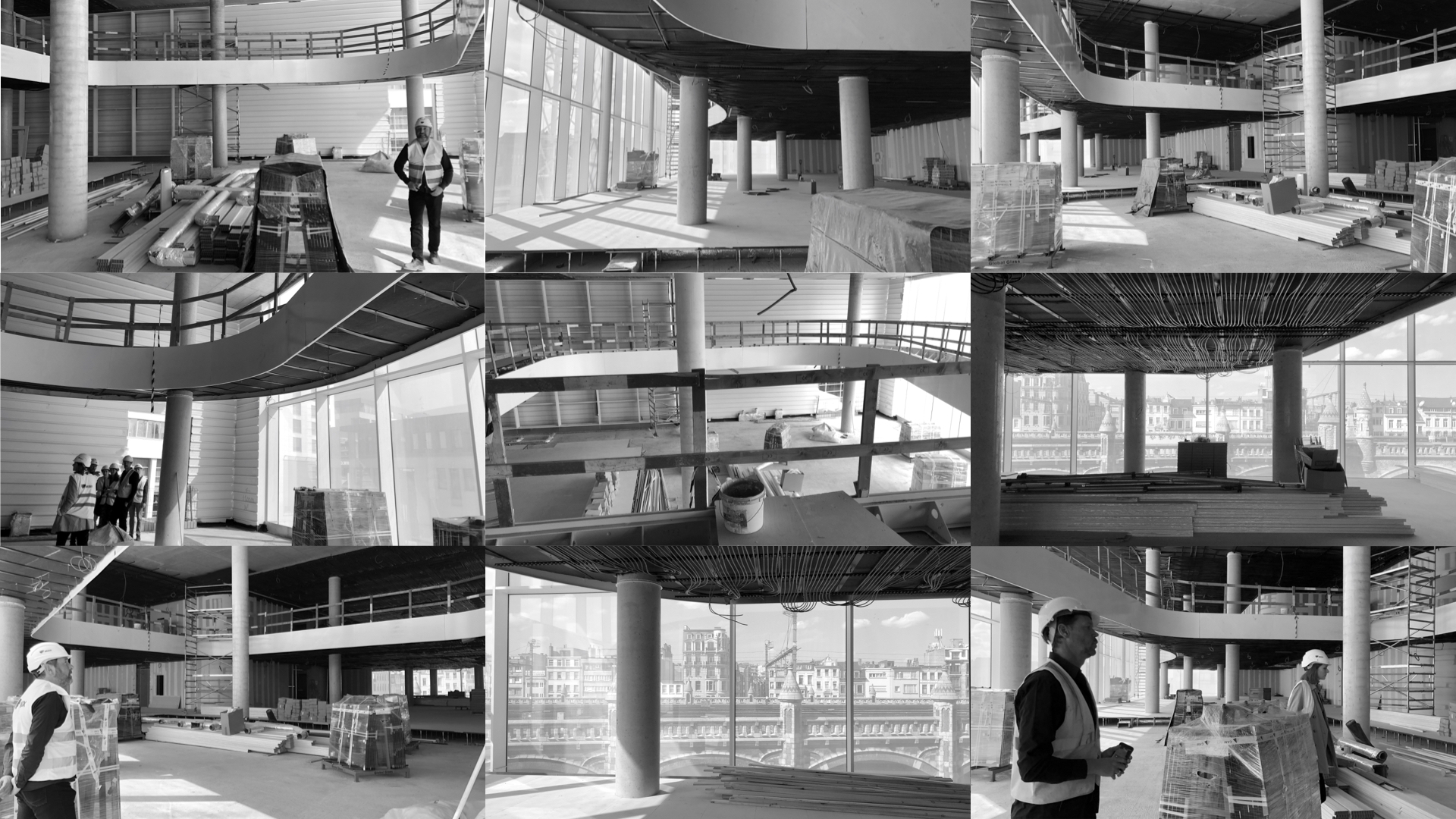
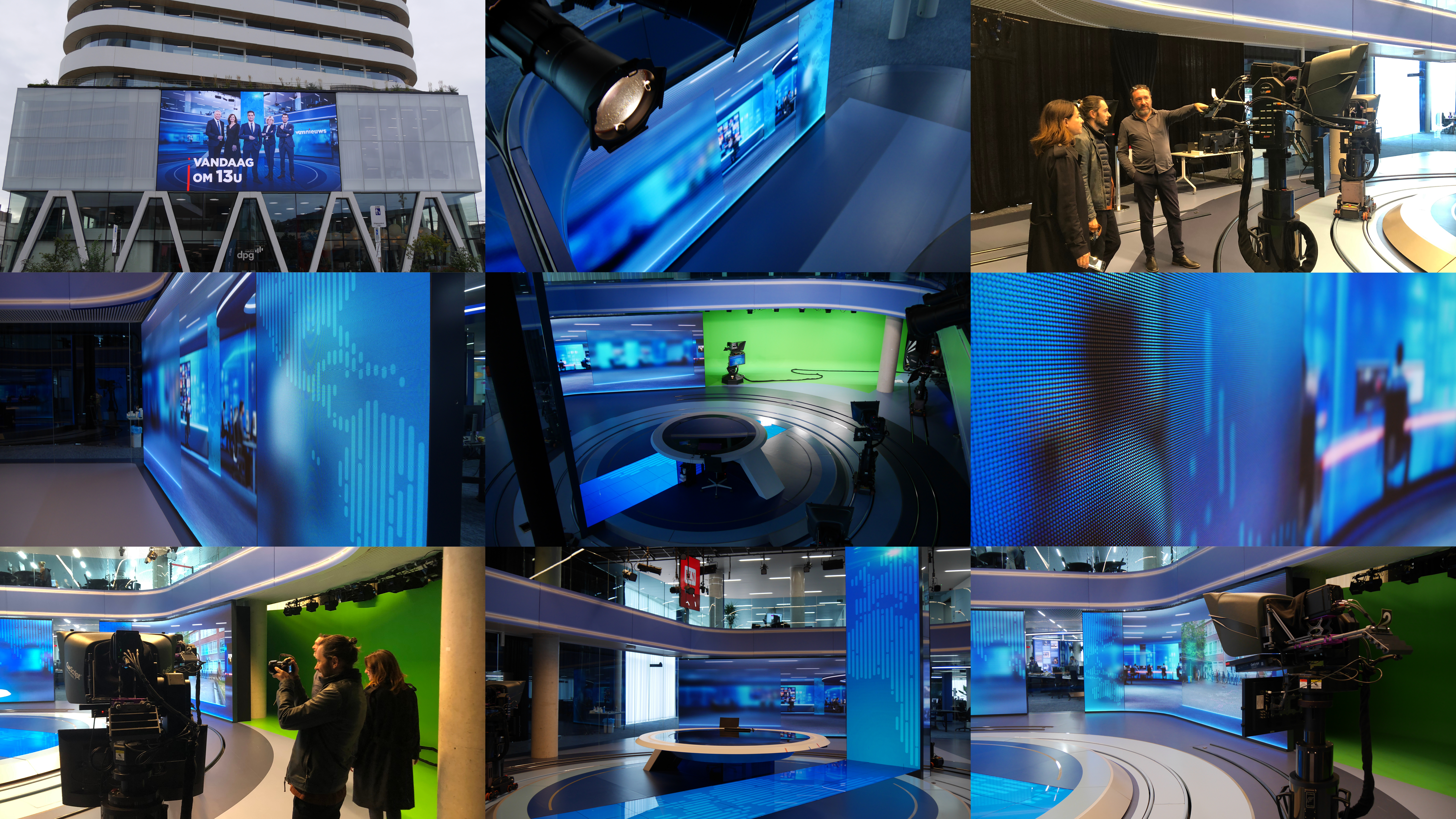
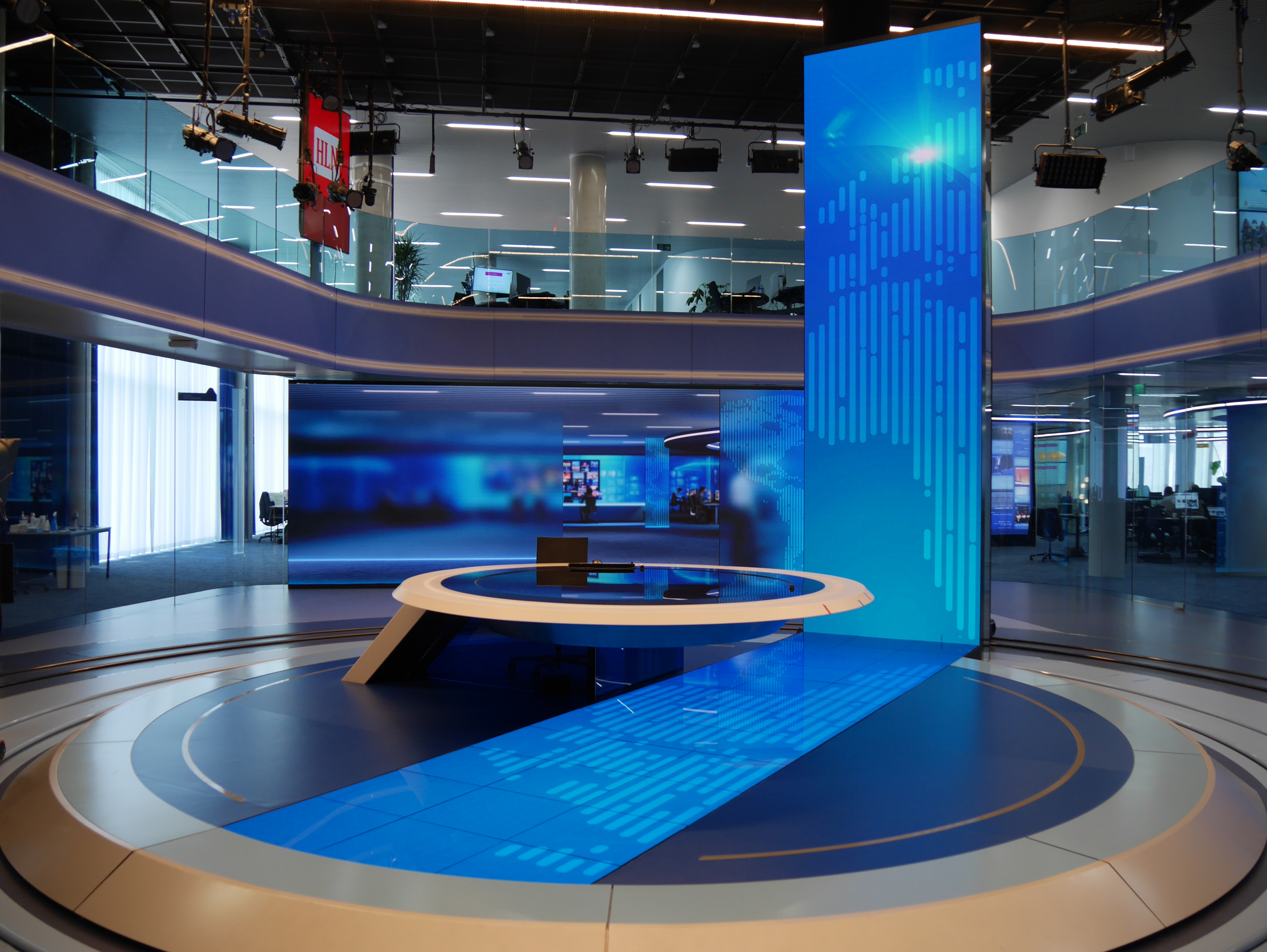
This time, it was about working with a new and amazing building called the News City. A place, in the center of Antwerp, specially built to gather all the news brands of Group DPG.
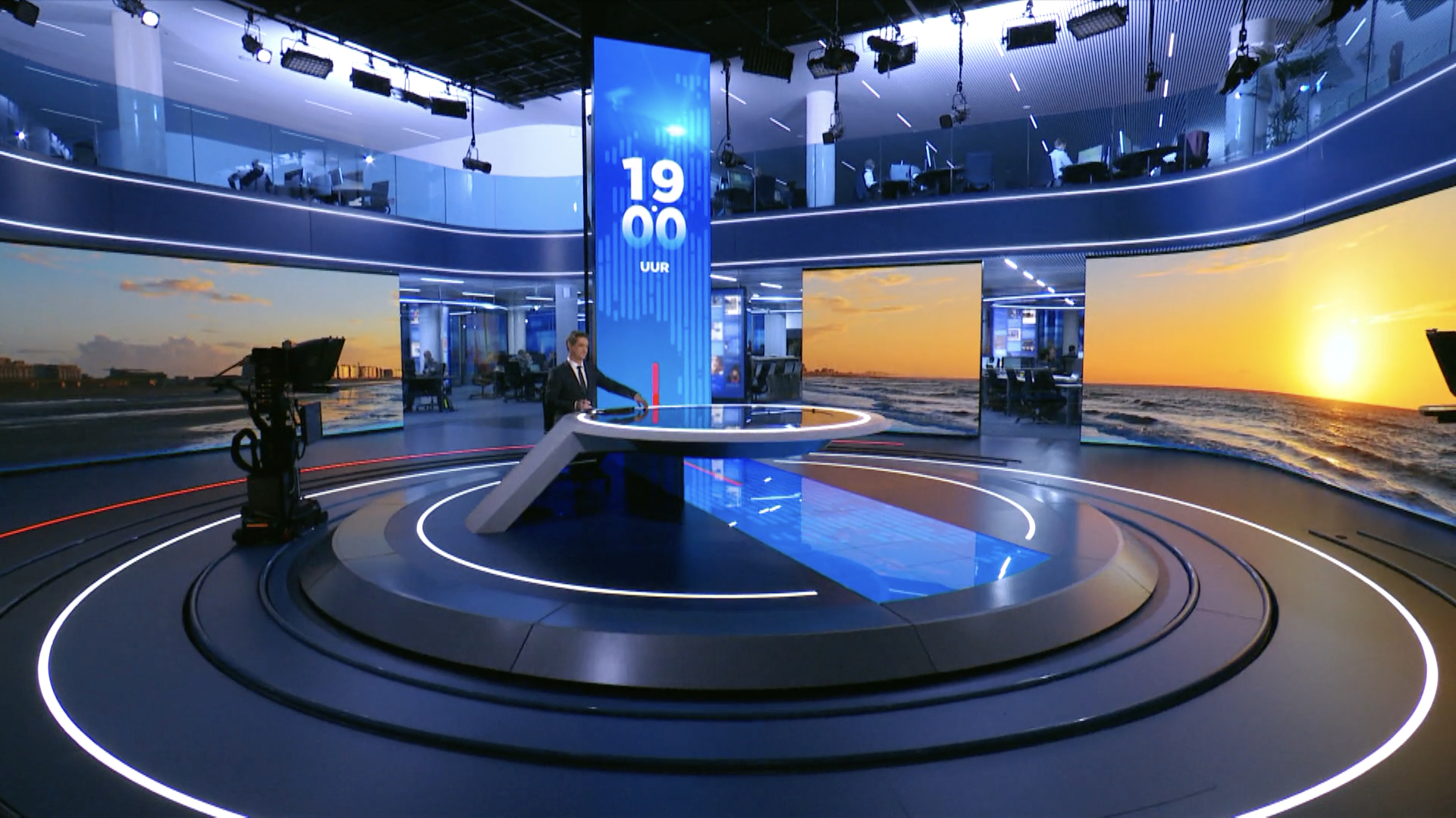
We kept our previous, strong 360° concept that has been copied in many countries in the world and we went to the next level, using more digital codes to keep VTM Nieuws as a leader in news broadcasting.
We wanted the viewer to feel even more at the heart of the news, so that they are immersed in the news experience.
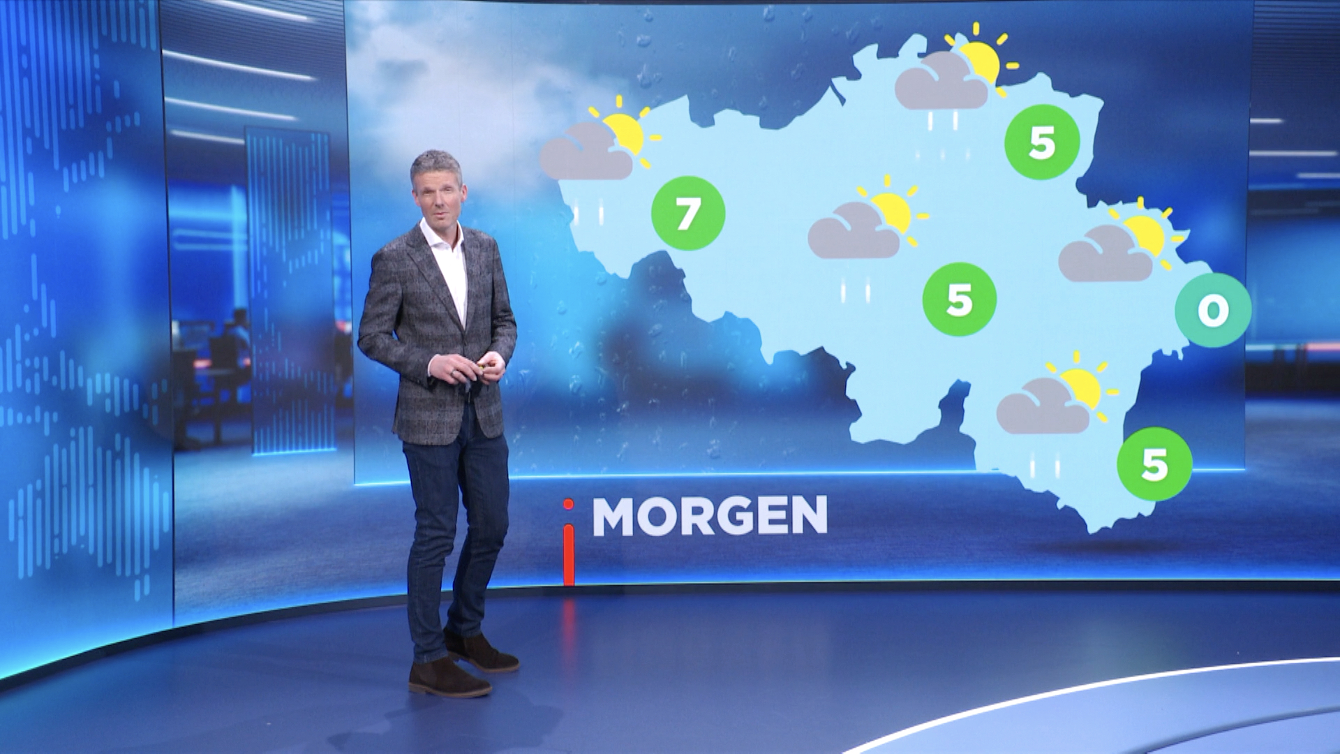
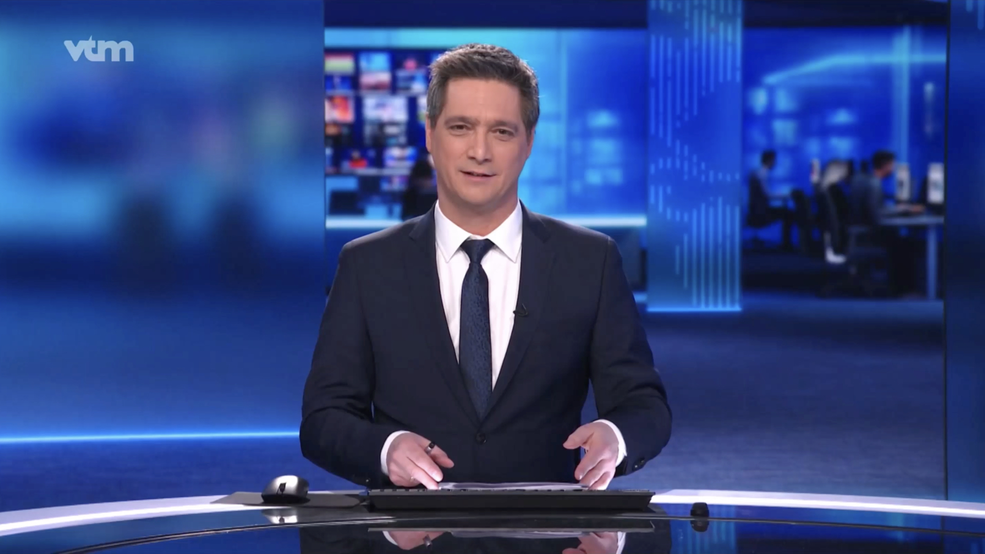
Now, we are able to play with both the big screens and the real newsroom behind the anchor; which gives depth to the set and more of a ‘live’ feeling.

--:-- / --:--
In terms of our graphic system, we kept the concept of the “continuum” shape, which is now part of the VTM Nieuws DNA, but we made it stronger and more digital. We reinvented the codes in order to play with the big « totem screen » in the centre of the set, which keeps the vertical format of mobile phones and Instagram stories.


The red line reminds us of the swiping motion on digital interfaces.
This line also evokes a news feed to show a brand that is always at the cutting edge of news. The movement, from bottom to top, also refers to “the totem screen” in the center of the set, which will become, for sure, an iconic element that might be copied by other newscasts 😉

--:-- / --:--
We designed an earth background that can be displayed on the totem, and also on the different set screens and for the graphics. The use of vertical lines on this background echoes the graphic identity of the brand. Keeping this background as it is, the images don’t overwhelm the set, giving a ‘less is more’ feeling, and highlighting what the anchor is saying.

--:-- / --:--

--:-- / --:--

--:-- / --:--
The positioning of the screens on the set offers the possibility of playing with different visual elements: cut-out images, graphics, backgrounds, videos, titles. The transition of on-screen images is directly inherited from the digital world, and thanks to a graphic stimulus, the red vertical line, a new image will appear, replacing the current one.
--:-- / --:--
PRODUCERS
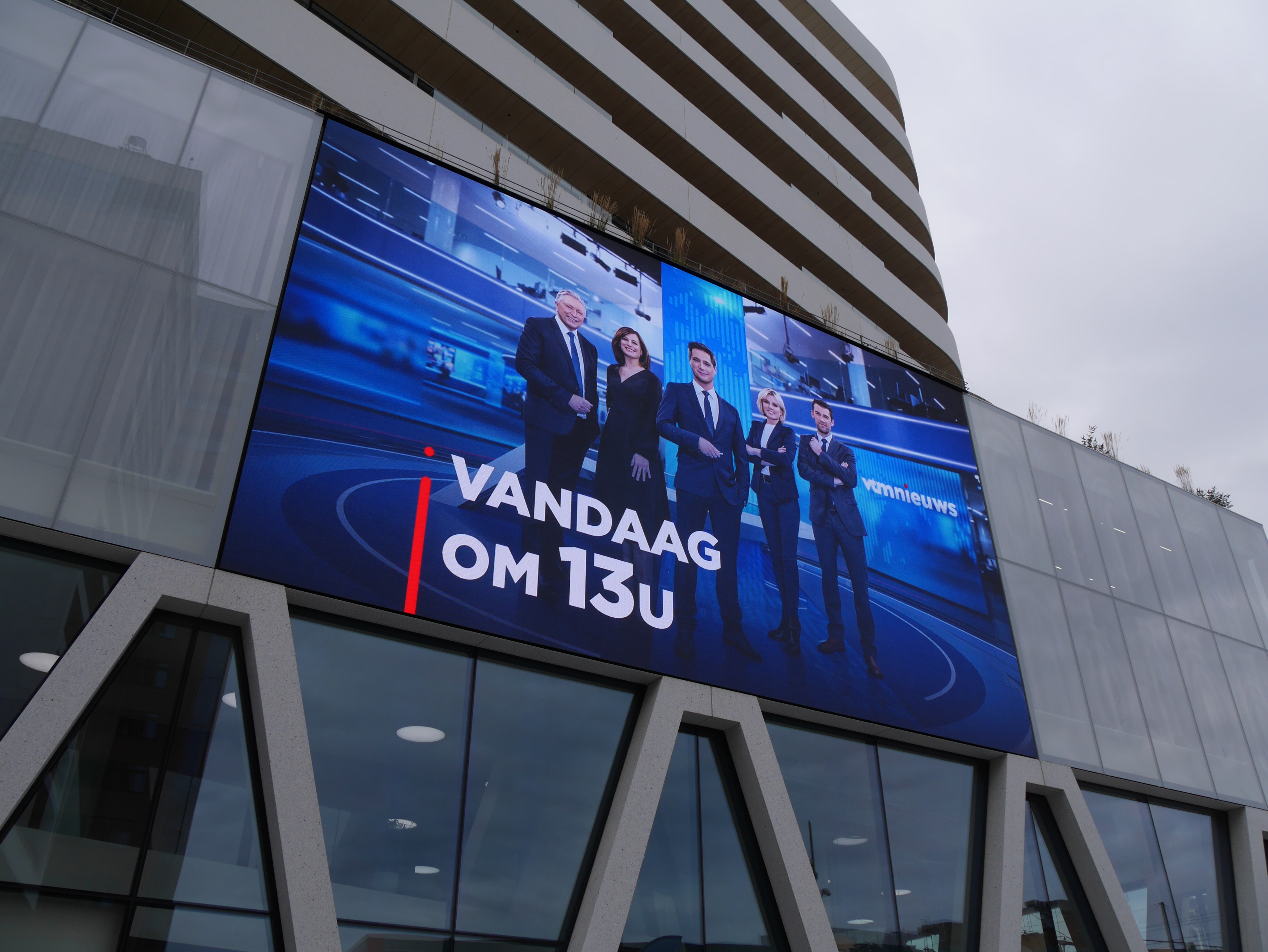
Emmanuelle Lacaze & Charlotte Vande Vyvre & Pauline De Decker
ART DIRECTORS
Nicolas Famery & Lazare Bessière
share