POLAR+
POLAR+
Canal + has launched a new channel, Polar+, for crime and suspense series and movies.
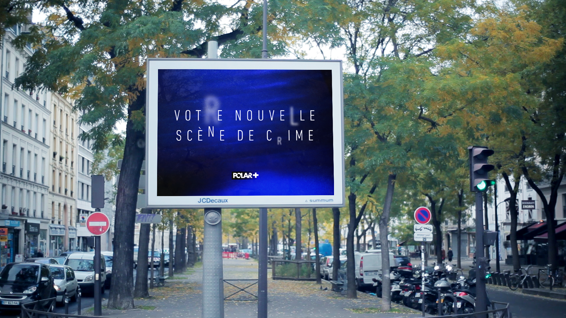
We came with a very strong and simple concept: the idea of revelation.
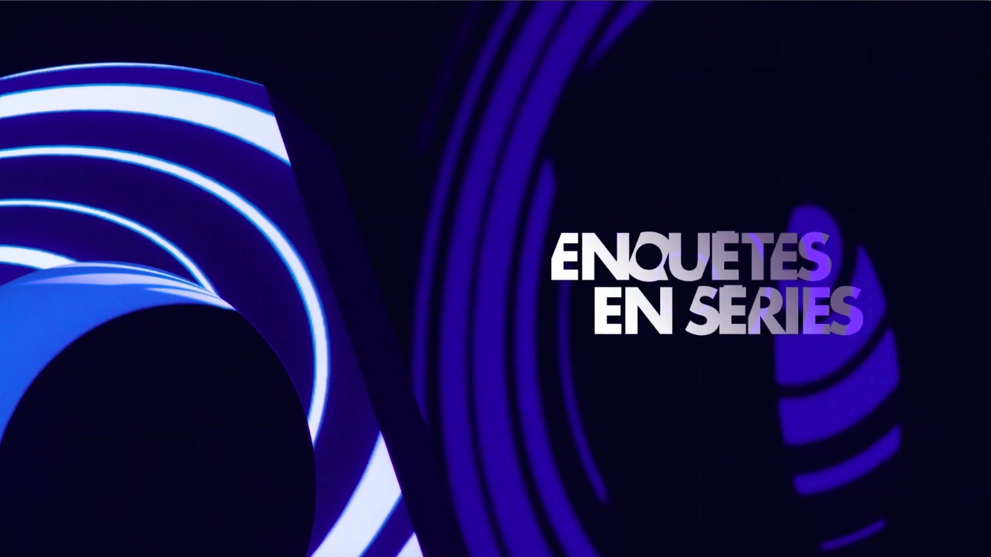
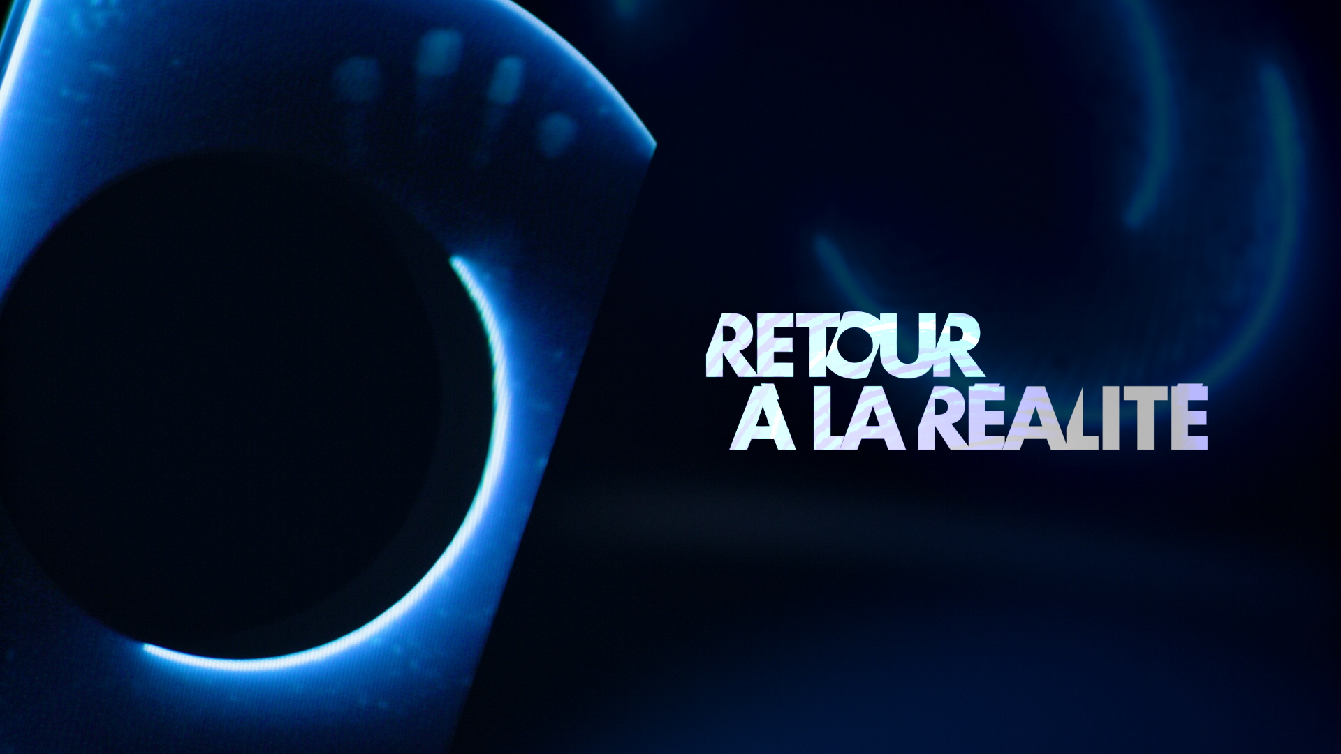
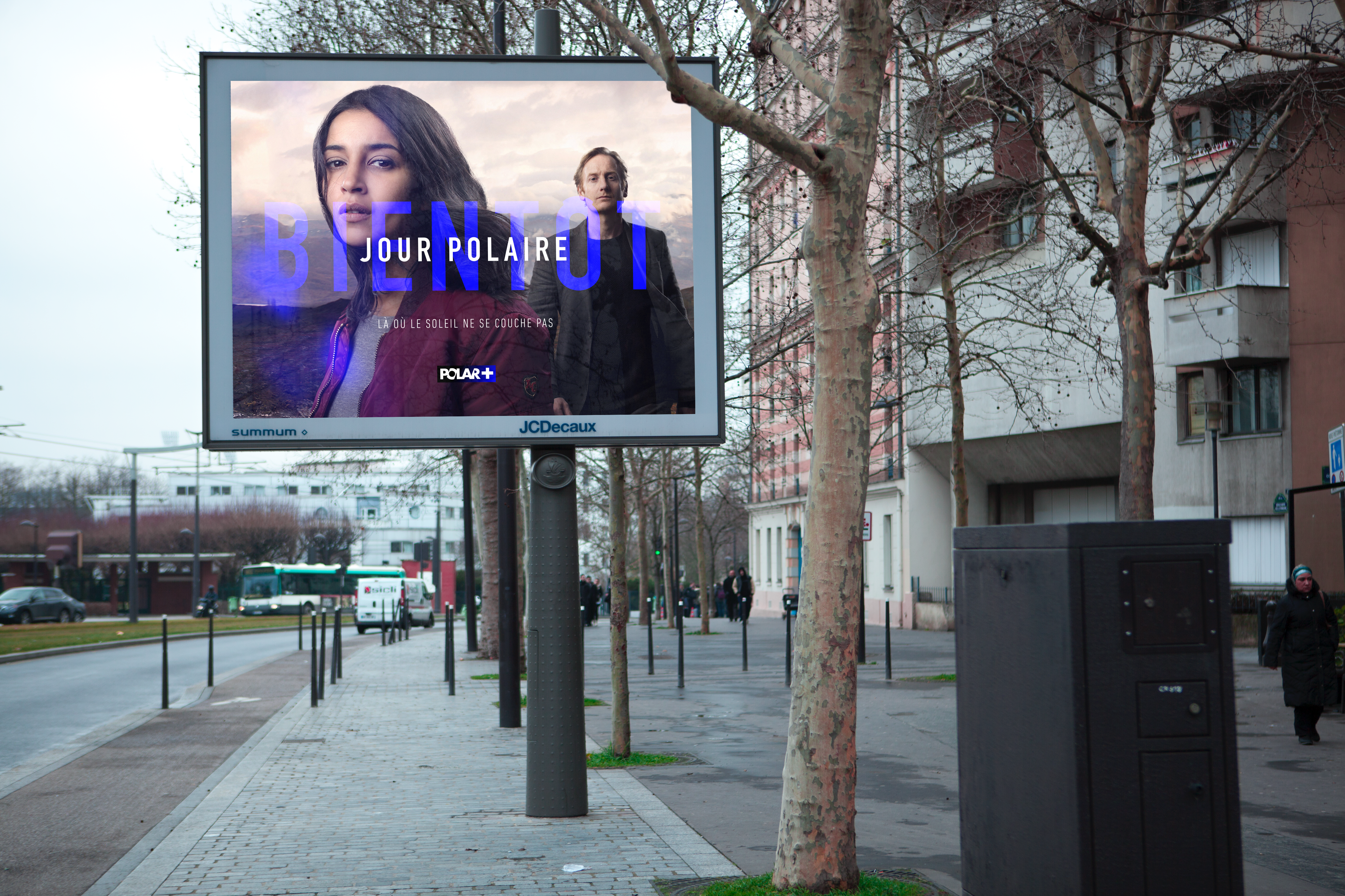
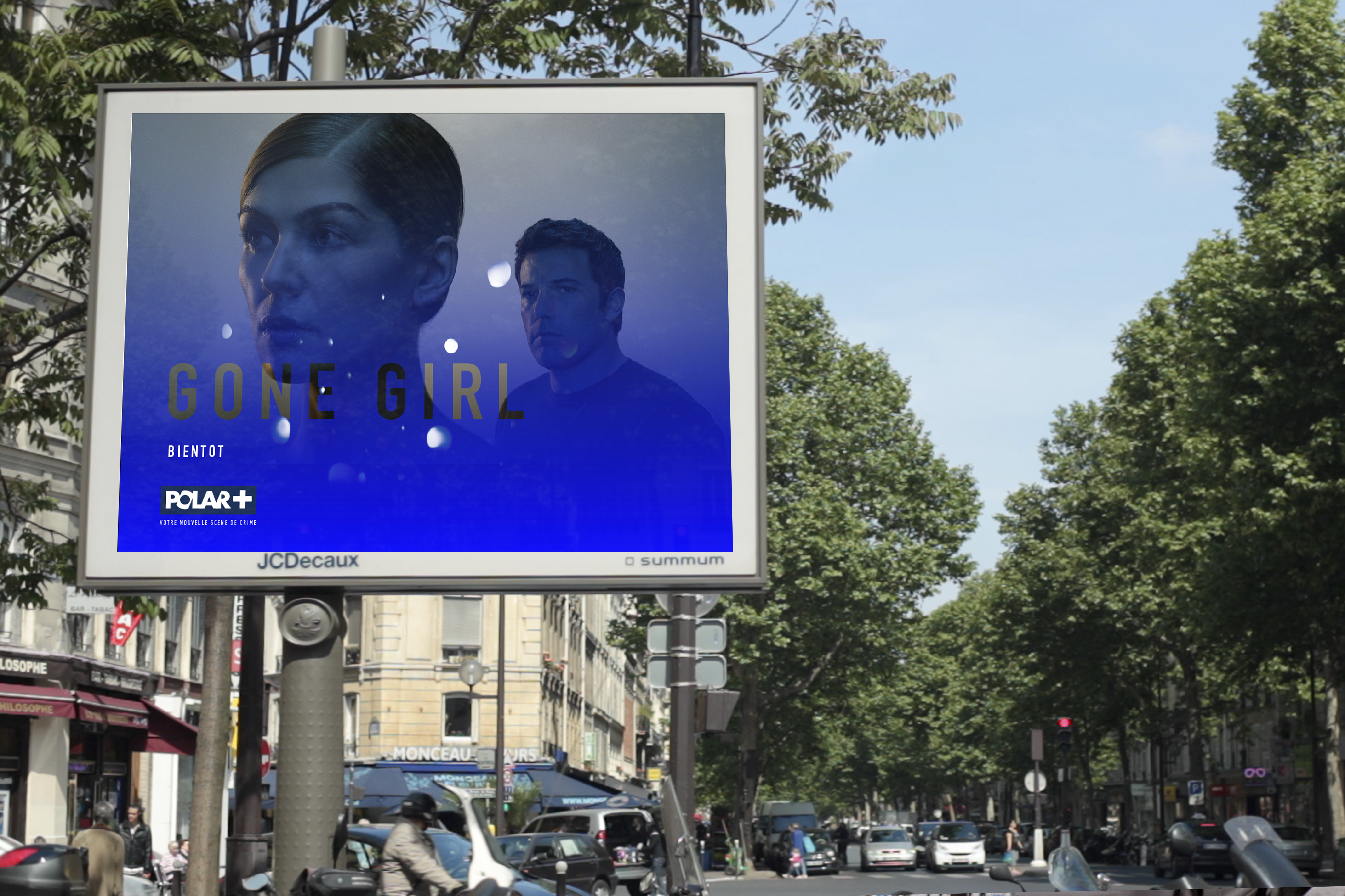
To illustrate the concept of revelation we created automatized templates that play with the typography until the letters come together to reveal the message. This use of the typography can be used on all the formats: digital, on air, print.
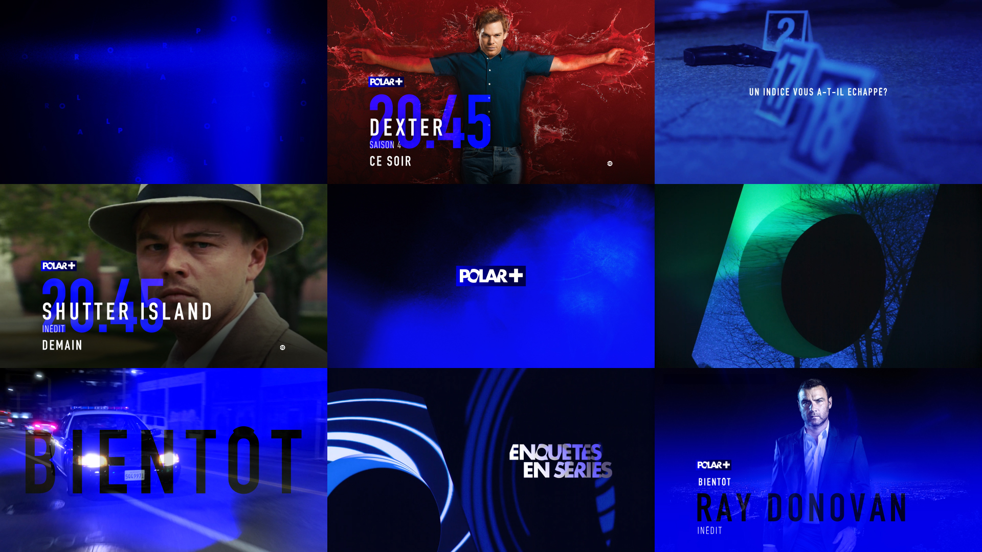
An electric blue color is also used to express this concept of revelation. It suggests the flashing light of the police cars, the blue light revealing the fingerprints at a crime scene or the light of the computer searching for clues.
--:-- / --:--
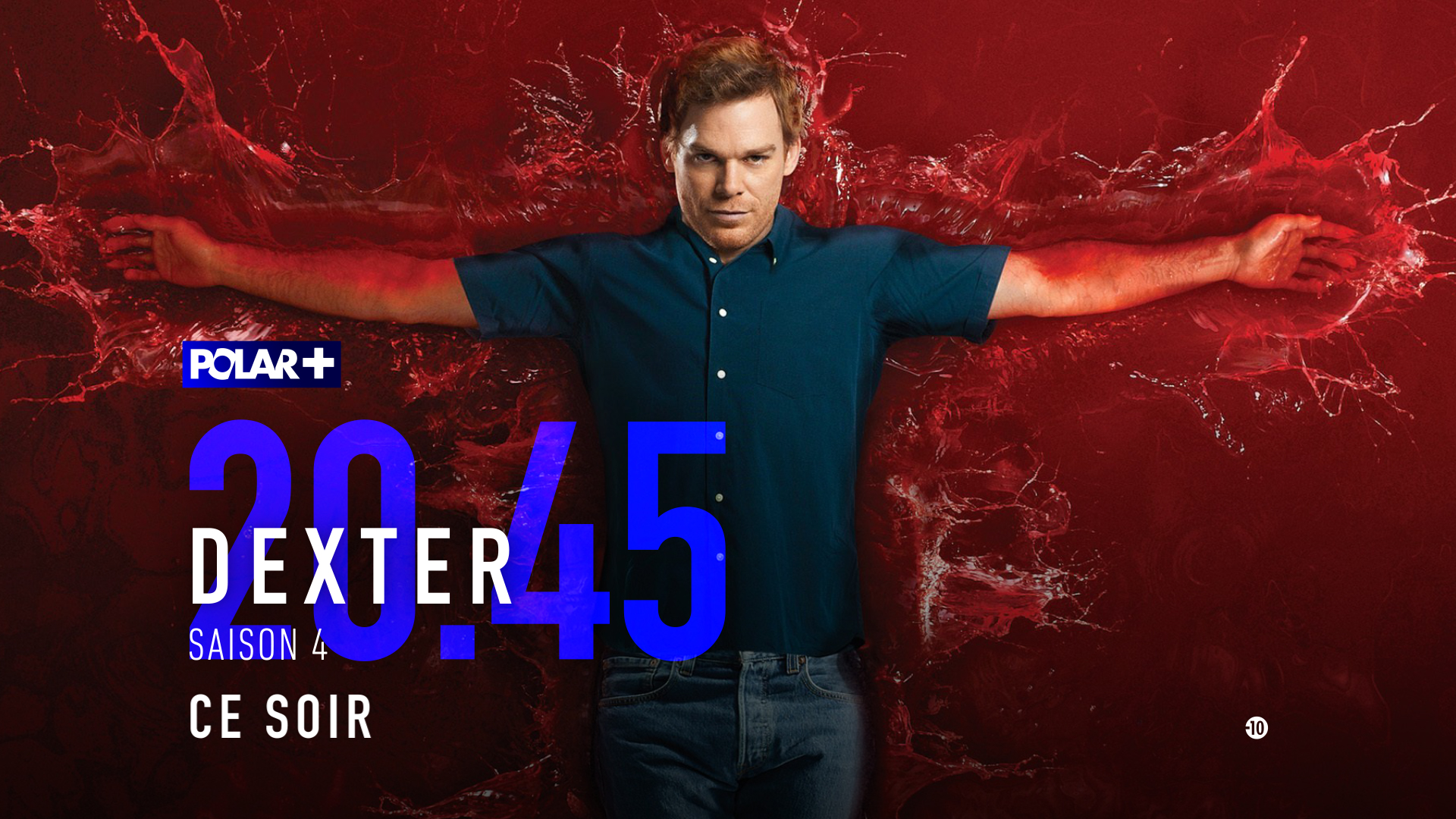
For the idents and the ad breaks we decided to stimulate the viewer’s imagination with sounds of crime scenes and abstract images using our graphic codes (animated typography and midnight blue color).
The sound is a very important part of our concept.
We created a very simple but easily recognizable signature.
2 notes suggesting suspense in an exciting –not anxious- way.
00:00
--:-- / --:--
--:-- / --:--
--:-- / --:--
--:-- / --:--
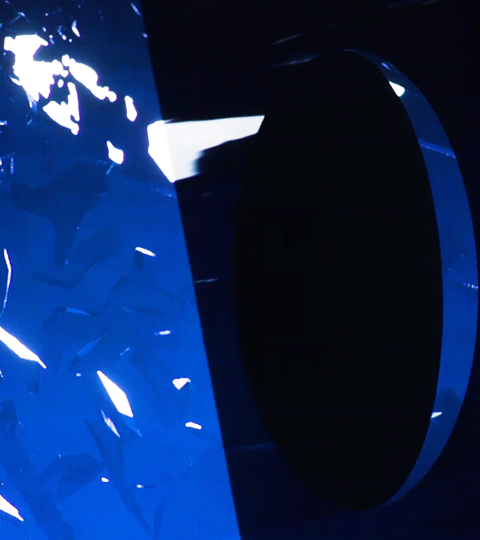
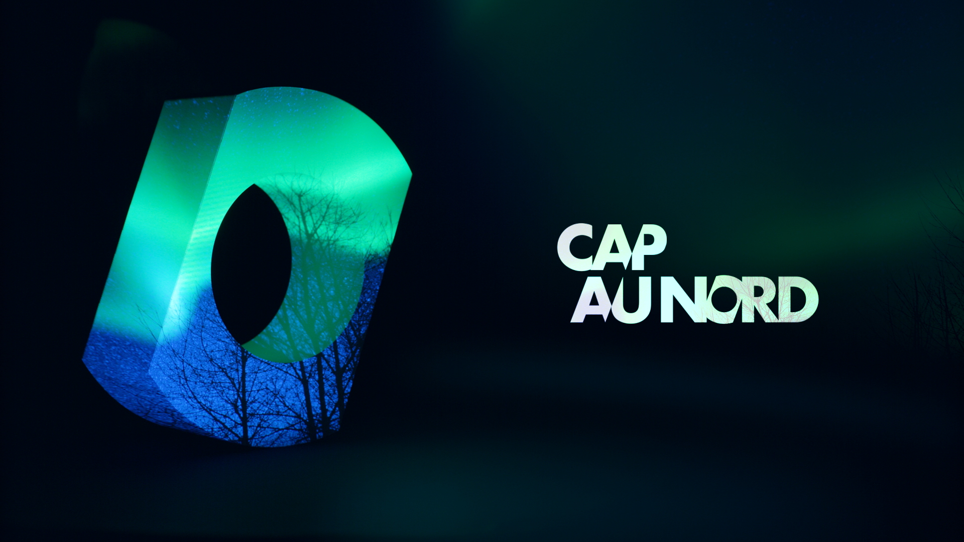
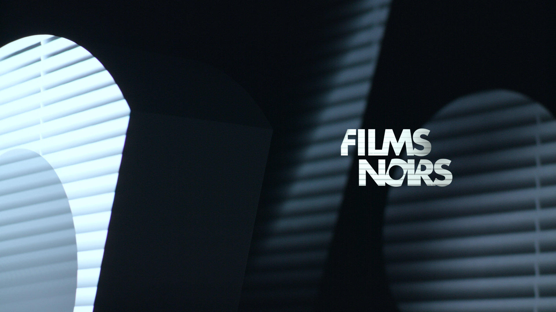
For the thematic openers we play with the specific “O” of the Polar+ logotype. We made a 3D “O” and projected images related to the themes on it.
--:-- / --:--
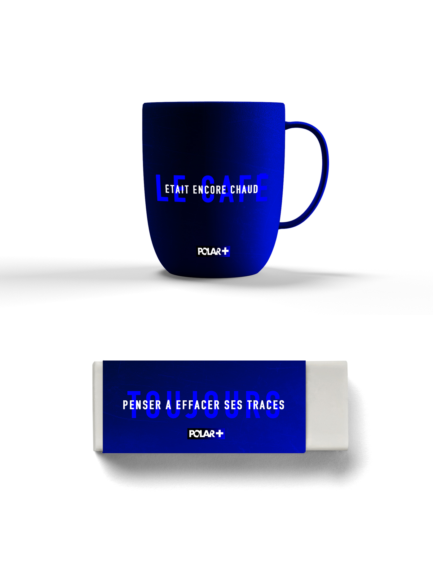
For the goodies, we played with familiar crime scene tropes, to create a humorous twist on our concept.
Producers
Emmanuelle Lacaze
Charlotte Vande Vyvre
Eglantine Guitard
Graphic Designers
Lazare Bessière
Stéphane Gibert
Art Director
Nicolas Famery
Music & Sound design
La Plage Records
awards
French Art Directors Club / Paris 2018 / Nominated for “Best sound”
French Art Directors Club / Paris 2018 / Silver Award for “Best Global design for a channel”
share