VTM – GLOBAL REBRANDING
VTM – GLOBAL REBRANDING
Our last rebranding for VTM remodeled the relationship between broadcaster and spectator. By introducing a conversational tone and style to the network’s brand design, it was the first time that a sense of dialogue had been initiated between a broadcaster and its audience. 6 years later, the Belgian-Flemish media group, Medialaan, returned to us to take their entertainment channel’s positioning as a pioneer of tomorrow’s television one step further.
--:-- / --:--
Conveying the prime element of VTM’s DNA, the thing that makes it « the entertainment of tomorrow », demanded a way of communicating that was even more dynamic, innovative, and agile than before.
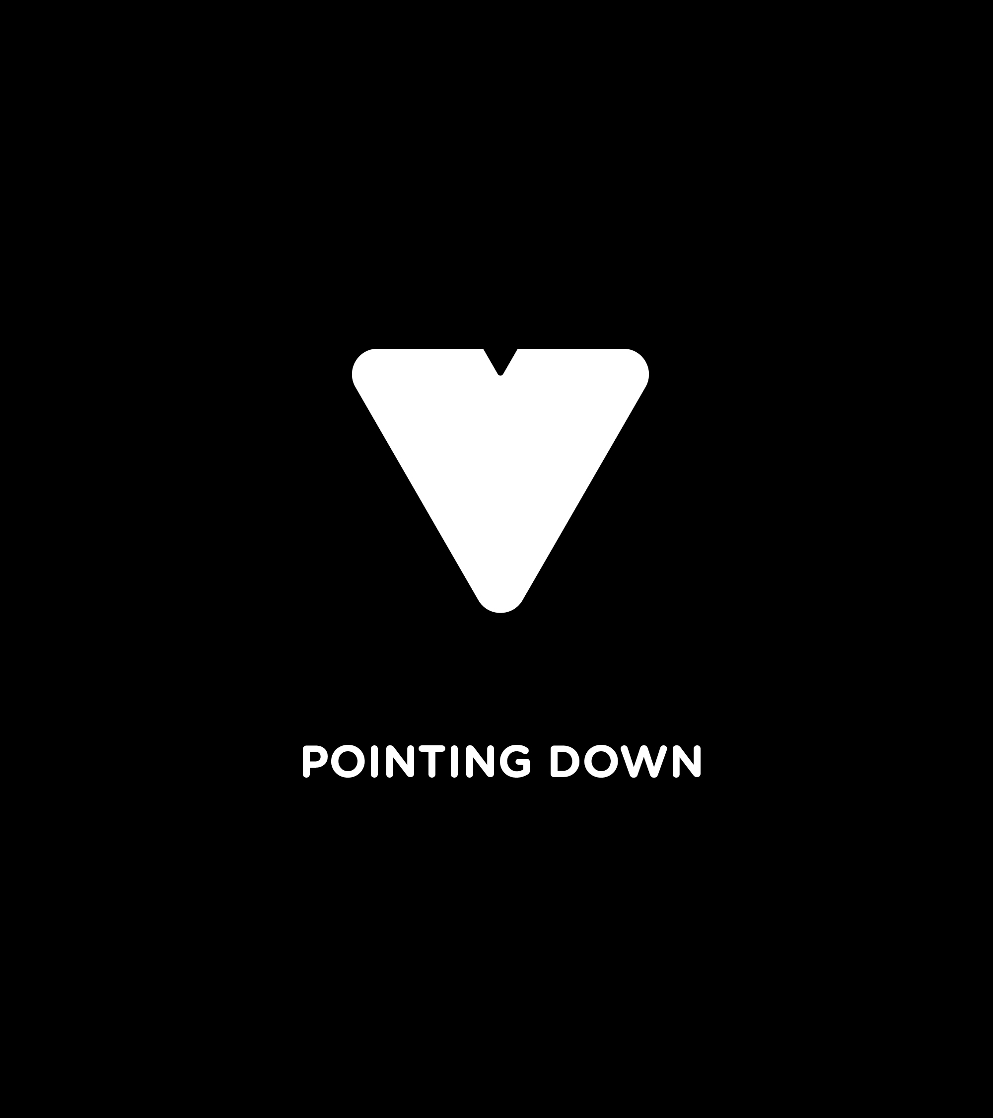
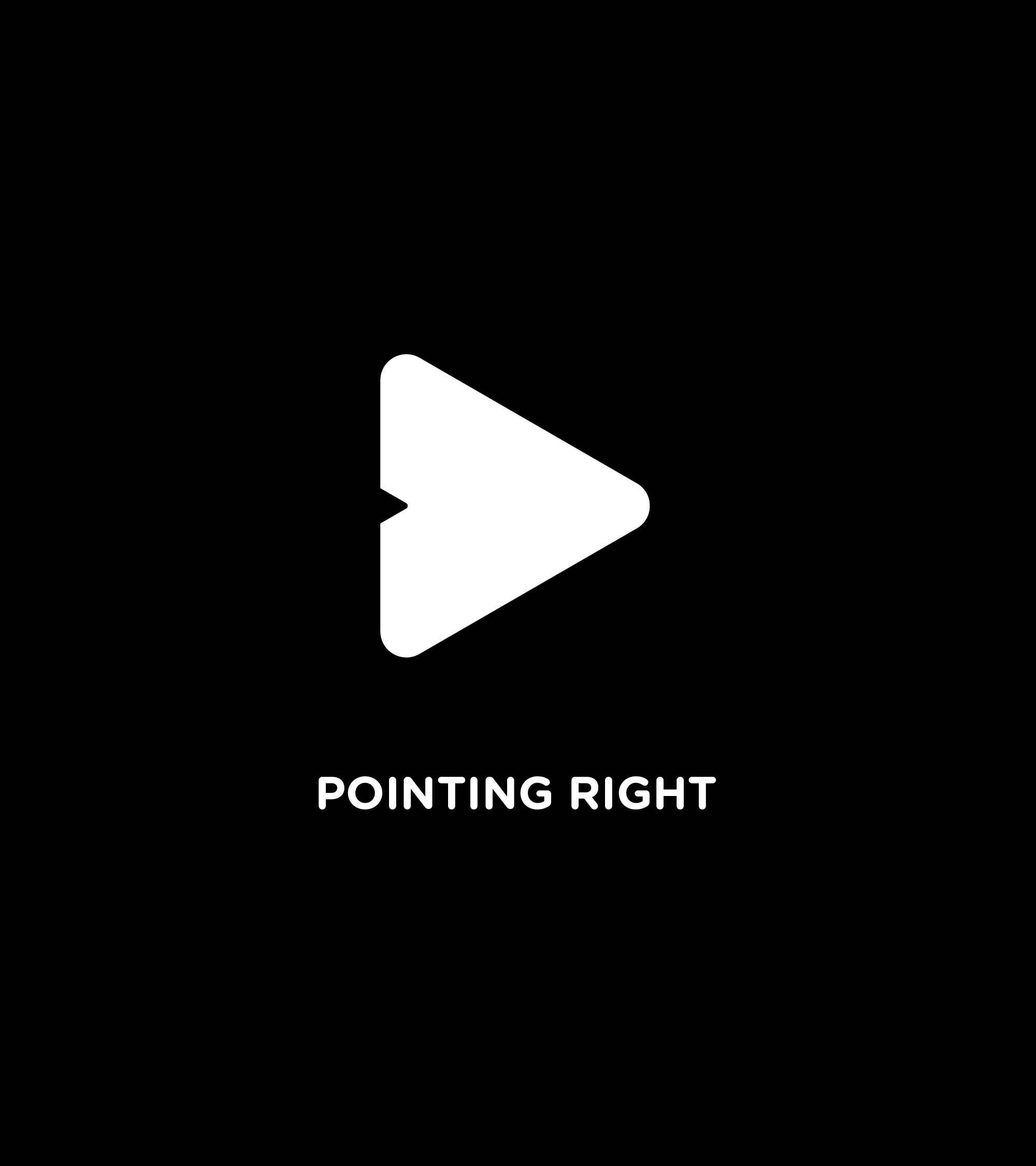
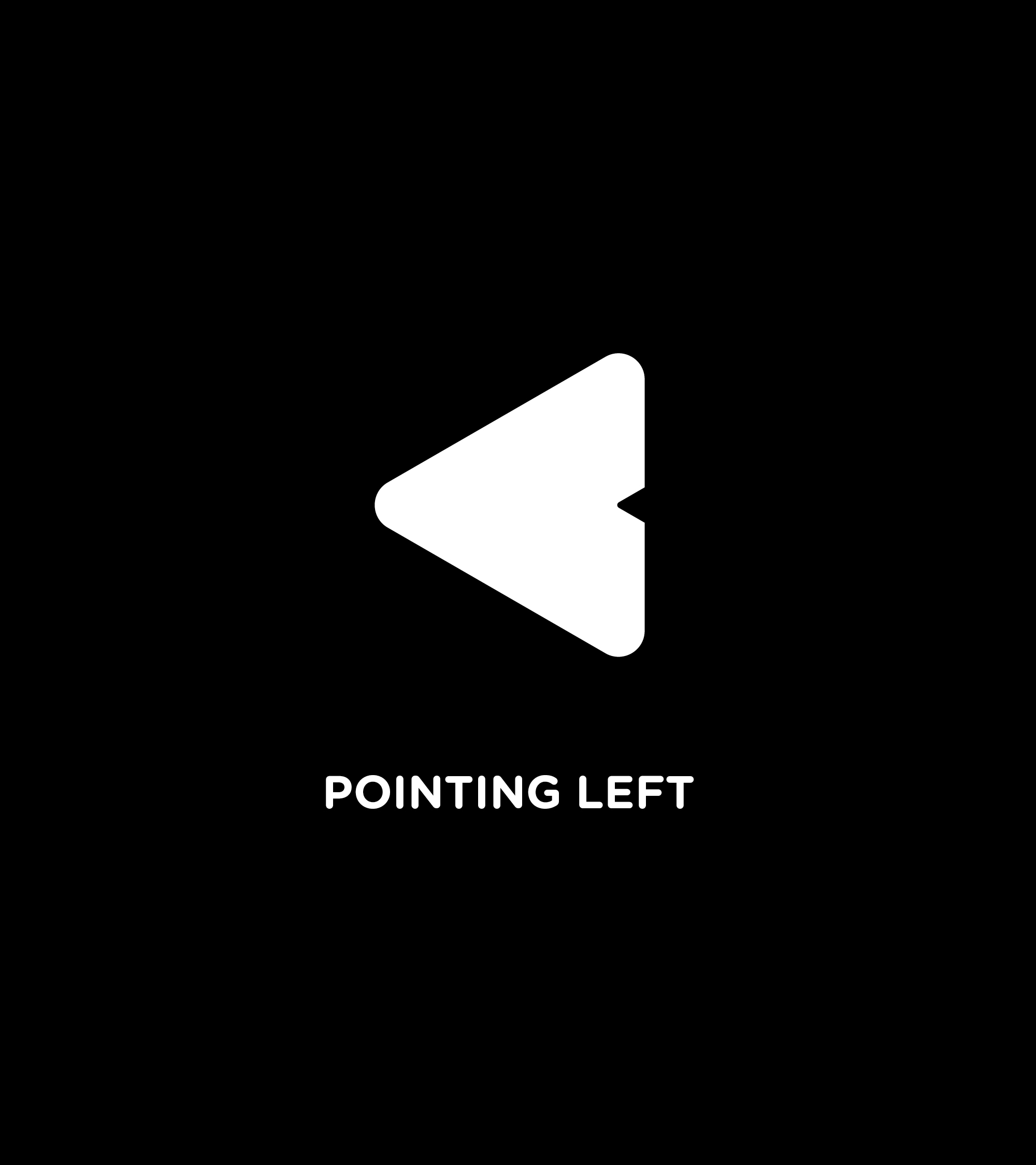
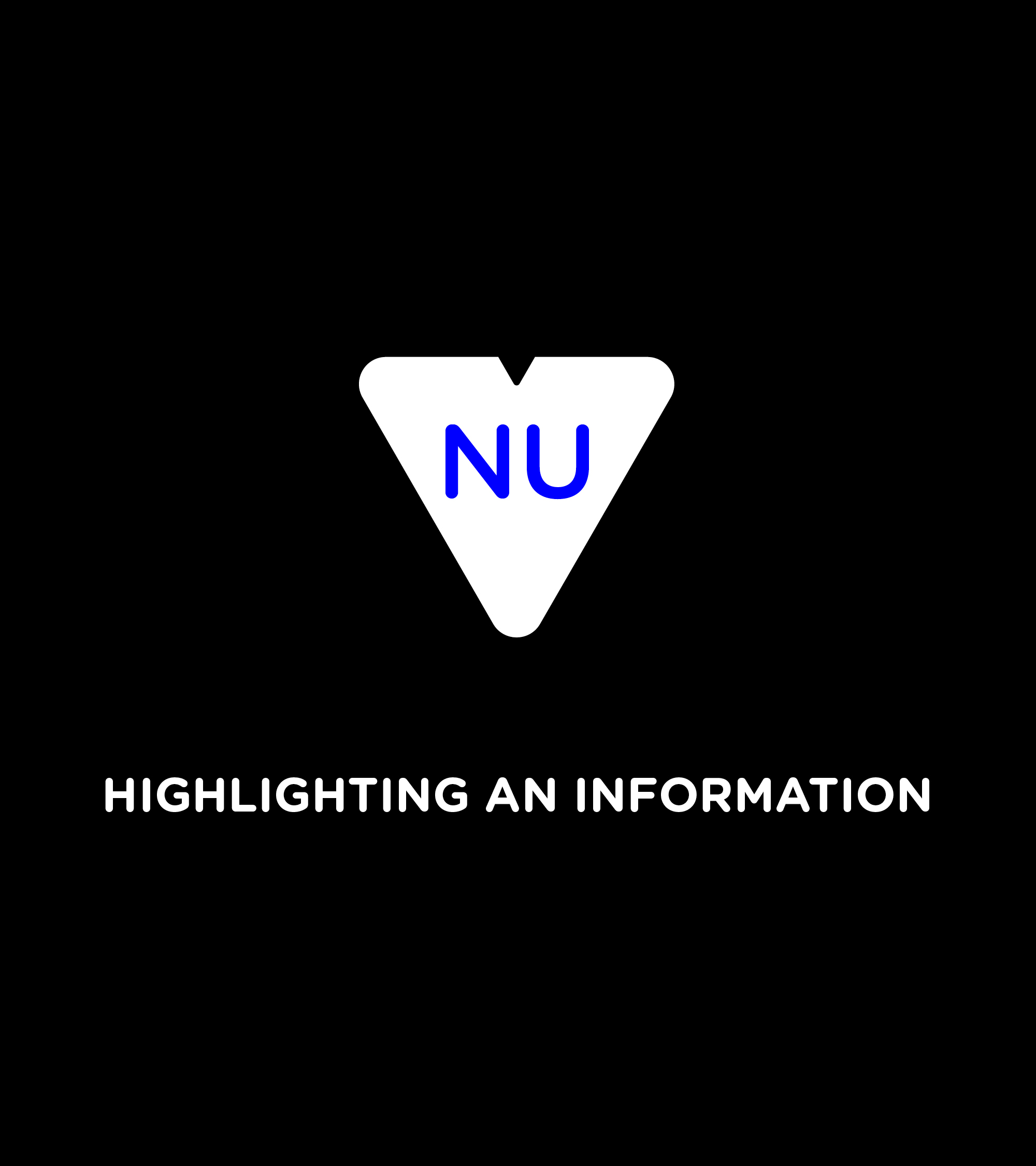
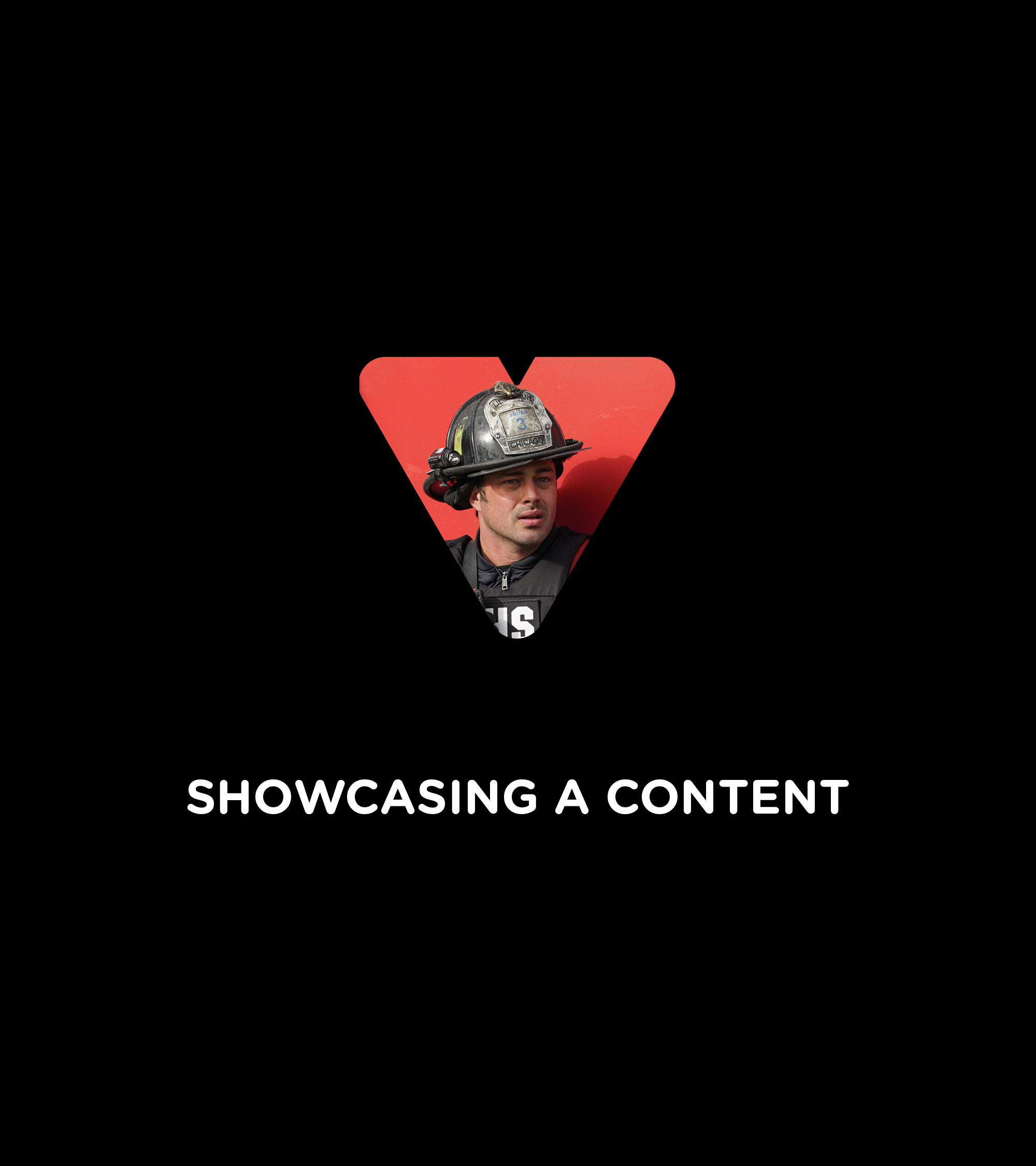
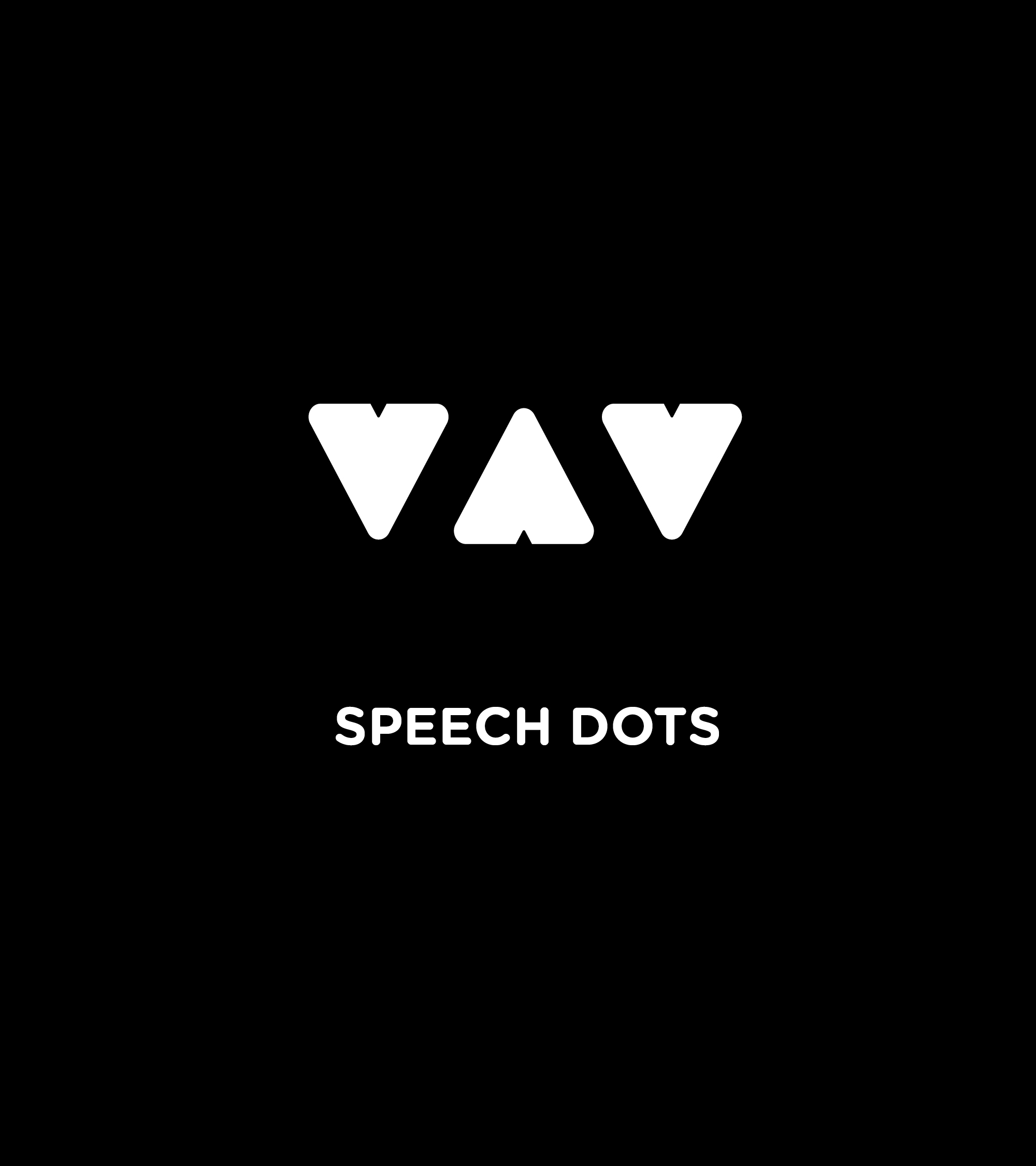
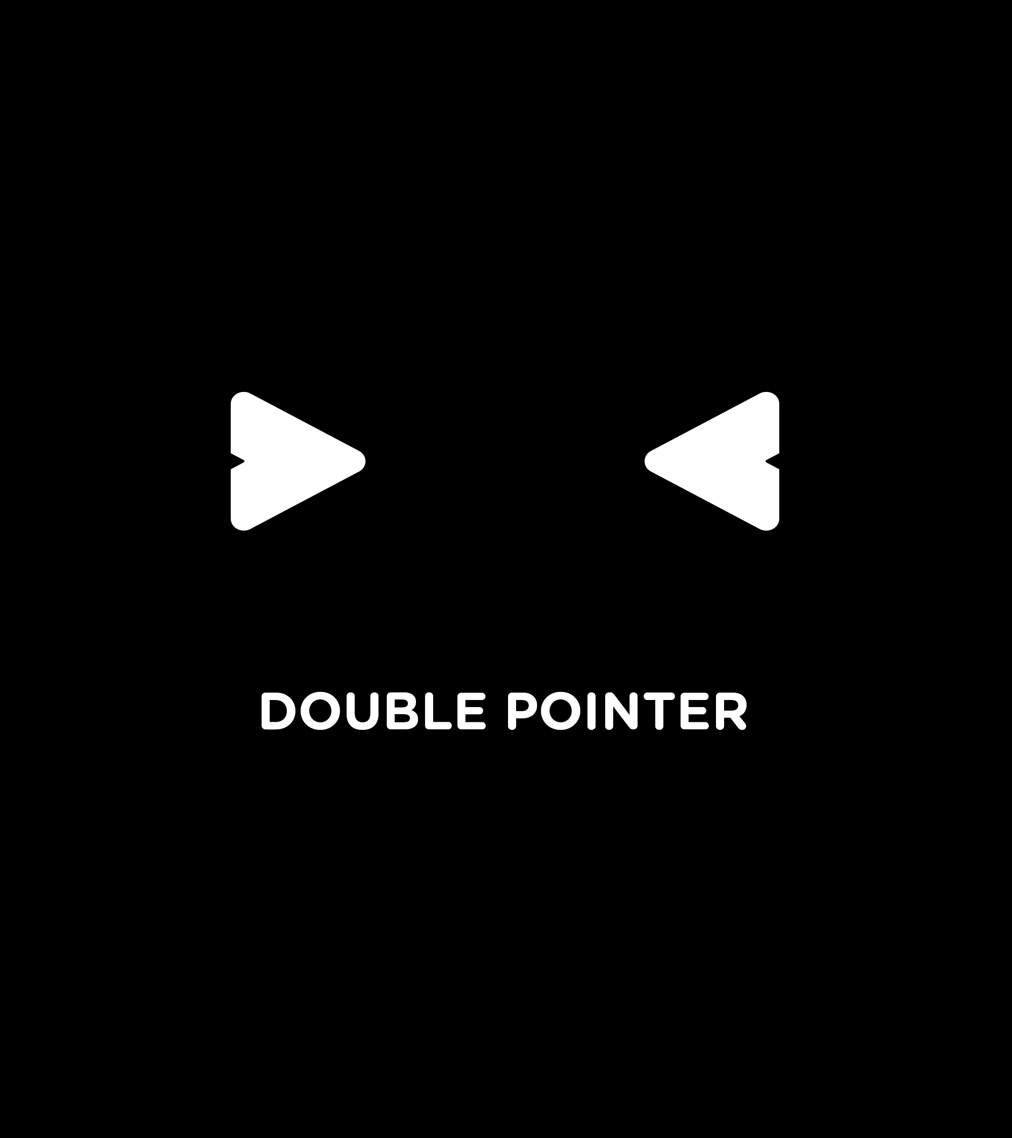
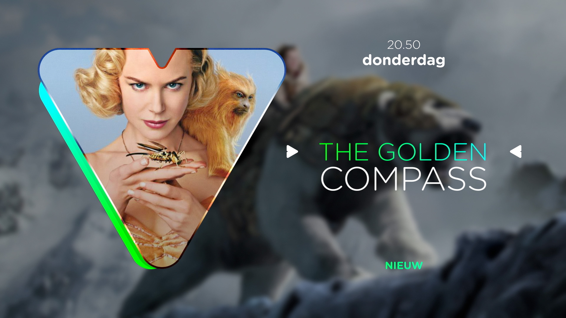
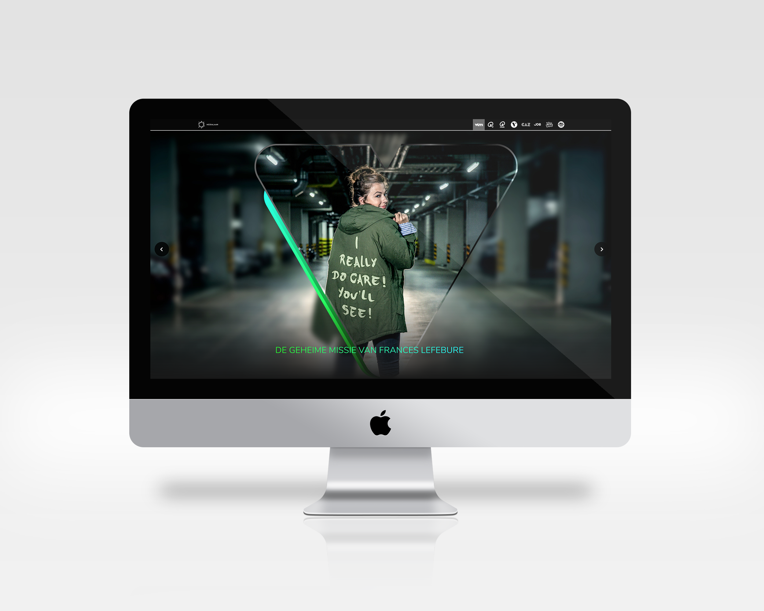
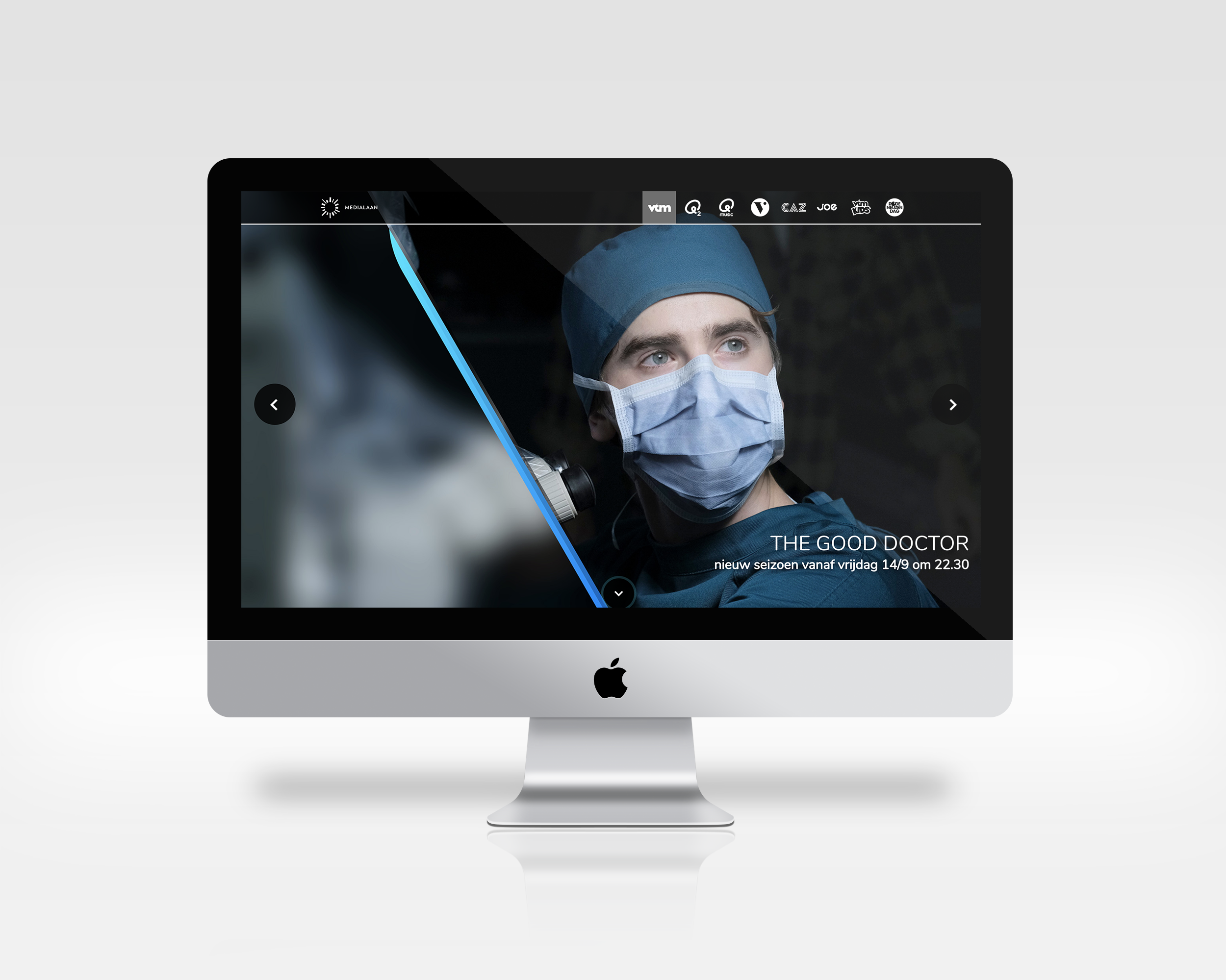
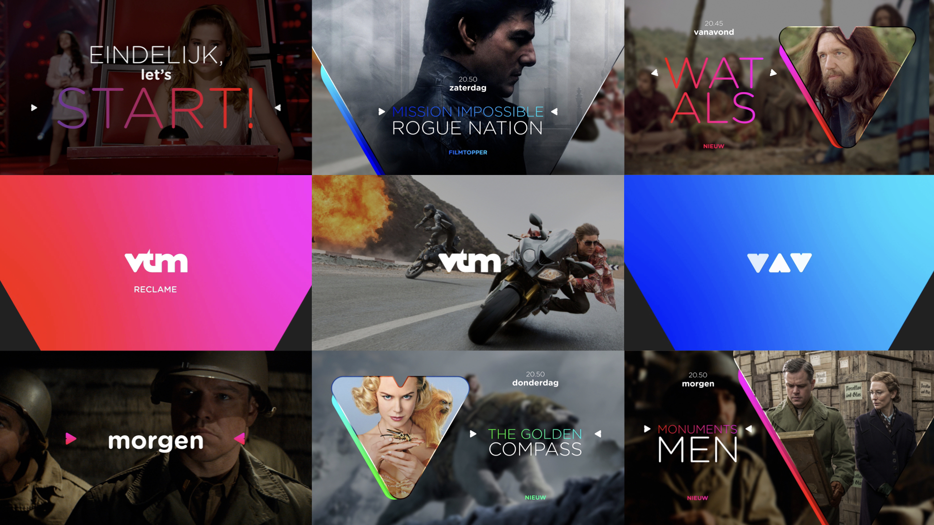
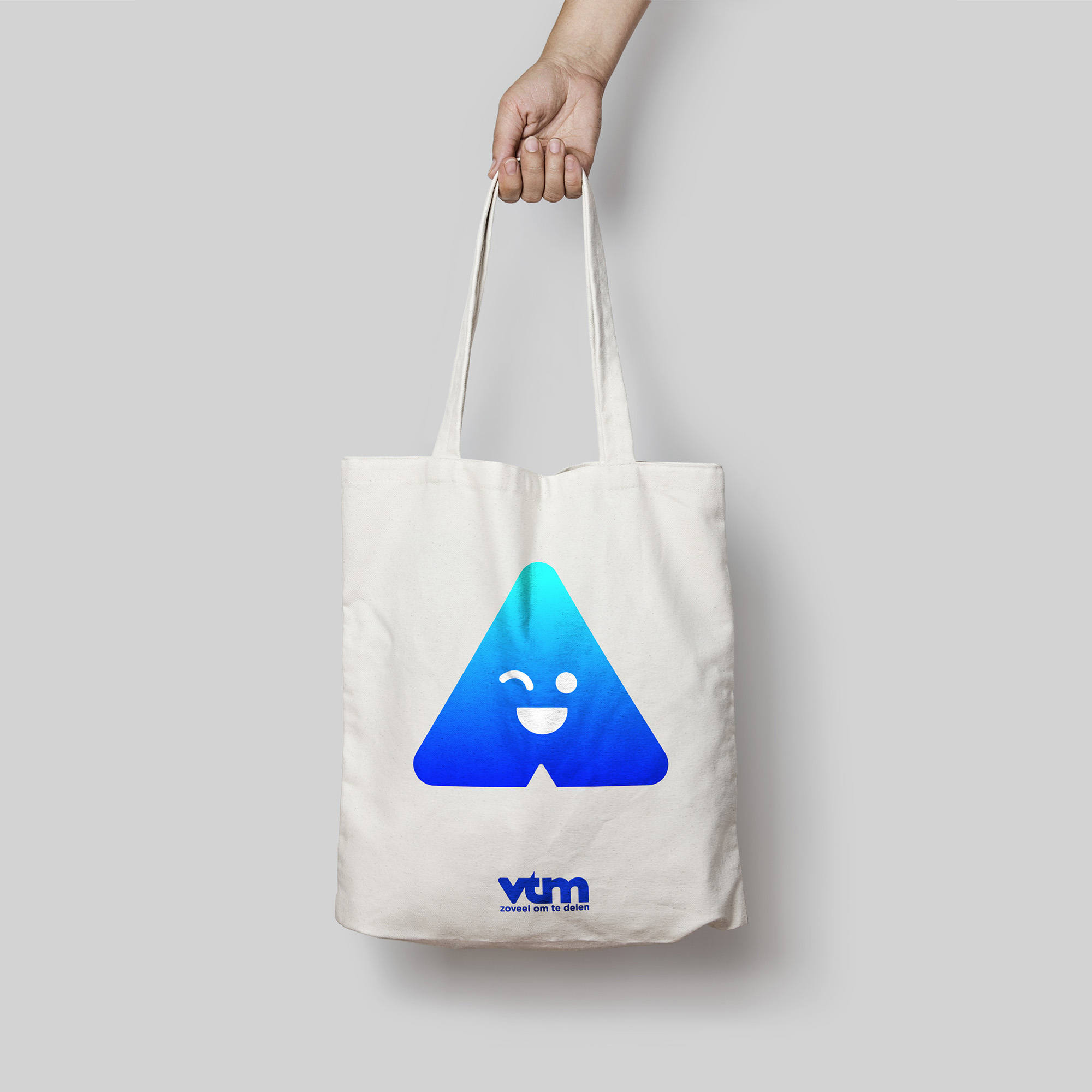
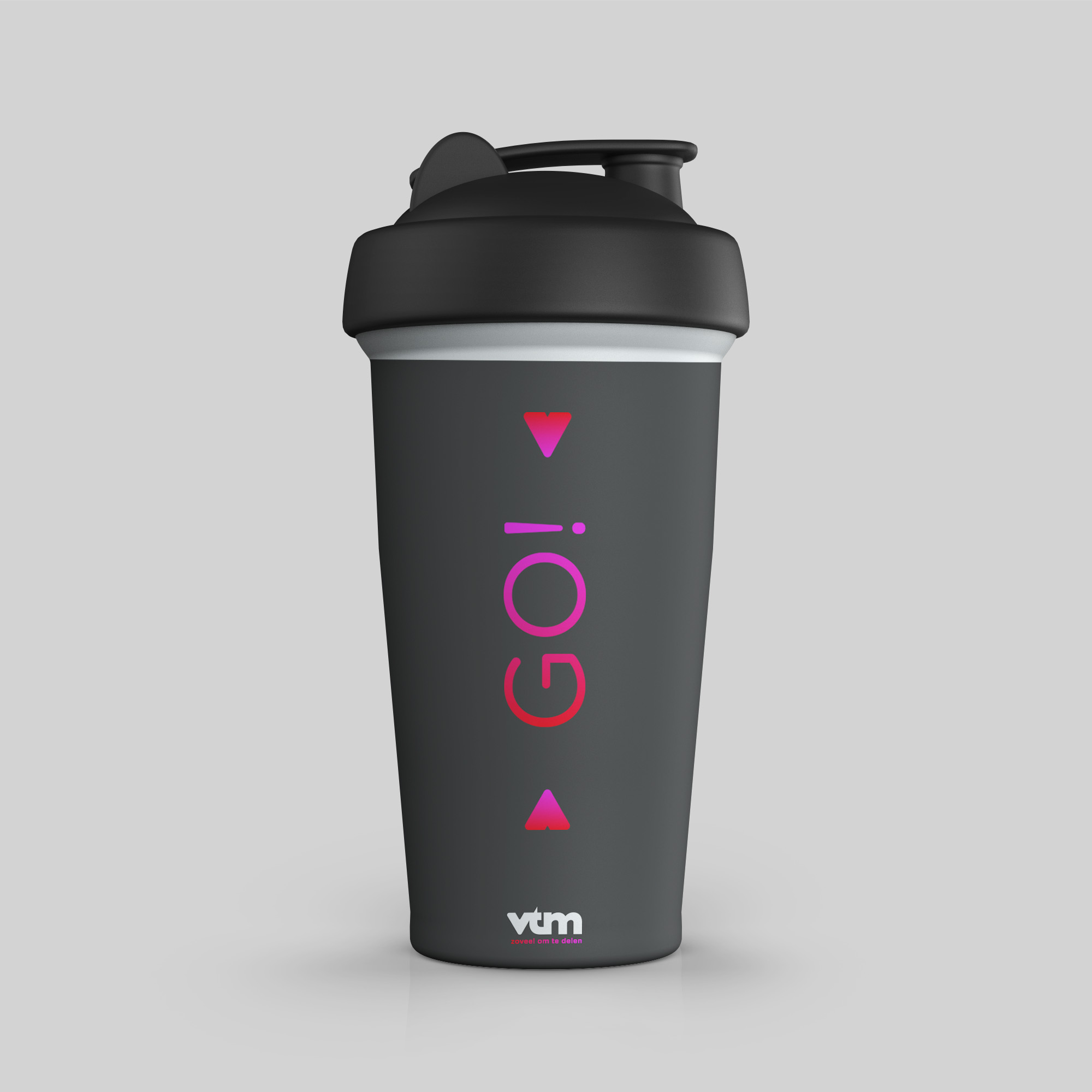
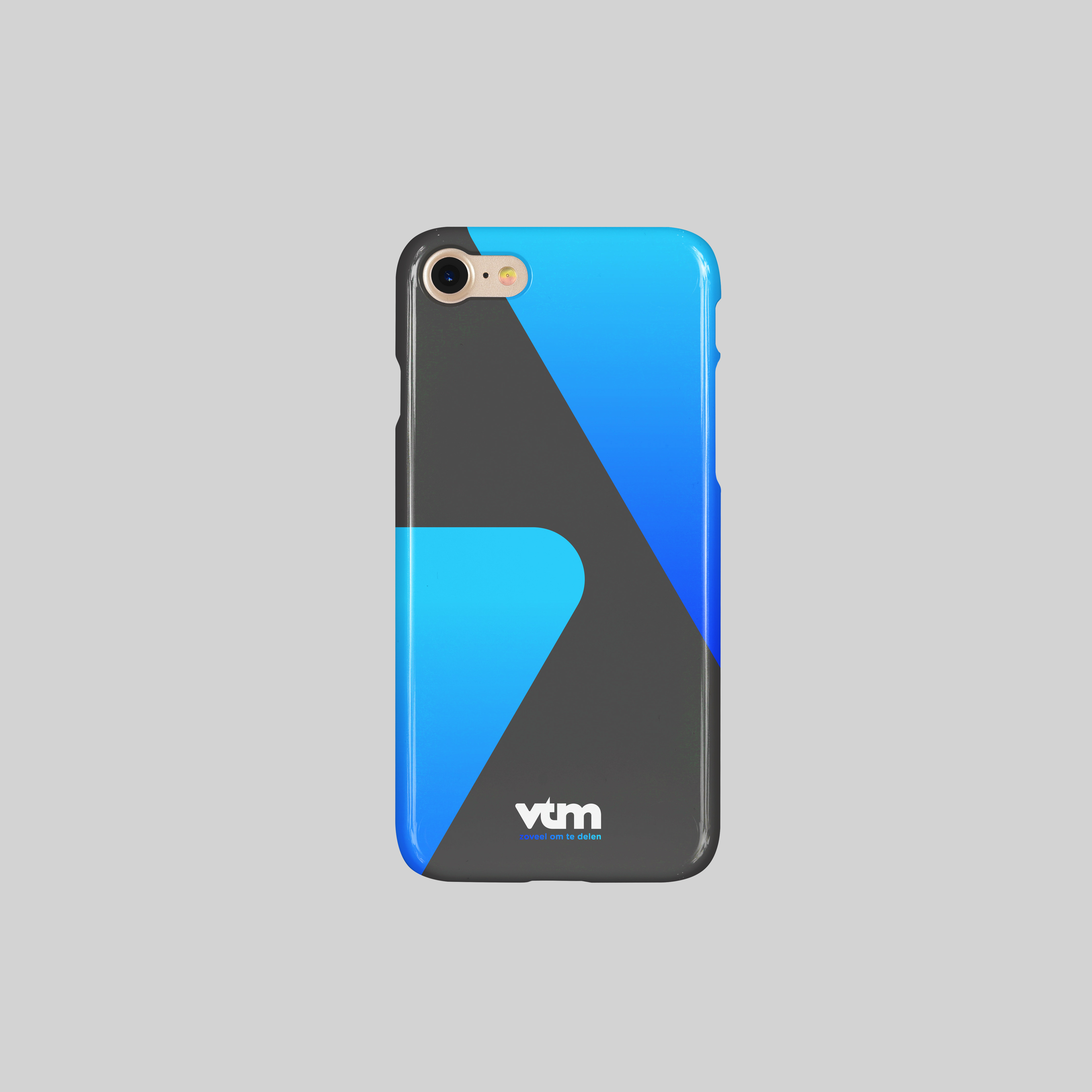
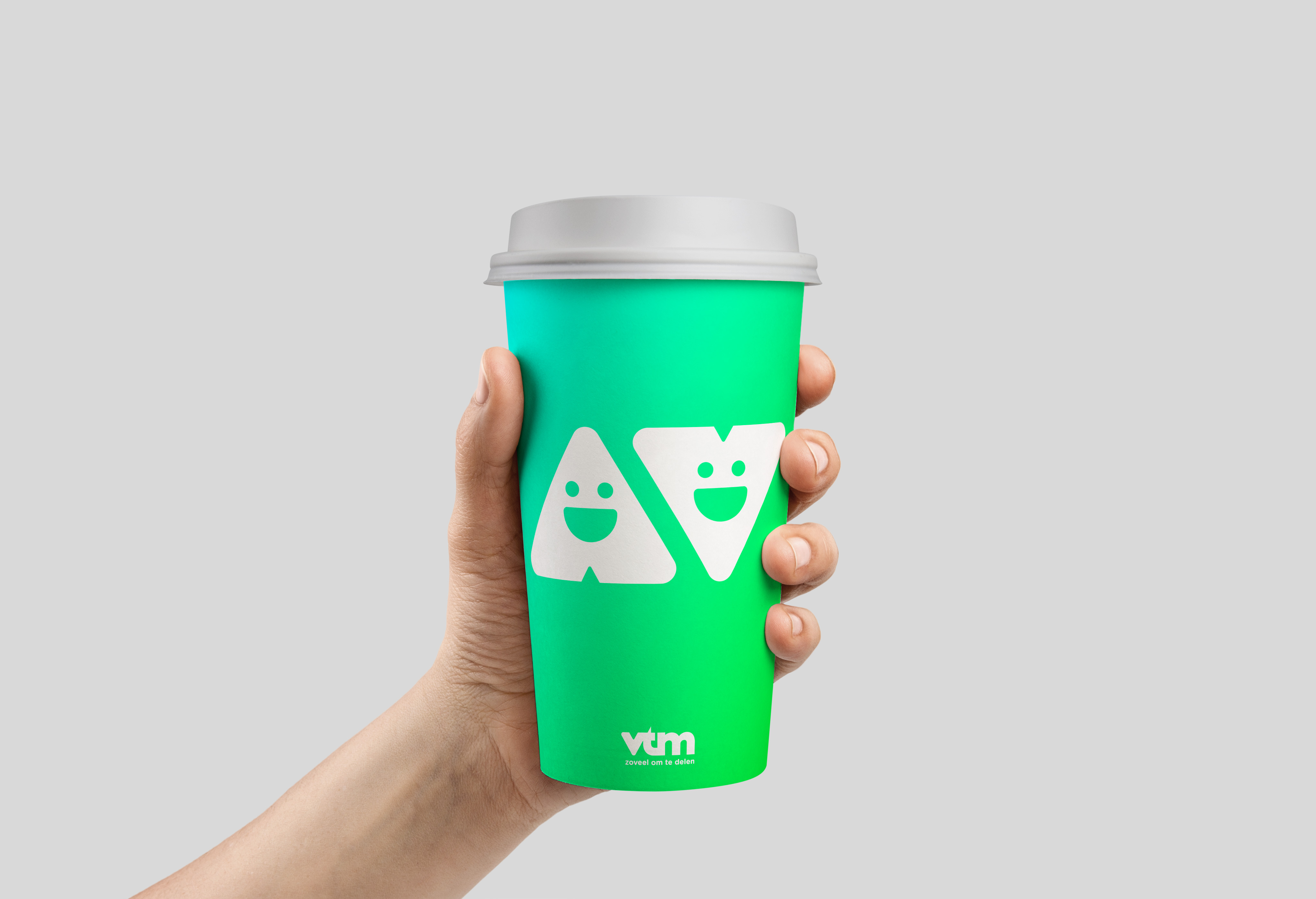
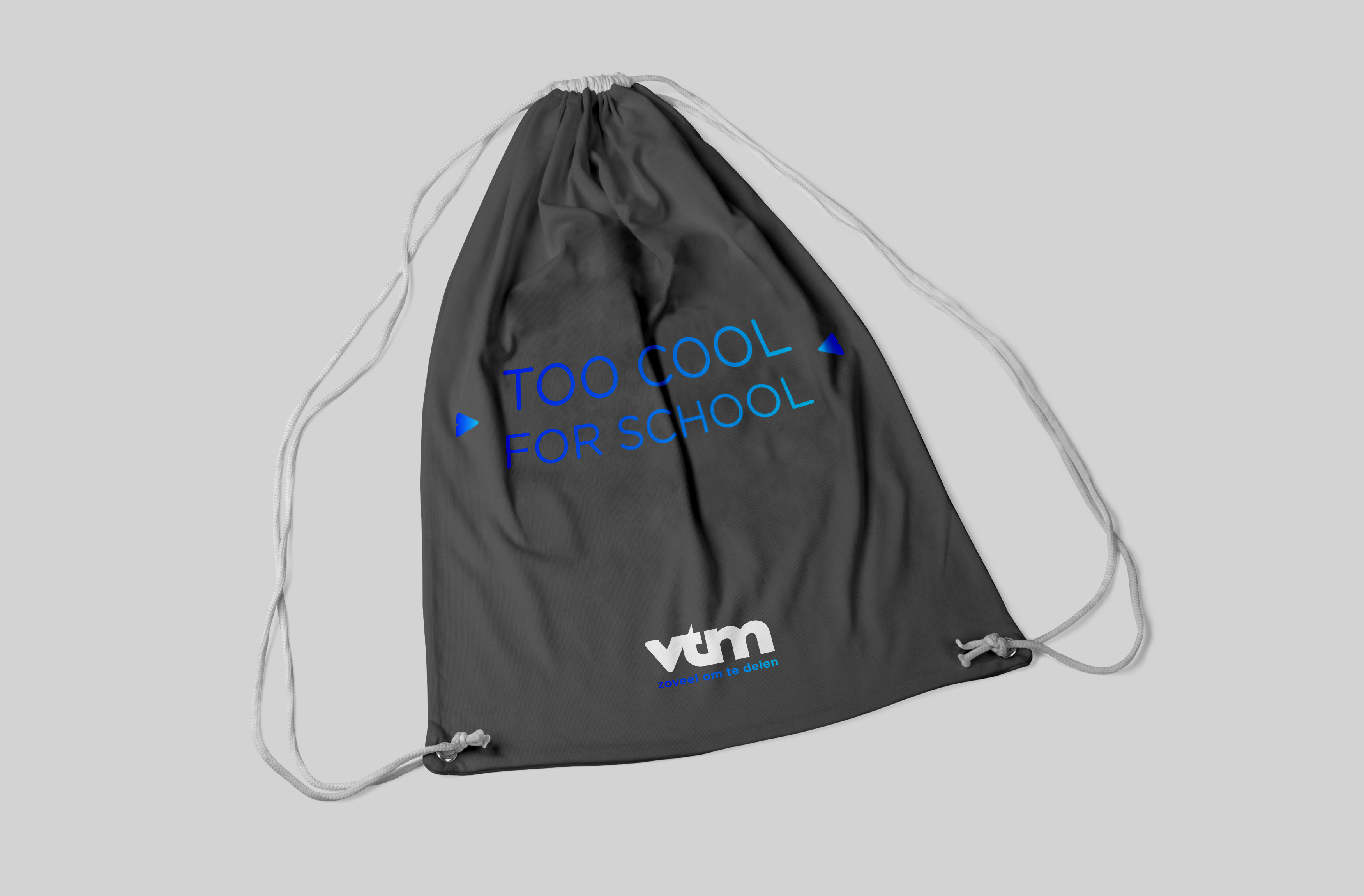
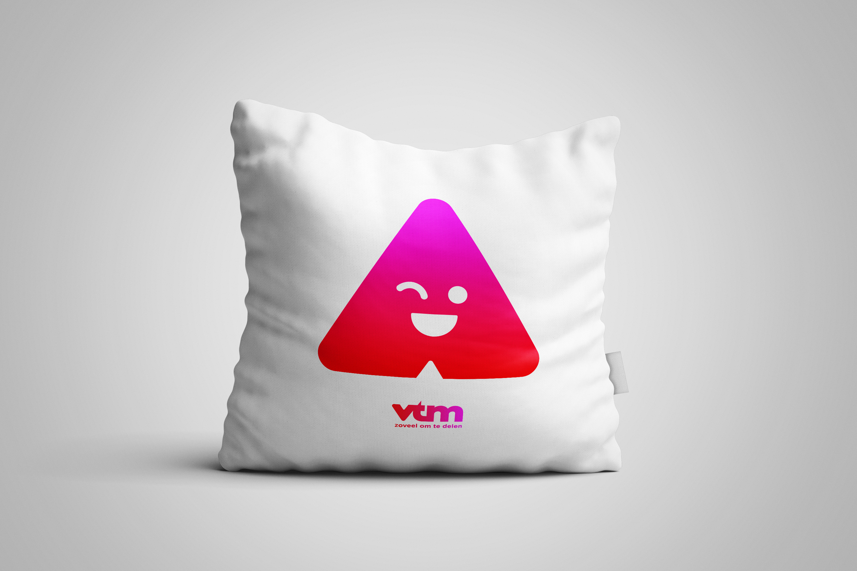
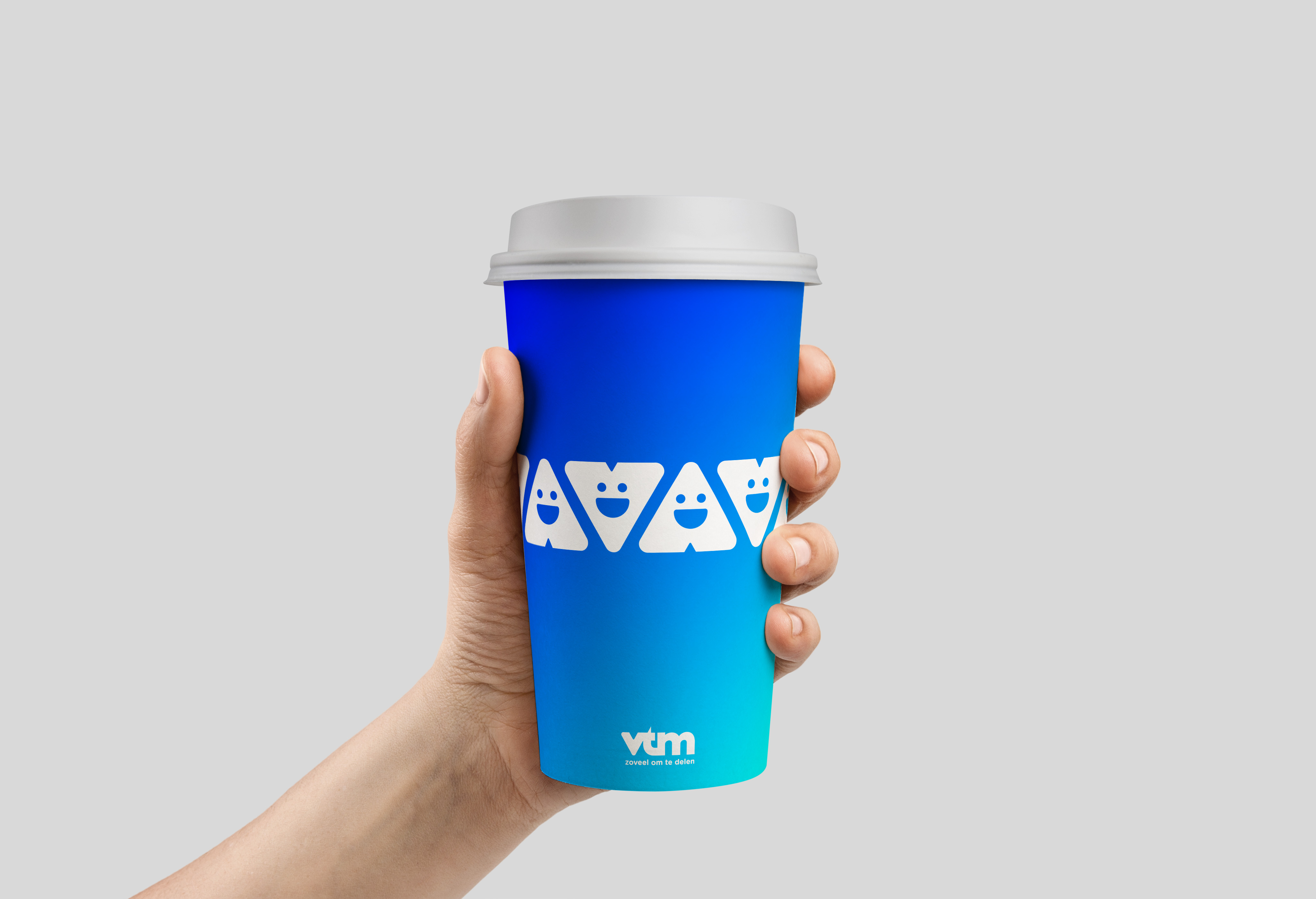
Highly agile and functional, the shape can be rotated, inverted, and duplicated – each variation of the shape offers a different meaning and purpose; whether evoking the brand – by functioning as a visual synonym for the VTM logotype (Down), highlighting titles and information (Doubled « speech marks »), announcing an upcoming or past programme (Right or Left), showcasing visual content (Enlarged), or promoting something new (Trebled « Ellipsis »).
Highly agile and functional, the shape can be rotated, inverted, and duplicated – each variation of the shape offers a different meaning and purpose; whether evoking the brand – by functioning as a visual synonym for the VTM logotype (Down), highlighting titles and information (Doubled « speech marks »), announcing an upcoming or past programme (Right or Left), showcasing visual content (Enlarged), or promoting something new (Trebled « Ellipsis »).
Highly agile and functional, the shape can be rotated, inverted, and duplicated – each variation of the shape offers a different meaning and purpose; whether evoking the brand – by functioning as a visual synonym for the VTM logotype (Down), highlighting titles and information (Doubled « speech marks »), announcing an upcoming or past programme (Right or Left), showcasing visual content (Enlarged), or promoting something new (Trebled « Ellipsis »).
Highly agile and functional, the shape can be rotated, inverted, and duplicated – each variation of the shape offers a different meaning and purpose; whether evoking the brand – by functioning as a visual synonym for the VTM logotype (Down), highlighting titles and information (Doubled « speech marks »), announcing an upcoming or past programme (Right or Left), showcasing visual content (Enlarged), or promoting something new (Trebled « Ellipsis »).
Highly agile and functional, the shape can be rotated, inverted, and duplicated – each variation of the shape offers a different meaning and purpose; whether evoking the brand – by functioning as a visual synonym for the VTM logotype (Down), highlighting titles and information (Doubled « speech marks »), announcing an upcoming or past programme (Right or Left), showcasing visual content (Enlarged), or promoting something new (Trebled « Ellipsis »).
Highly agile and functional, the shape can be rotated, inverted, and duplicated – each variation of the shape offers a different meaning and purpose; whether evoking the brand – by functioning as a visual synonym for the VTM logotype (Down), highlighting titles and information (Doubled « speech marks »), announcing an upcoming or past programme (Right or Left), showcasing visual content (Enlarged), or promoting something new (Trebled « Ellipsis »).
Highly agile and functional, the shape can be rotated, inverted, and duplicated – each variation of the shape offers a different meaning and purpose; whether evoking the brand – by functioning as a visual synonym for the VTM logotype (Down), highlighting titles and information (Doubled « speech marks »), announcing an upcoming or past programme (Right or Left), showcasing visual content (Enlarged), or promoting something new (Trebled « Ellipsis »).
Highly agile and functional, the shape can be rotated, inverted, and duplicated – each variation of the shape offers a different meaning and purpose; whether evoking the brand – by functioning as a visual synonym for the VTM logotype (Down), highlighting titles and information (Doubled « speech marks »), announcing an upcoming or past programme (Right or Left), showcasing visual content (Enlarged), or promoting something new (Trebled « Ellipsis »).
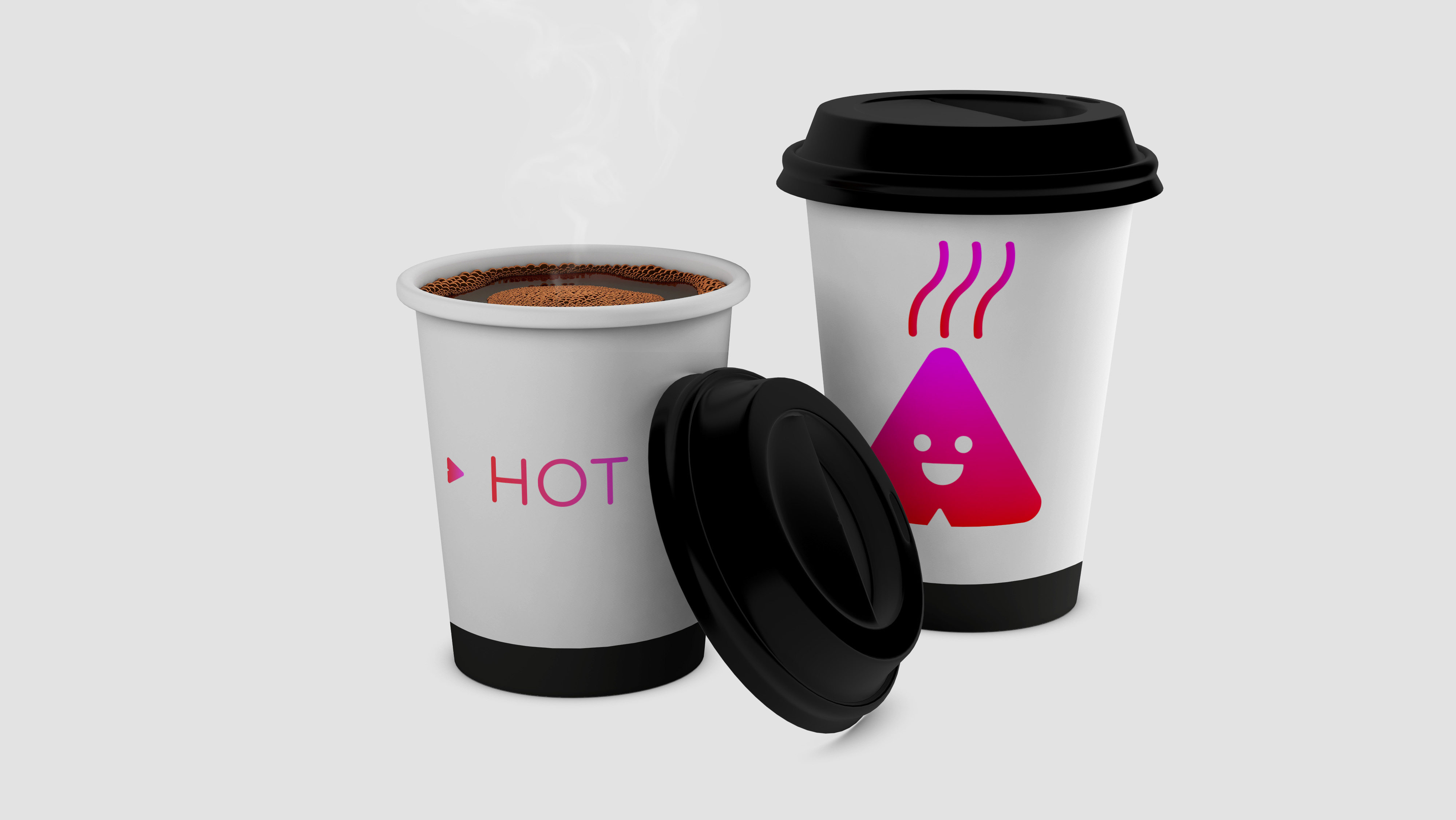
“The play-button is not simply a symbol of immediacy, forwards motion, the future and, of course, entertainment, but it is also a shape that can act like your ultimate entertainment companion; showing you what’s coming next, pointing out other great content, or reminding you of classics that you may have missed.”
Nicolas Famery - Art Director
The versatility of the brand design and its components’ behavior, confers VTM a renewed sense of dynamism, agility and creativity, reaffirming the broadcaster’s position as a leader of tomorrow’s entertainment.
The versatility of the brand design and its components’ behavior, confers VTM a renewed sense of dynamism, agility and creativity, reaffirming the broadcaster’s position as a leader of tomorrow’s entertainment.
The versatility of the brand design and its components’ behavior, confers VTM a renewed sense of dynamism, agility and creativity, reaffirming the broadcaster’s position as a leader of tomorrow’s entertainment.
The versatility of the brand design and its components’ behavior, confers VTM a renewed sense of dynamism, agility and creativity, reaffirming the broadcaster’s position as a leader of tomorrow’s entertainment.
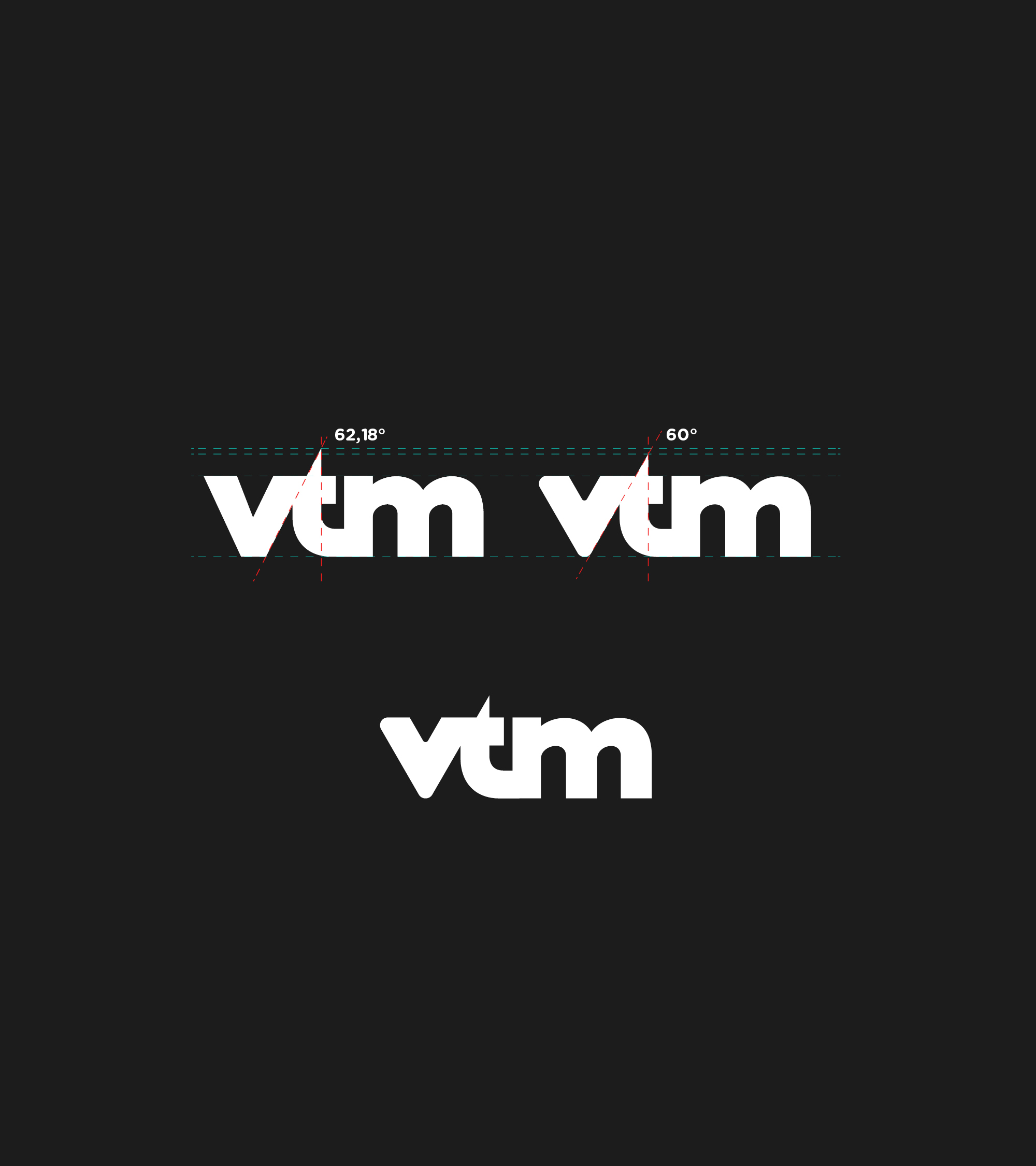
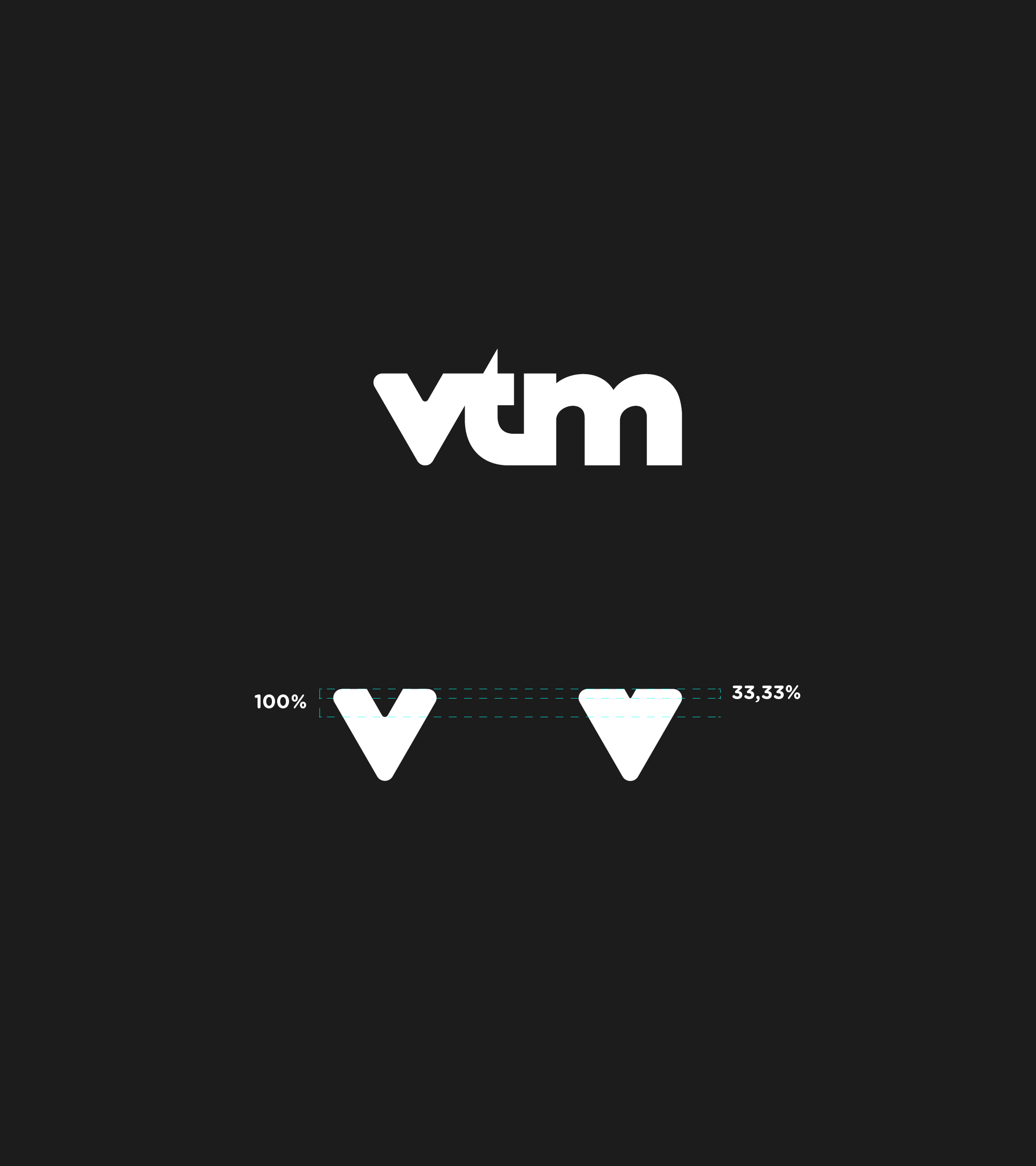
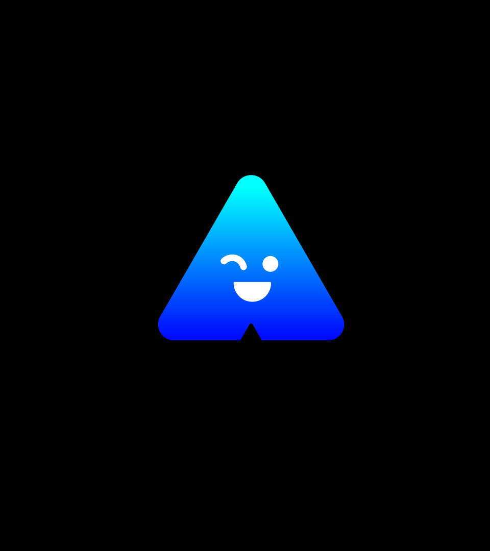
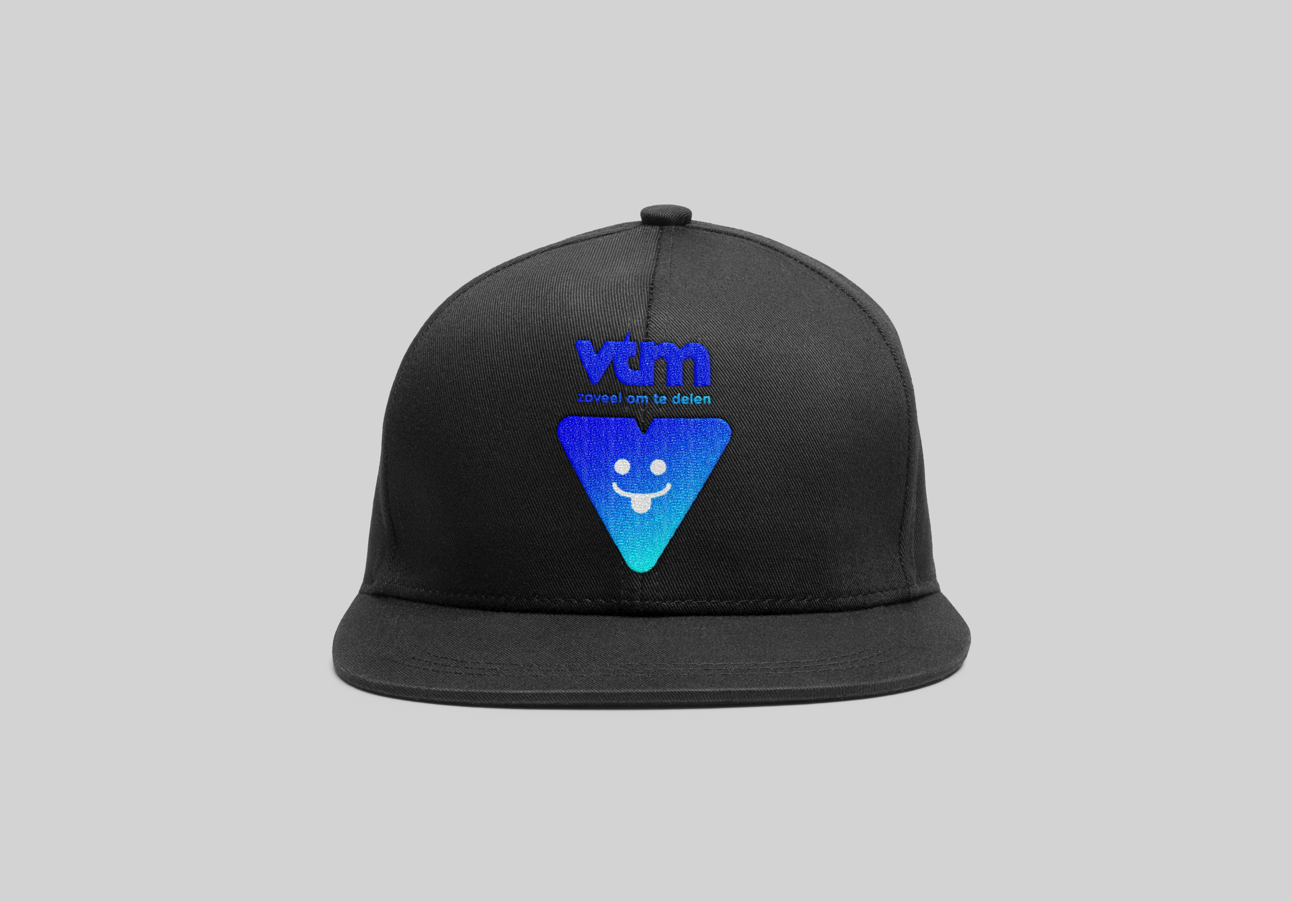
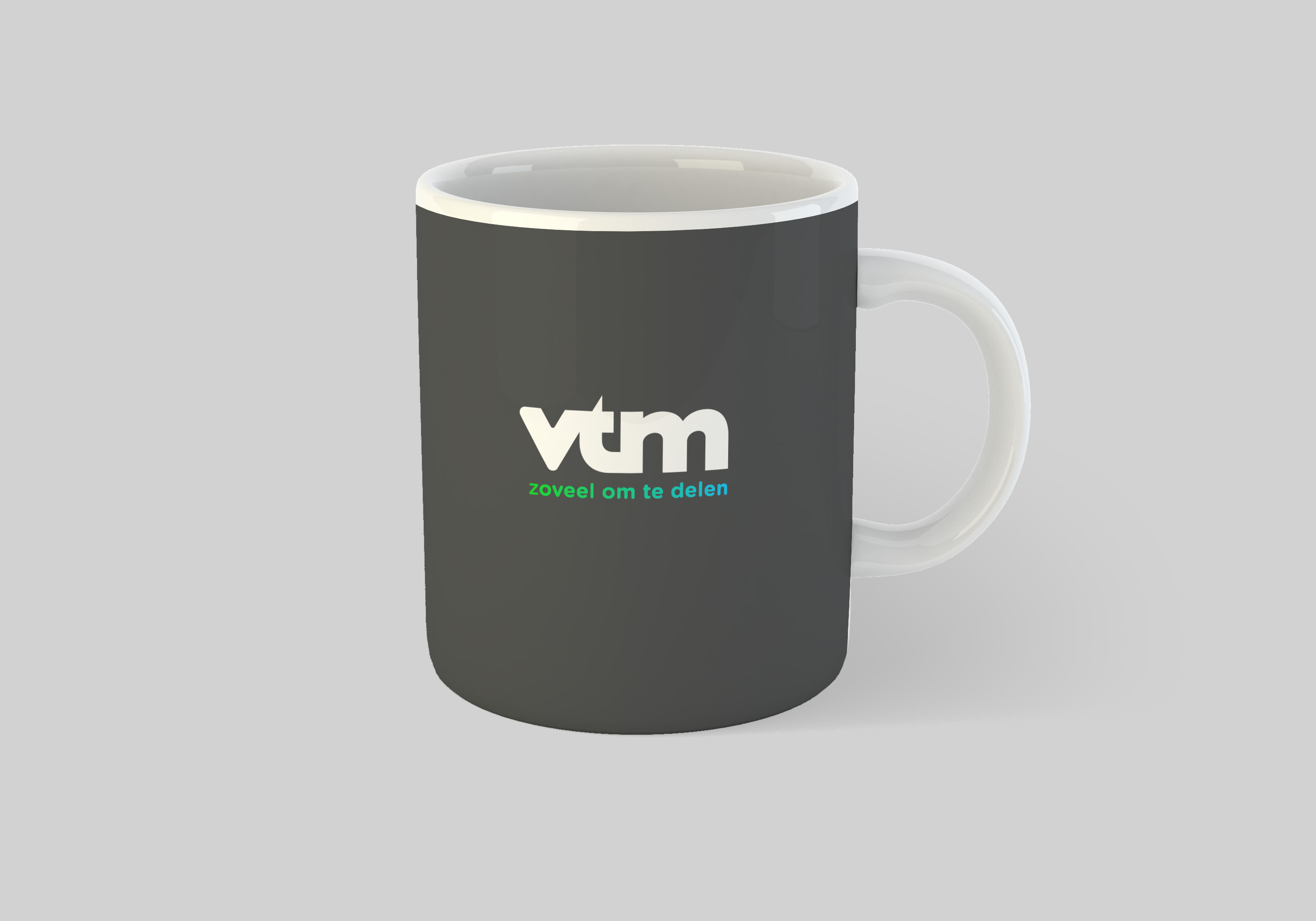
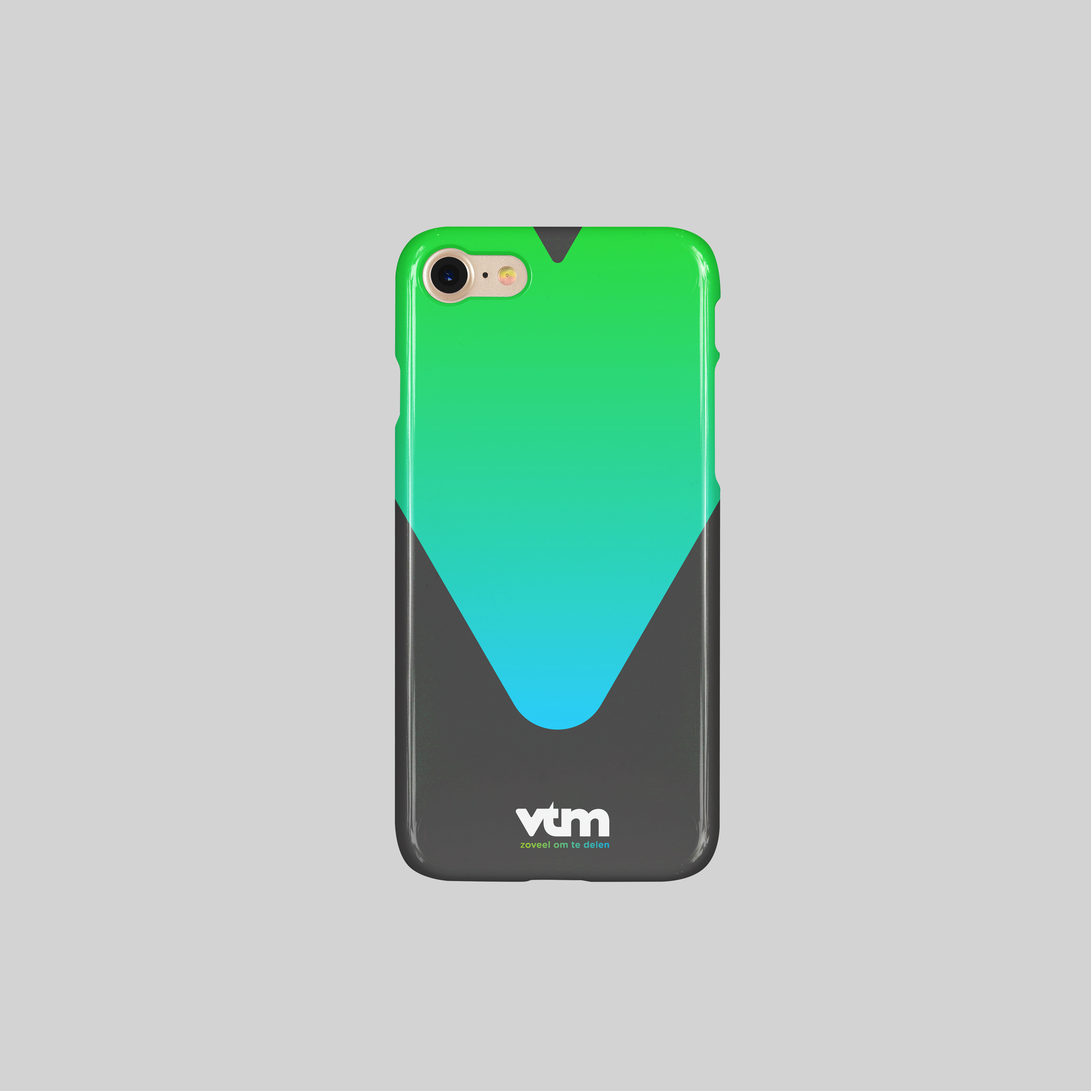
The V of the logo lent itself easily to the creation of a highly versatile shape. By reducing the V’s incision by 300%, the pointer resembles a play-button with a multi-functional potential, one that can be applied to on air, off air or digital, and recalls the logotype at all times. The slightest incision was preserved to maintain the shape’s distinctiveness as well as evoke the history and important milestones reached during Gédéon and VTM’s long collaboration.
The V of the logo lent itself easily to the creation of a highly versatile shape. By reducing the V’s incision by 300%, the pointer resembles a play-button with a multi-functional potential, one that can be applied to on air, off air or digital, and recalls the logotype at all times. The slightest incision was preserved to maintain the shape’s distinctiveness as well as evoke the history and important milestones reached during Gédéon and VTM’s long collaboration.
Producers
Emmanuelle Lacaze & Charlotte Vande Vyvre
Motion Designer
Stéphane Gibert
Art Directors
Nicolas Famery & Lazare Bessière
share