France Médias Monde – Print Campaign
France Médias Monde – Print Campaign
When France Médias Monde replaced « l’Audiovisuel Extérieur de la France », we created the brand that would bring together French broadcasting around the world. A new identity, a new design and a new series of campaigns conveyed the distinctive values of each channel in the group: RFI, France 24 and Monte Carlo Doualiya.
Brand campaigns
Brand Identity
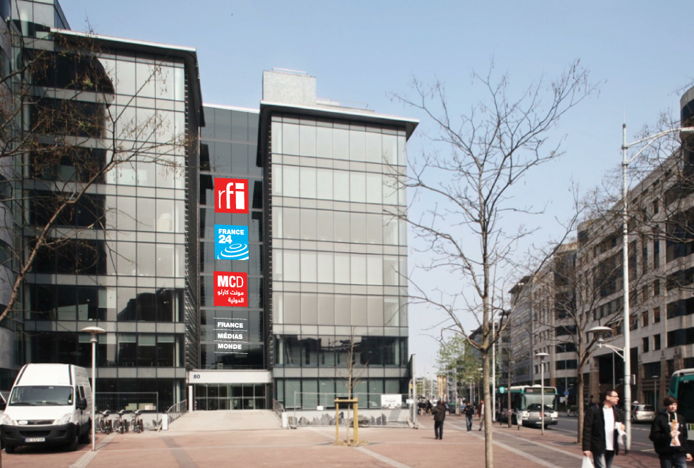
We streamlined the channel logos, reshaping them according to a unified grid system, which also formed the basis of the FMM logo.
A FOURTH SQUARE TO BE CONSISTENT

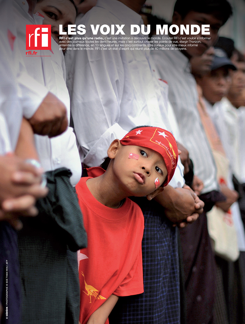
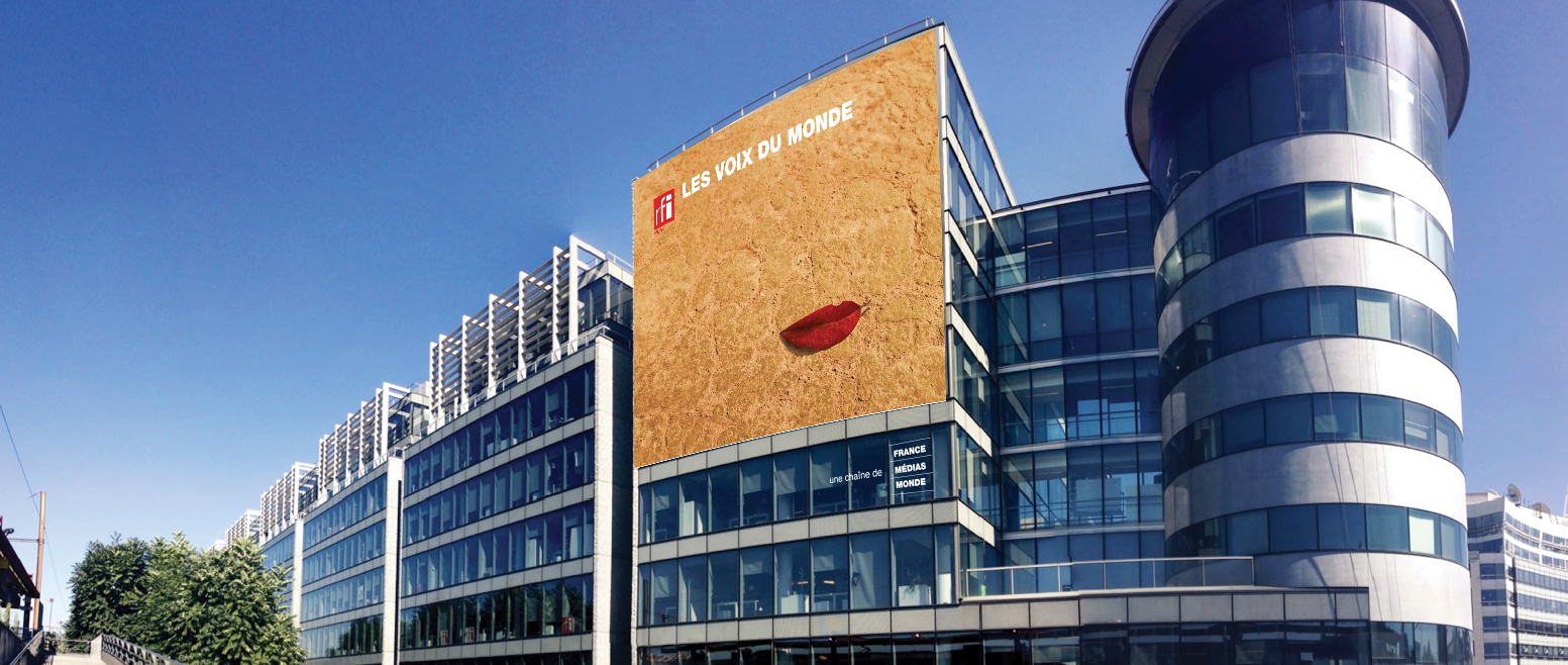
Radio is first and foremost a voice: a voice that guides; a voice that reassures; a voice you can trust, like a beacon in the night. This was the rationale behind our Radio France Internationale campaign. The bright red motif represents RFI, always broadcasting, wherever you are in the world, whenever you need them.
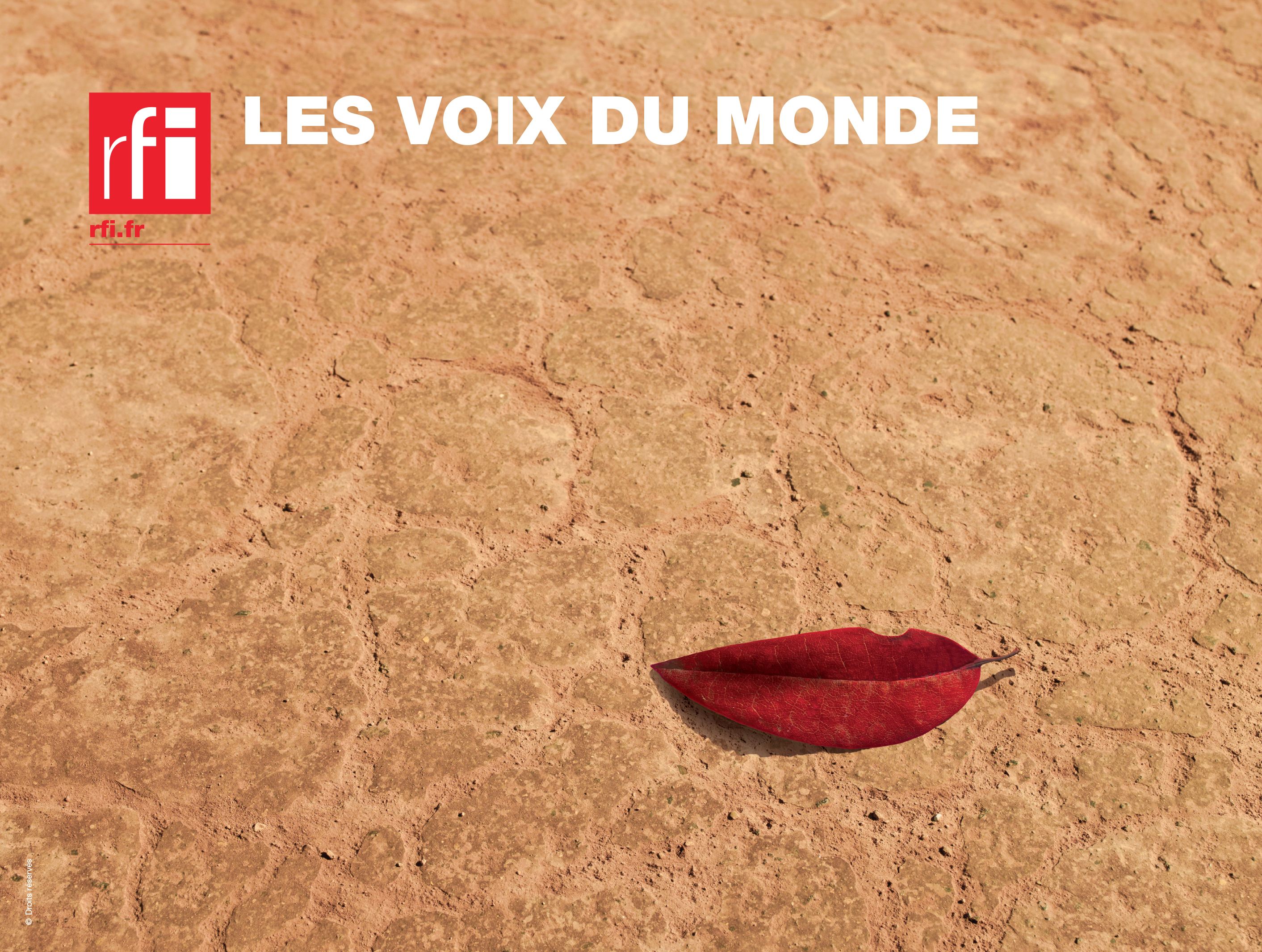
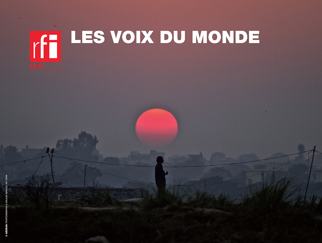
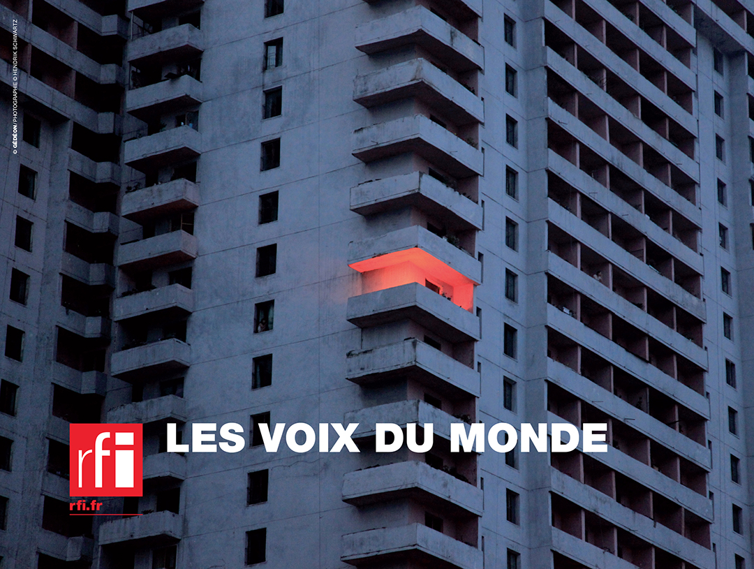
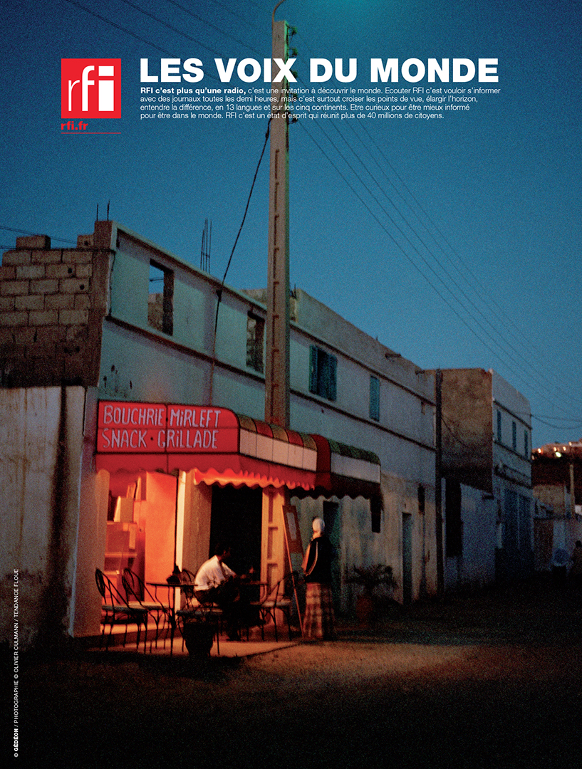
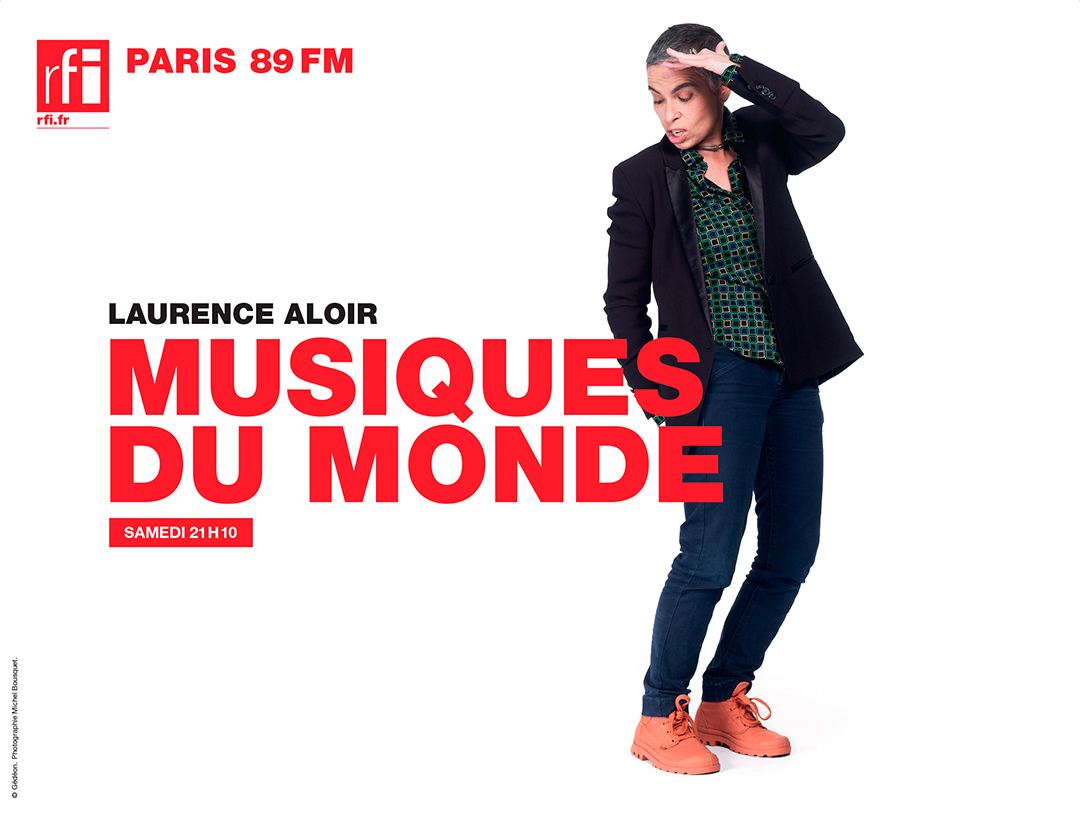
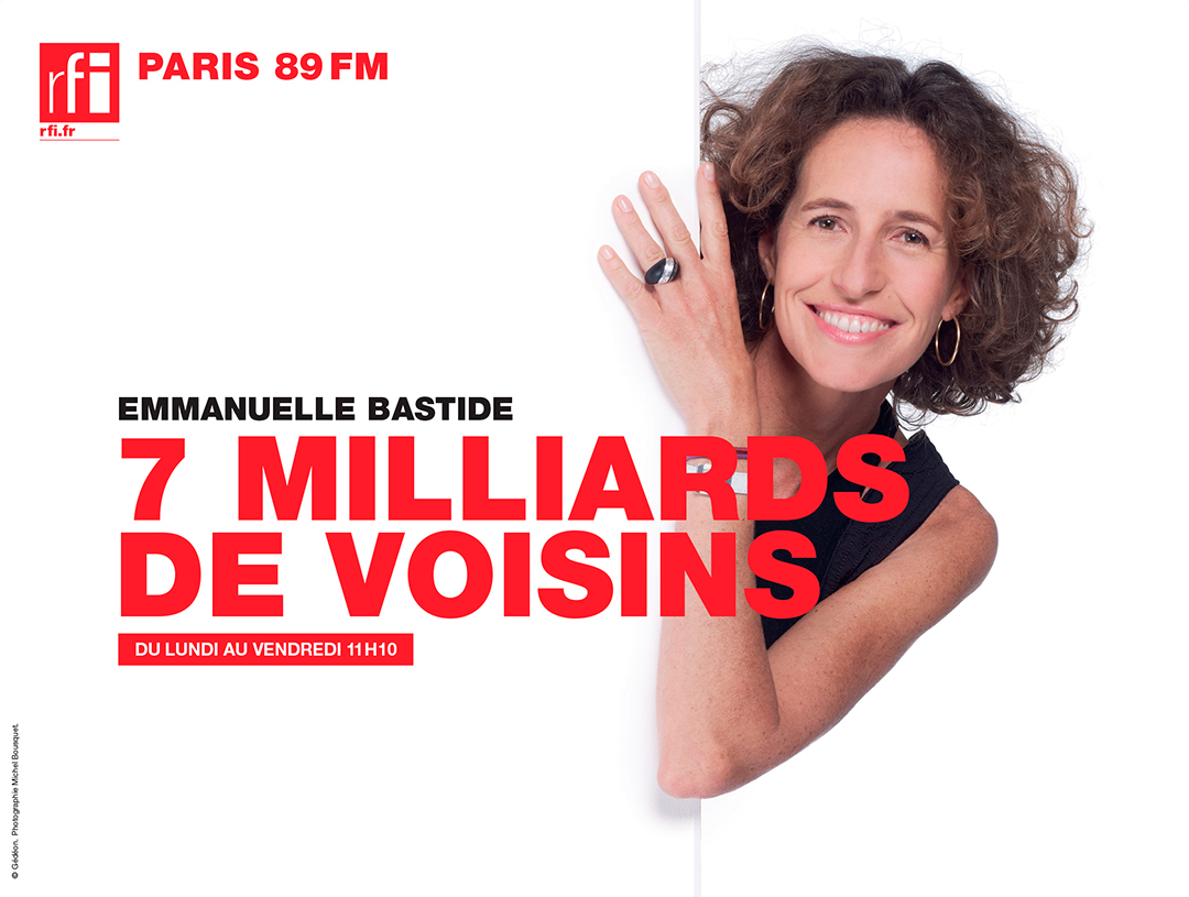
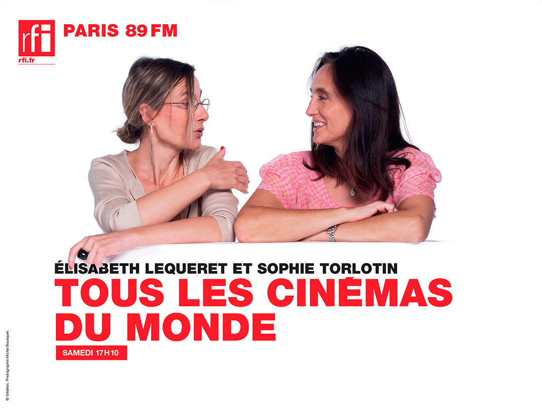
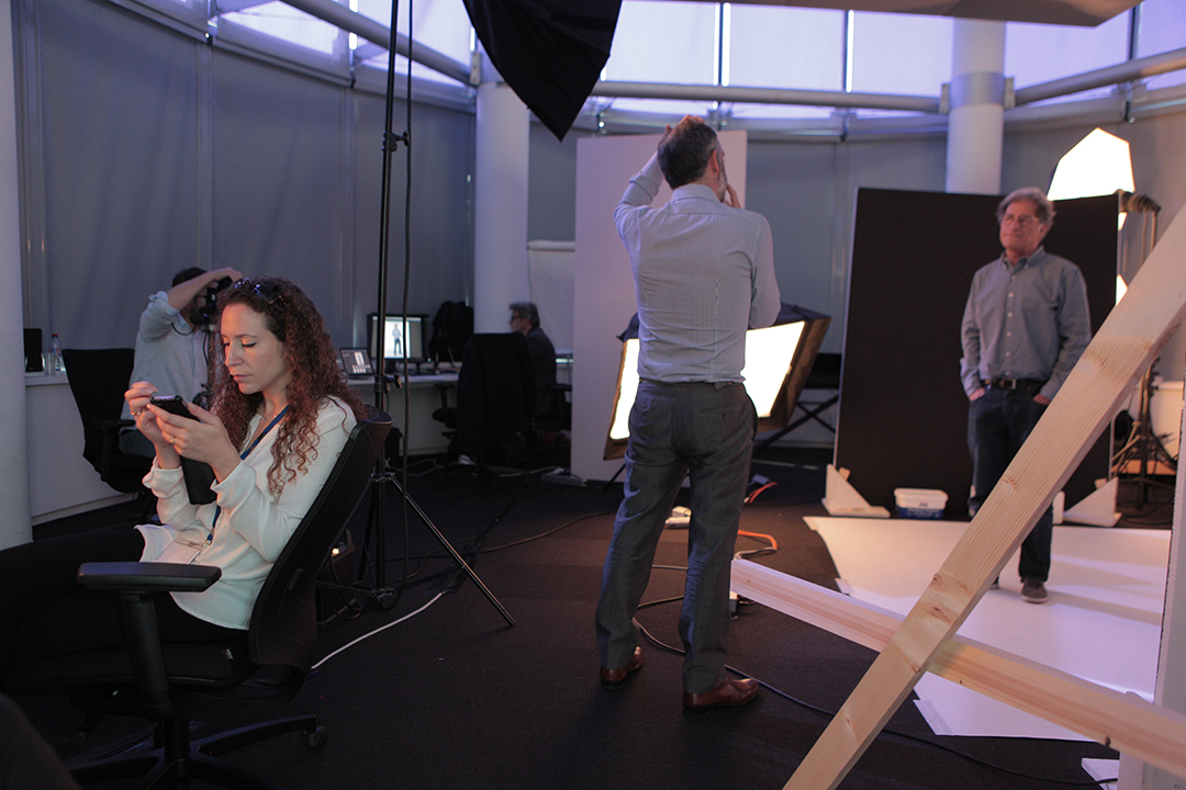
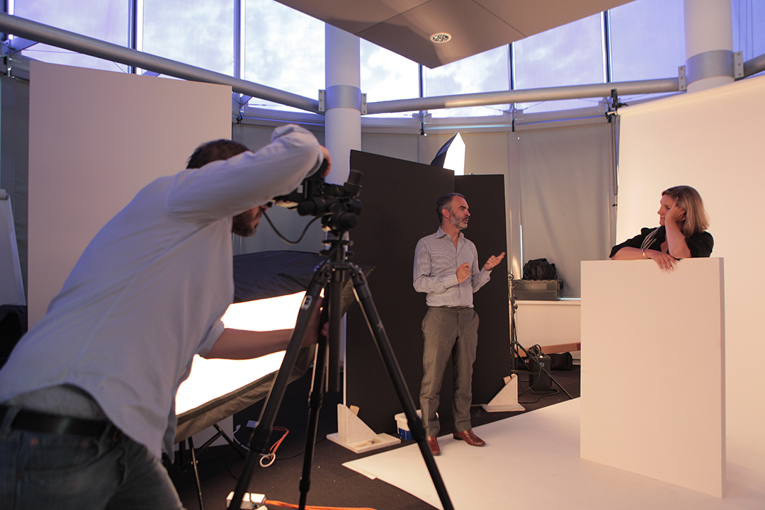
We also produced a series of portraits of the RFI presenters, giving them the freedom to express their personality through their poses. The geometry of the space allowed us to create playful compositions using block type.
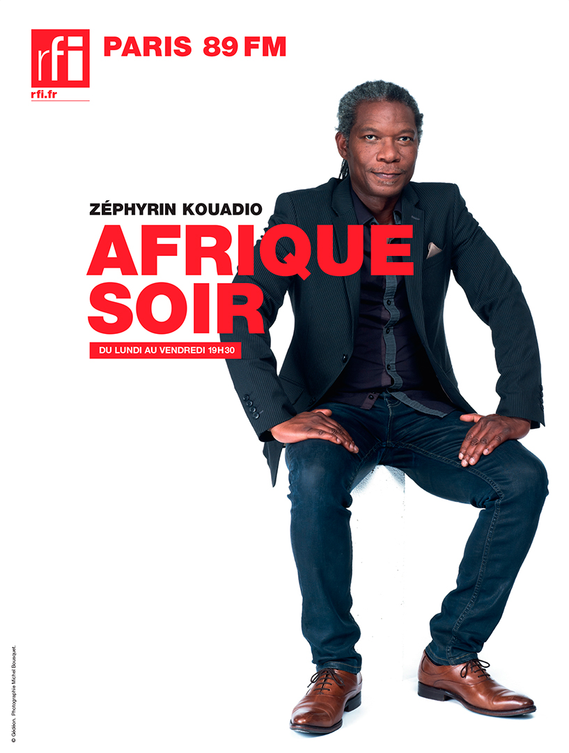
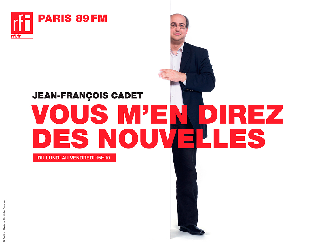
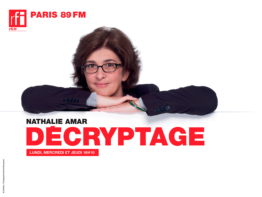
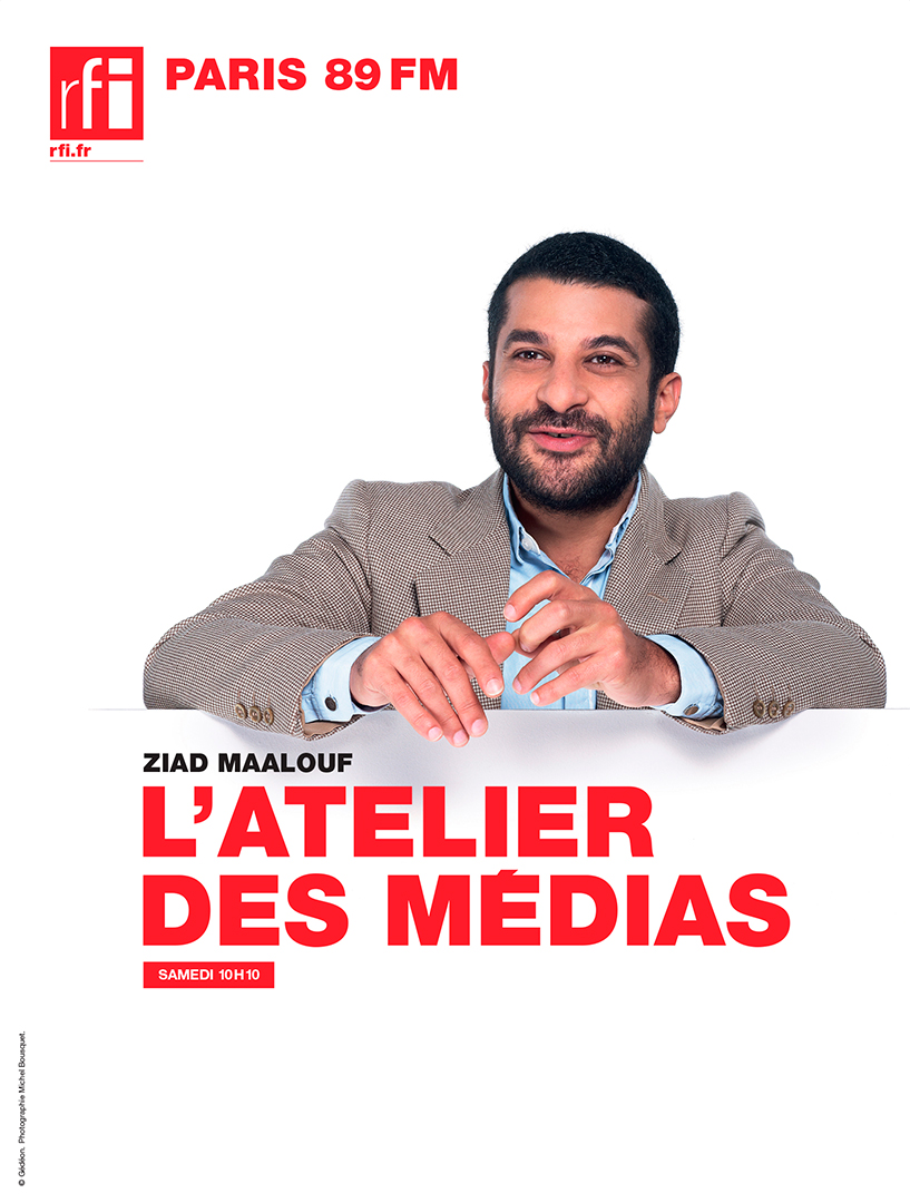
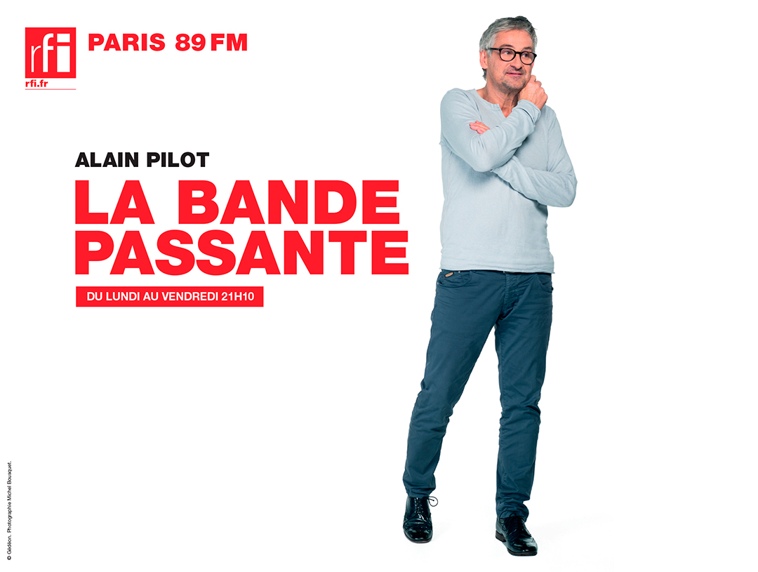
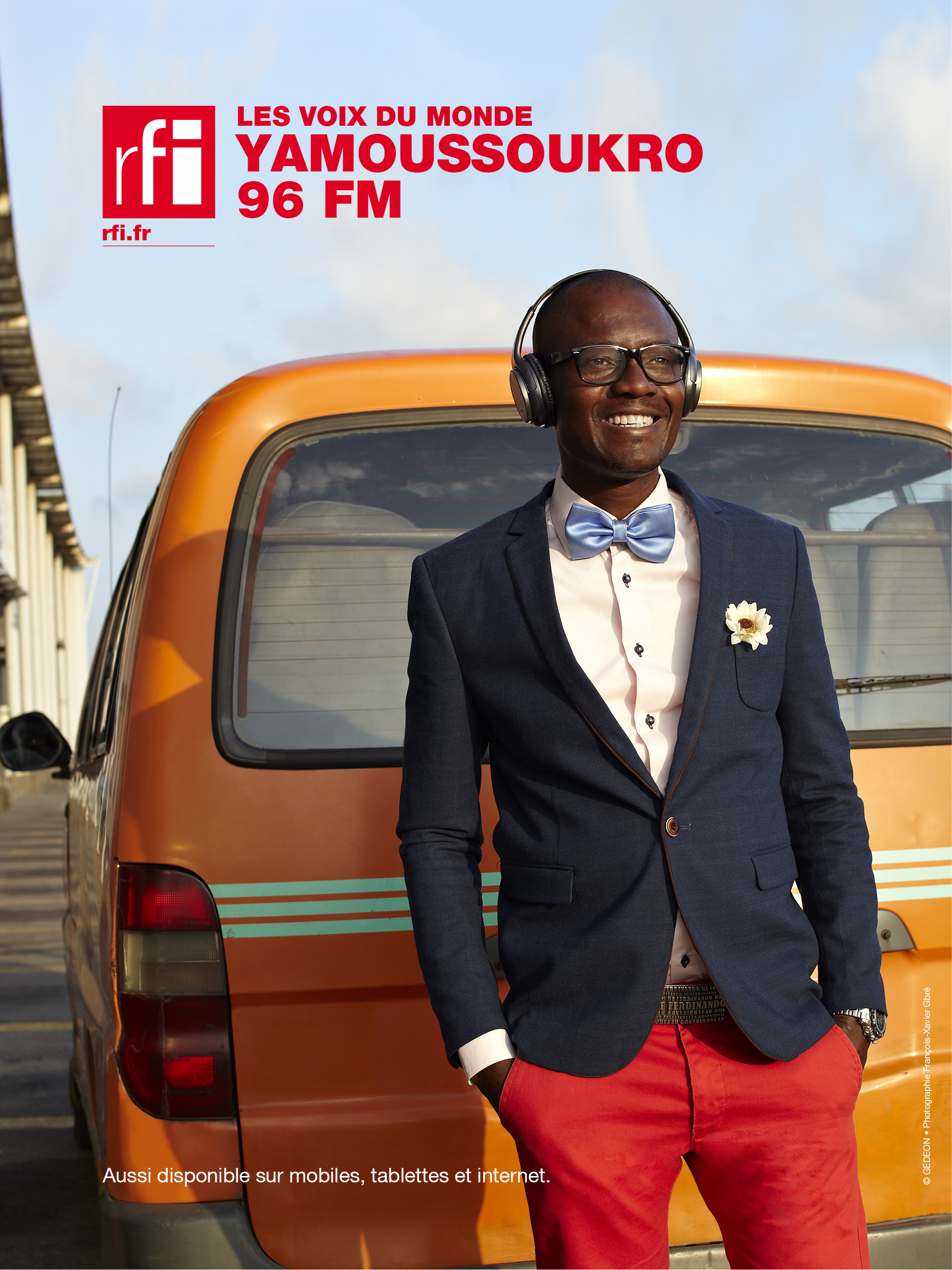
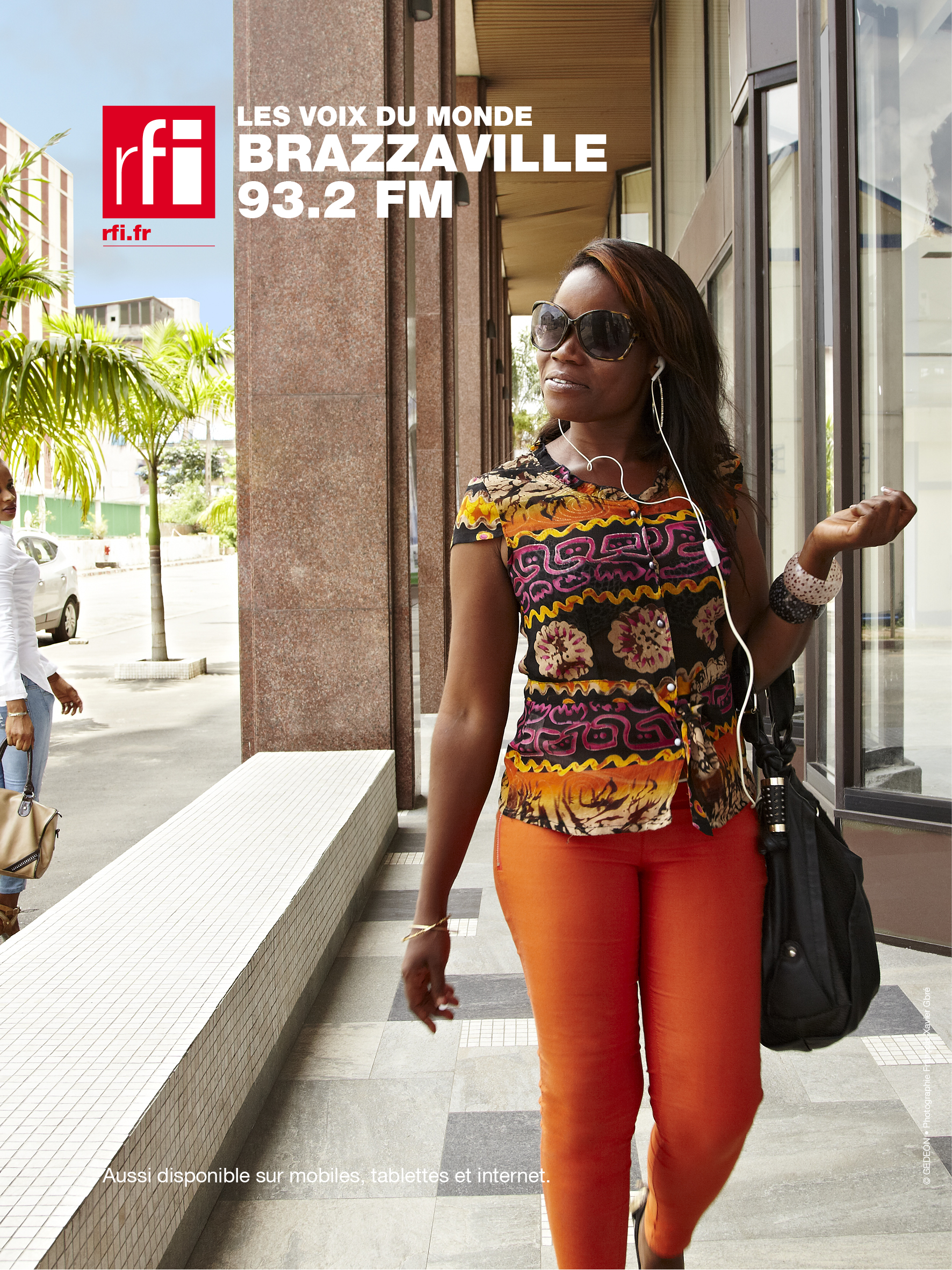
RFI has a huge audience in Africa, so the station asked us to create a campaign to promote their most popular frequencies. We produced a series of posters showing how RFI reflects the culture and the lifestyle of its listeners.
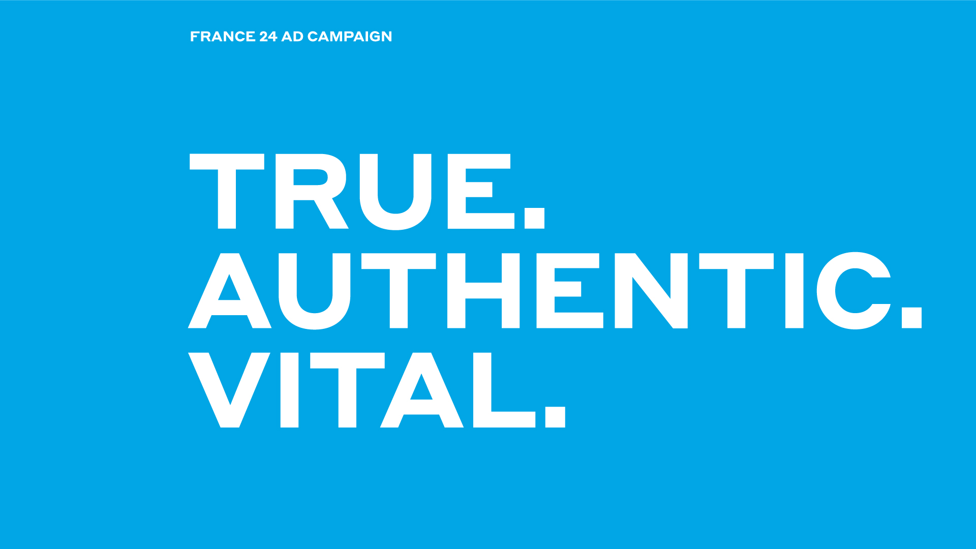
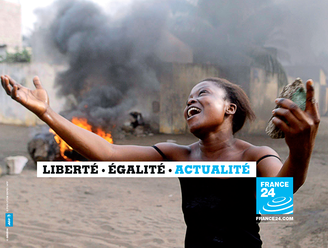
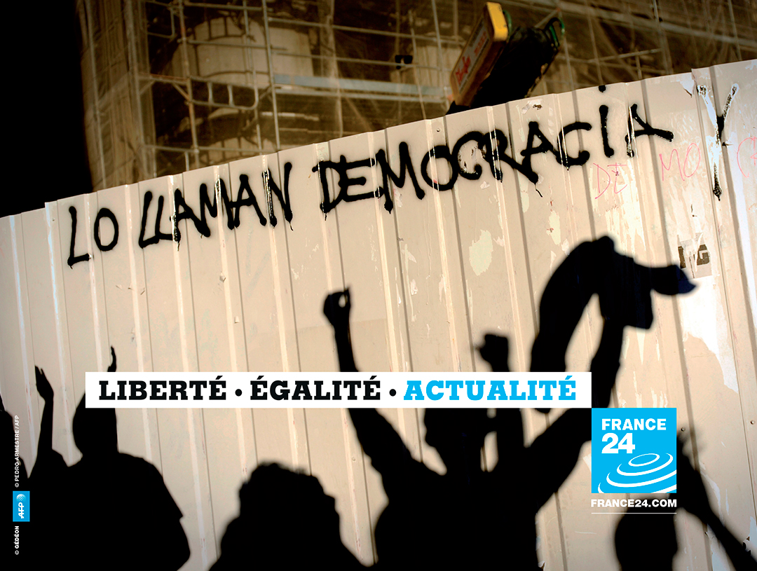
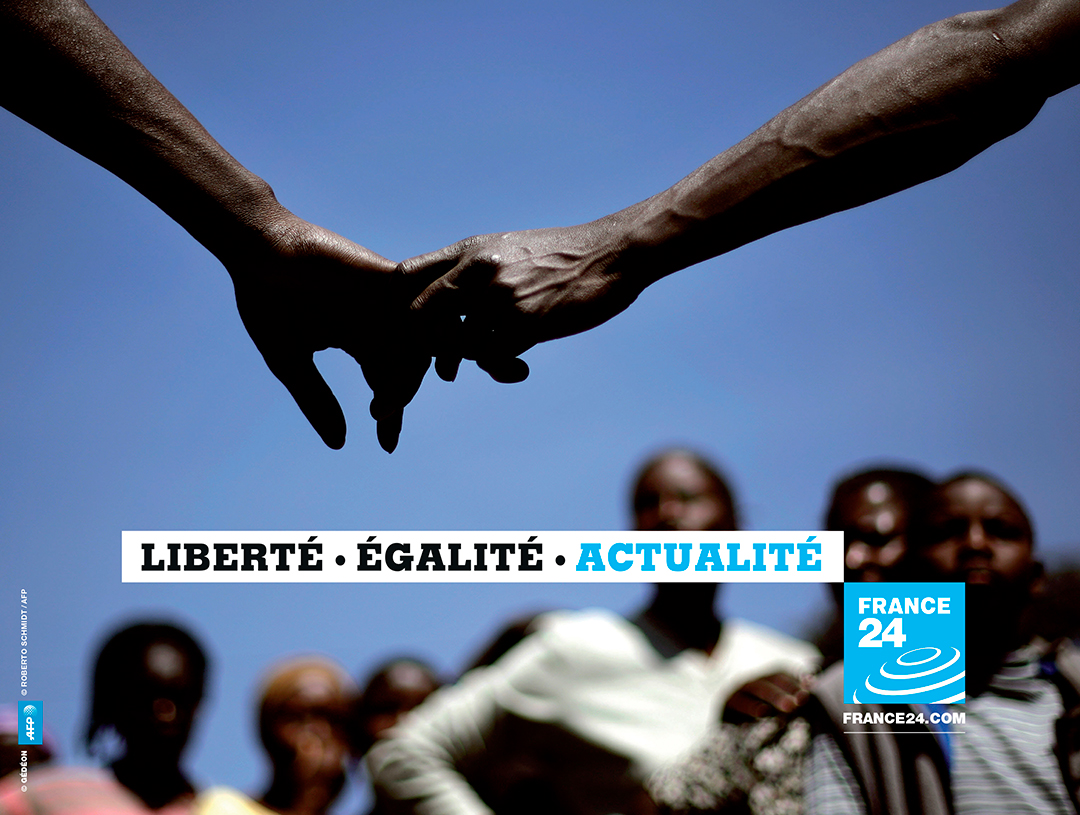
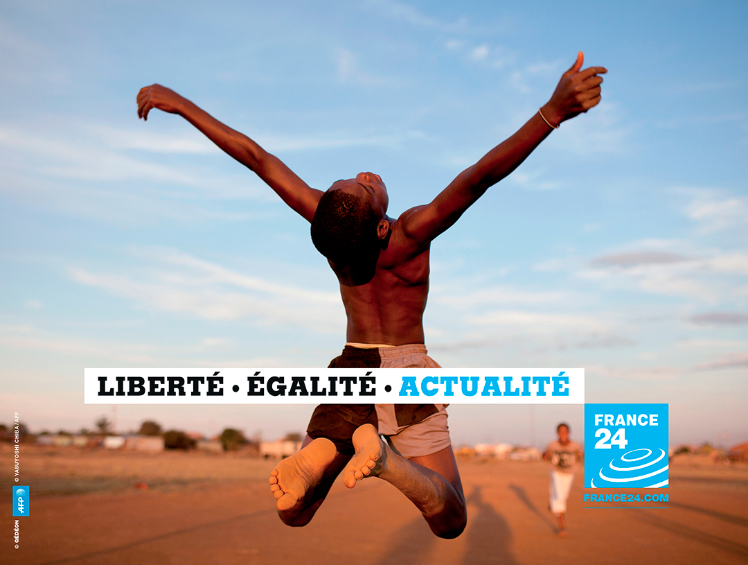
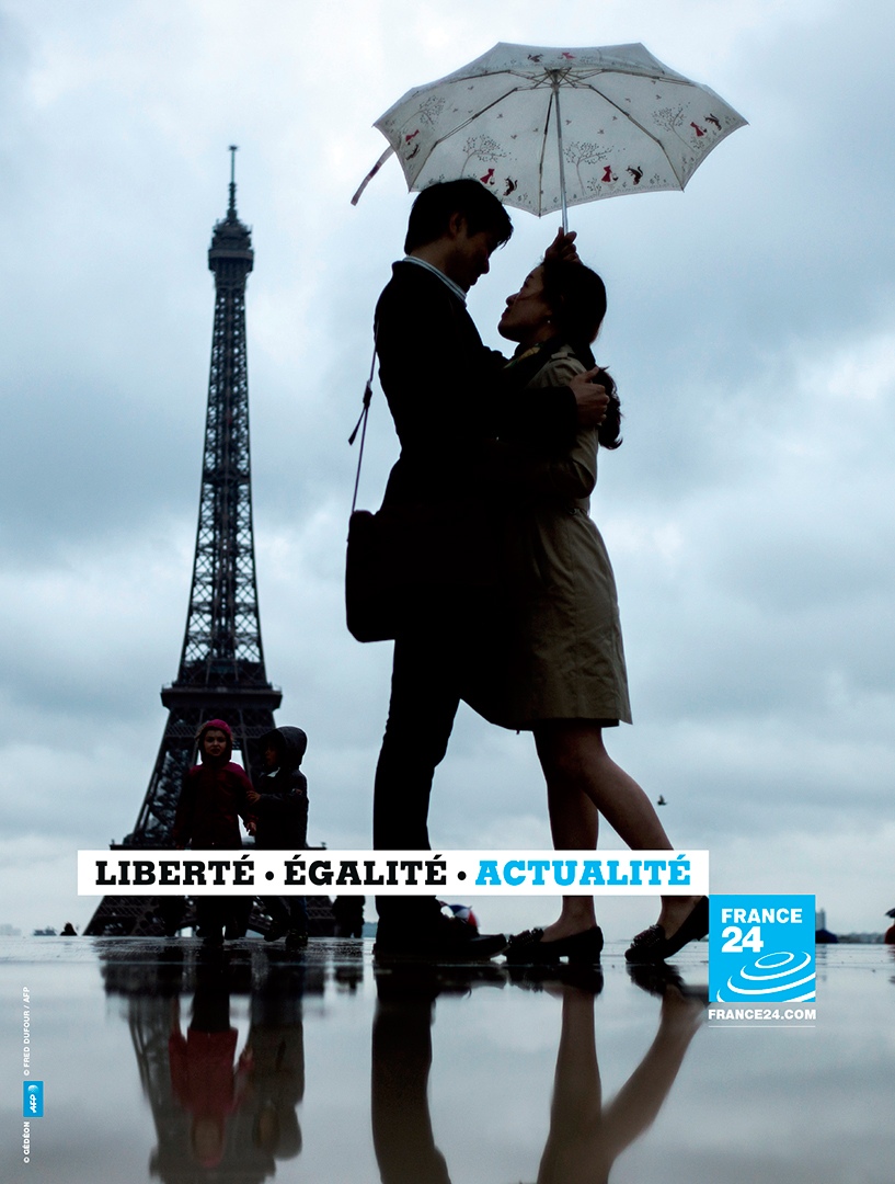
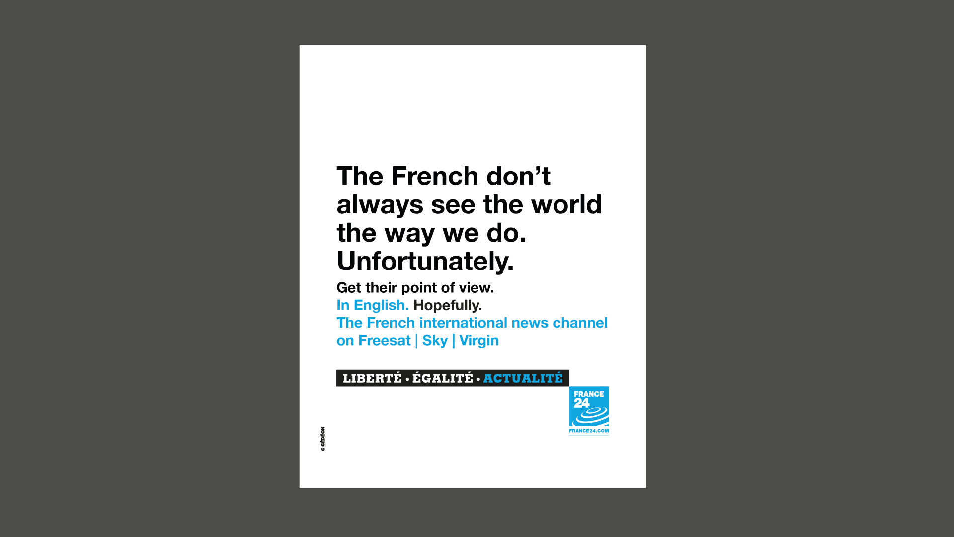
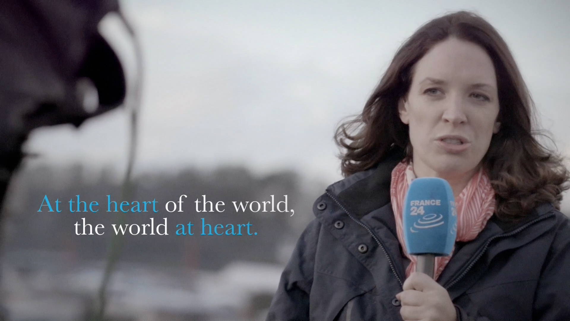
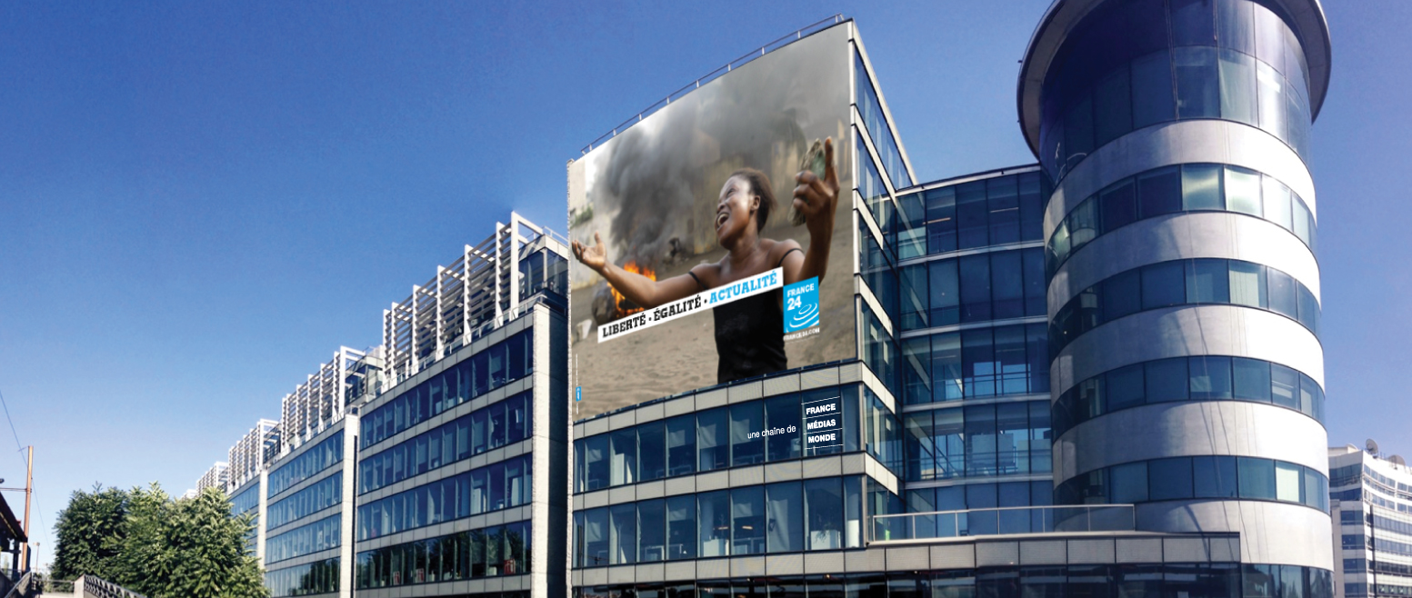
The idea was simple. News happens every day, everywhere, and France 24 gives you a unique French viewpoint. That’s why our tagline refers to the French national motto, « Liberté, Egalité, Fraternité », replacing the last word with « Actualité » (News). However, « Fraternité » (Brotherhood) remains evident in the remarkable images taken by the AFP (Agence France Presse) photojournalists all over the world. The campaign was released in and adapted to every territory where France 24 is broadcast.
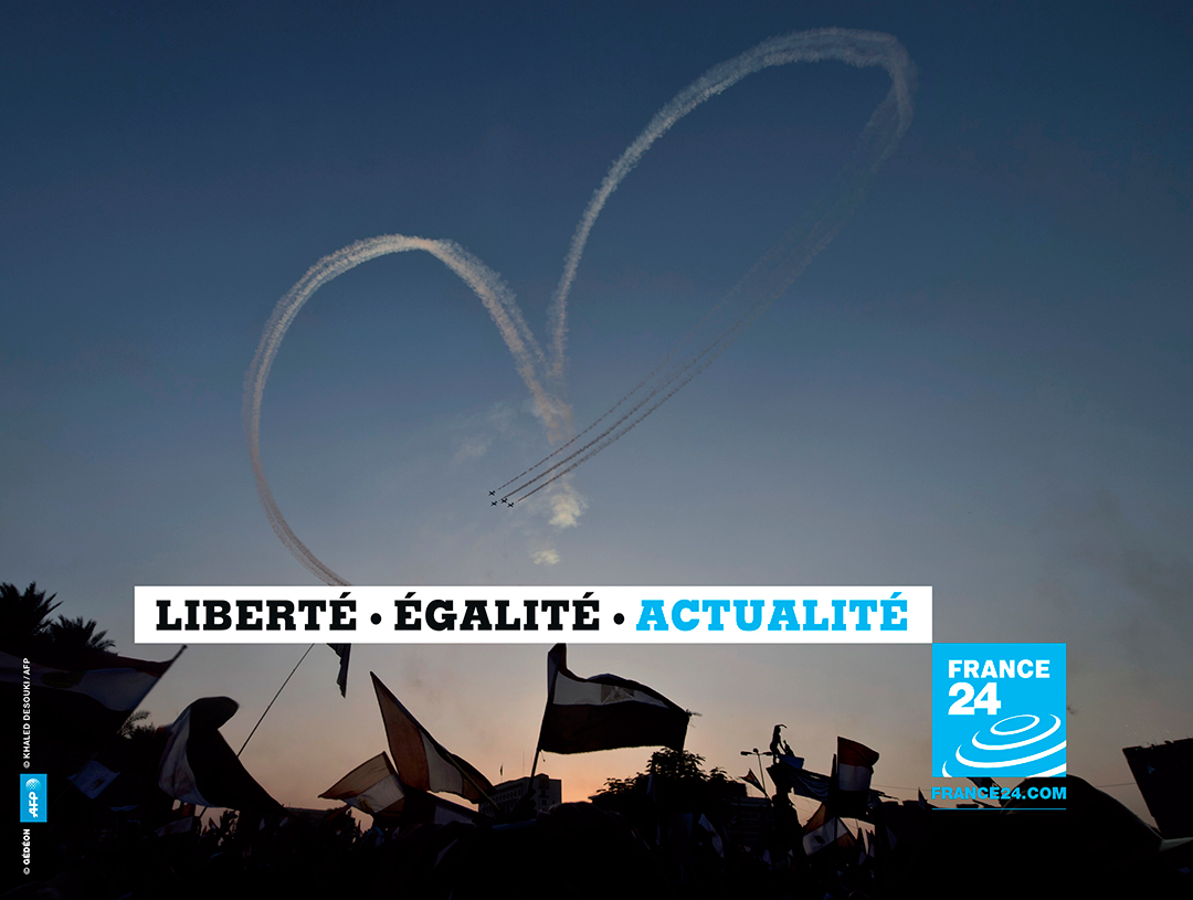
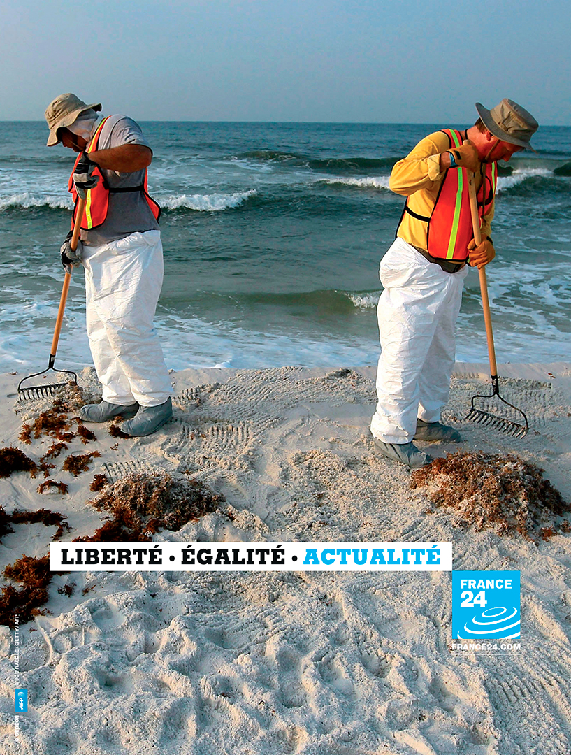
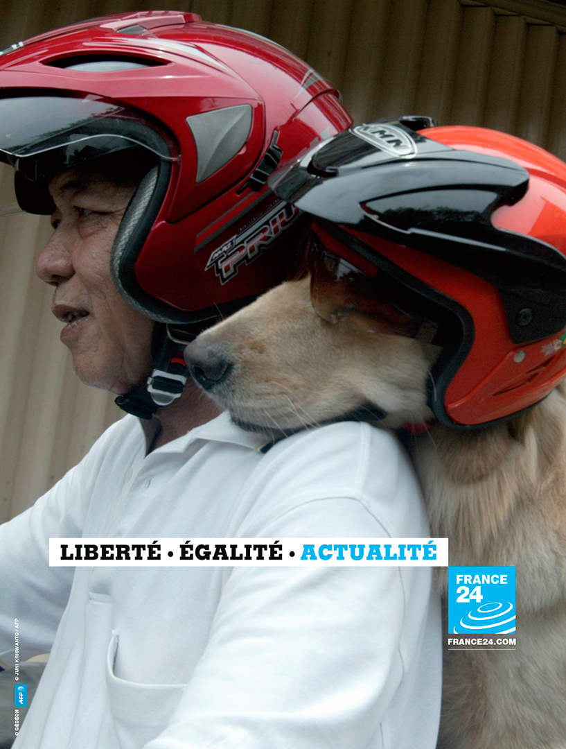
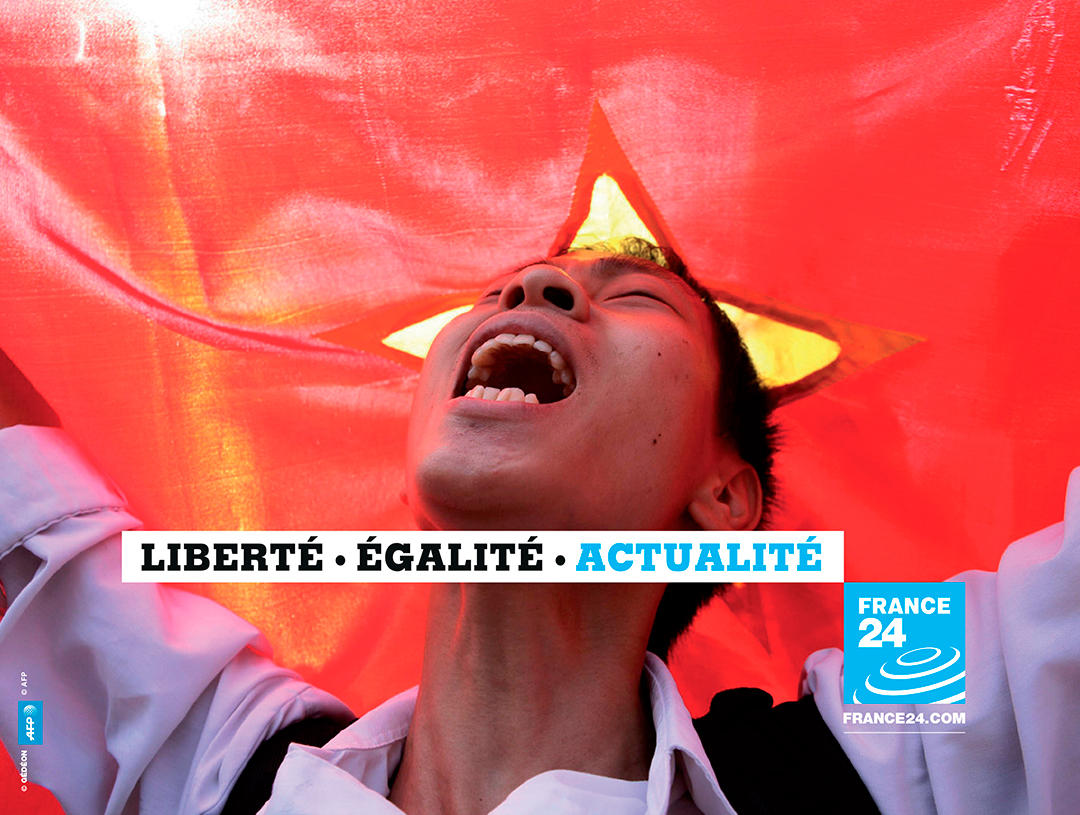
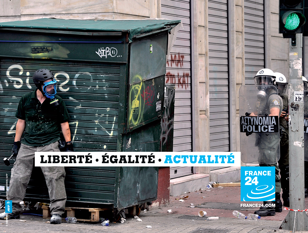
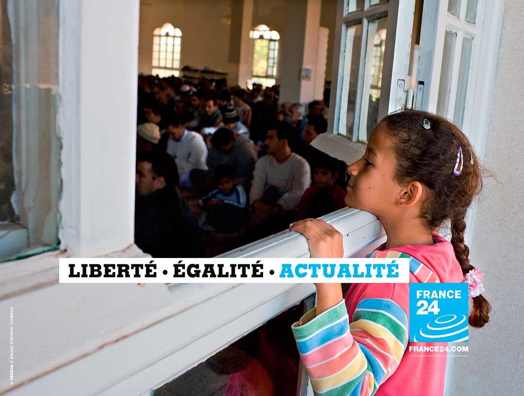
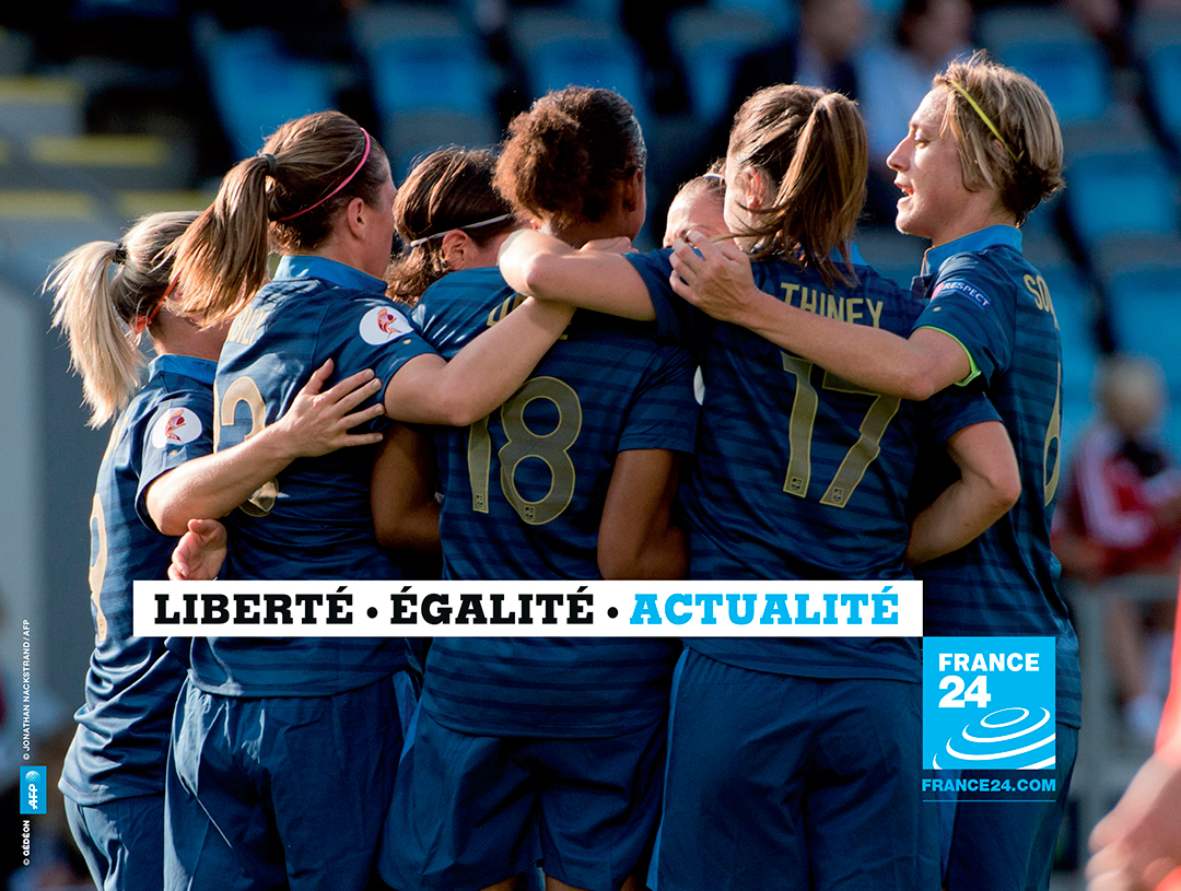
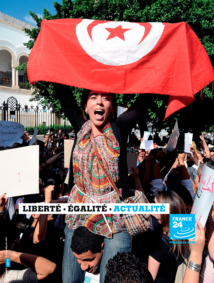
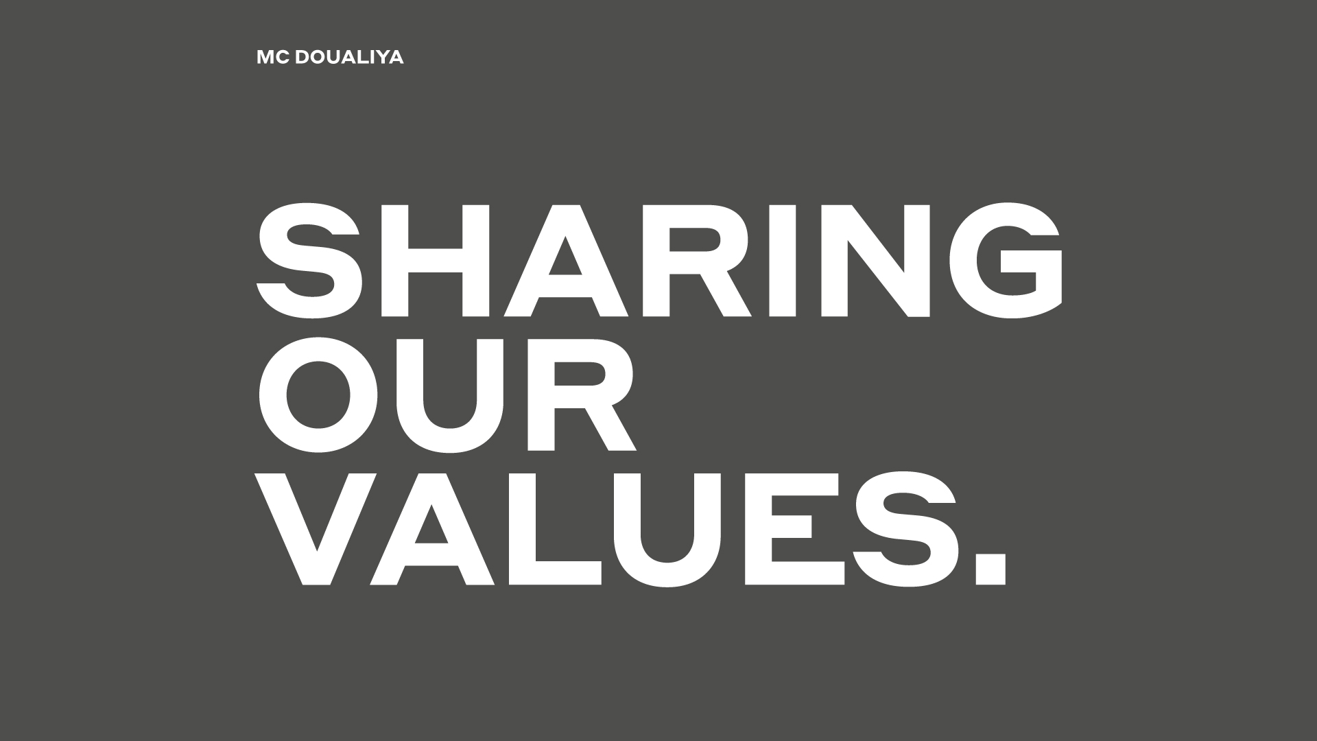
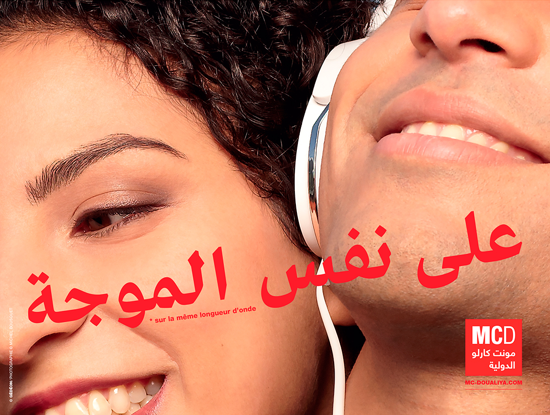
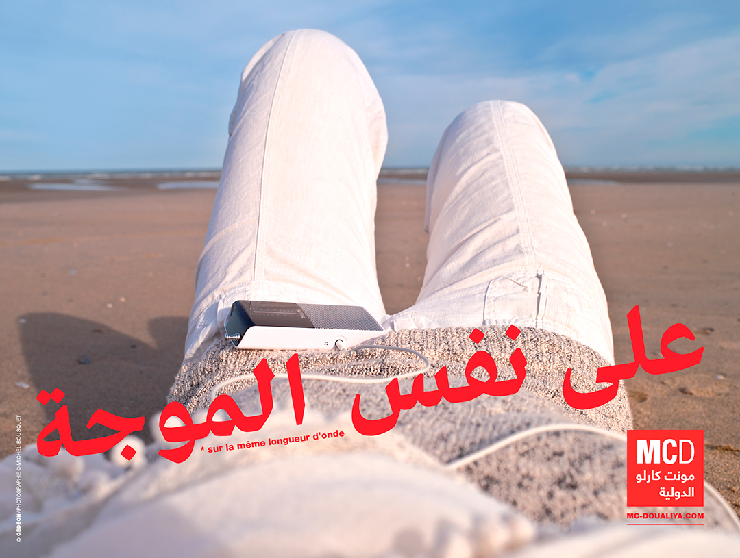
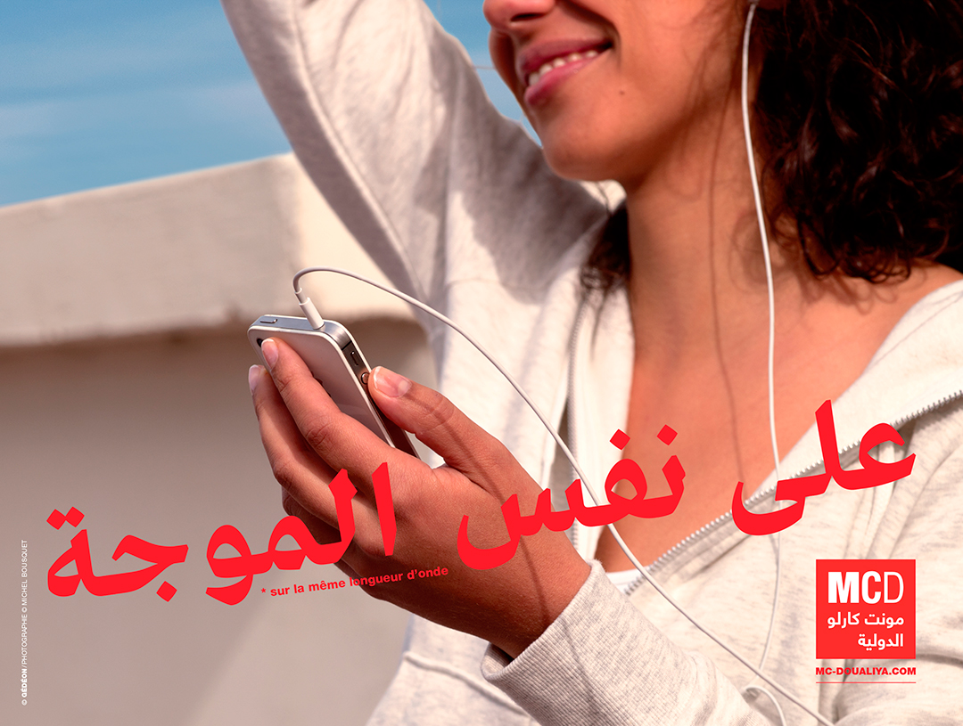
The group’s third brand is the Arabic-speaking radio station Monte Carlo Doualiya, which provides a platform for open debate in countries where the media are often synonymous with political bias. Our challenge was, therefore, to produce images that express French democratic values while respecting regional sensibilities.
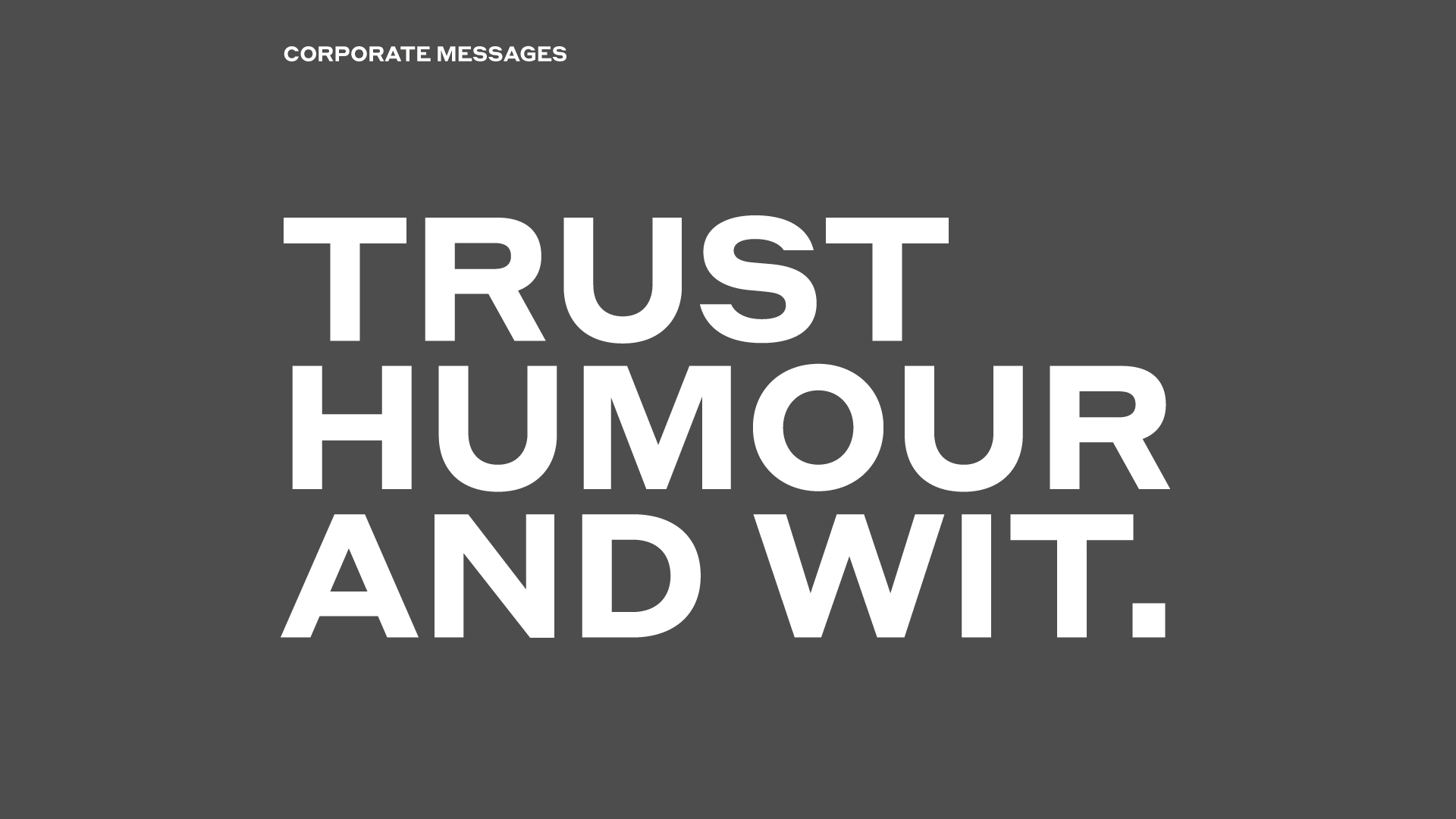
The group’s corporate communications needed to express the wealth of topics they cover, so we decided to make the text itself the focal point. This allowed us to play with the corporate type (Helvetica ultra thin) and the three brand colors, using quotes and quips to enliven the tone and convey FMM’s distinctive character.
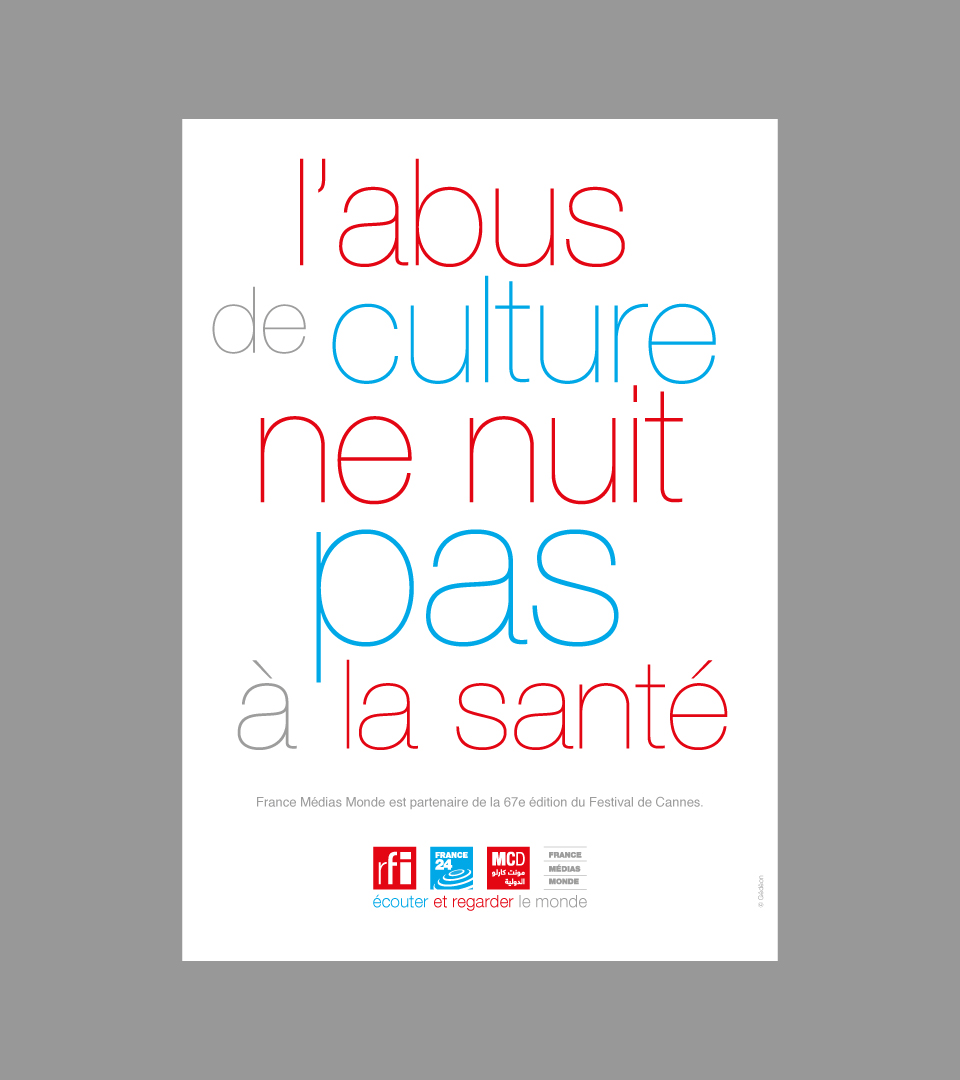
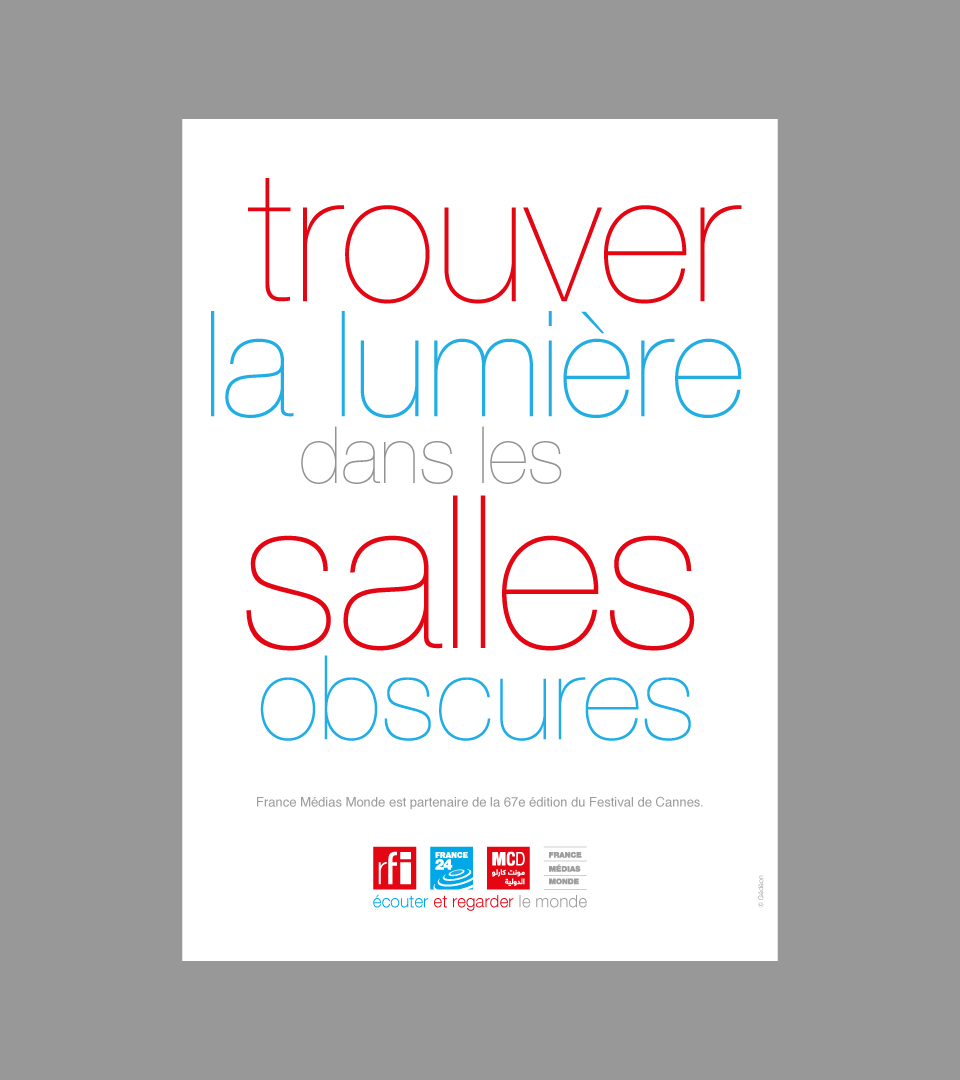
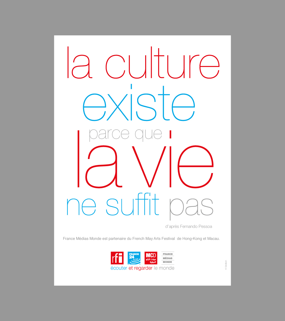
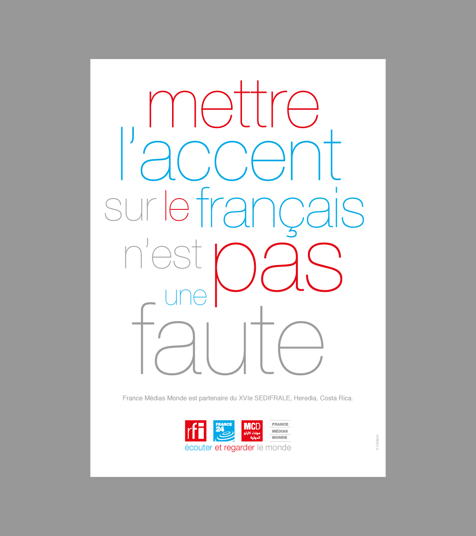
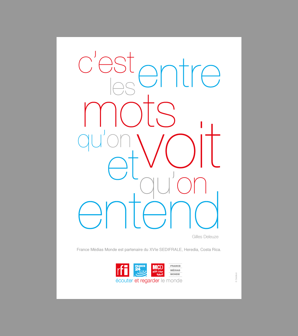
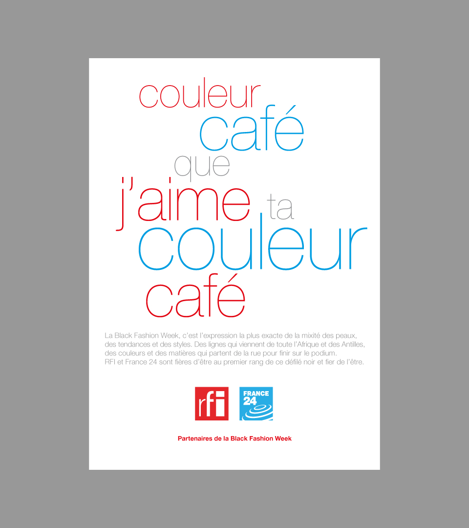
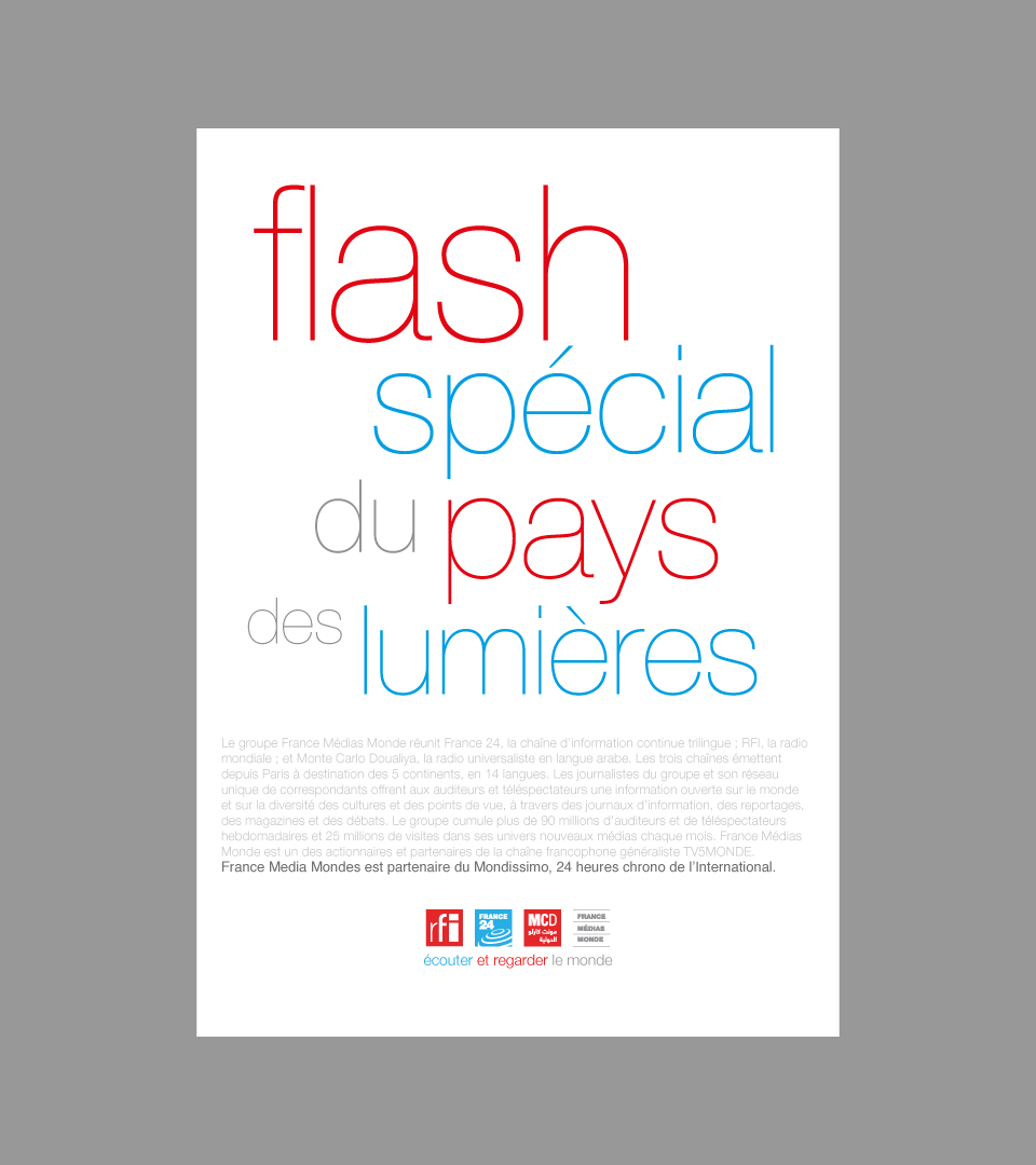
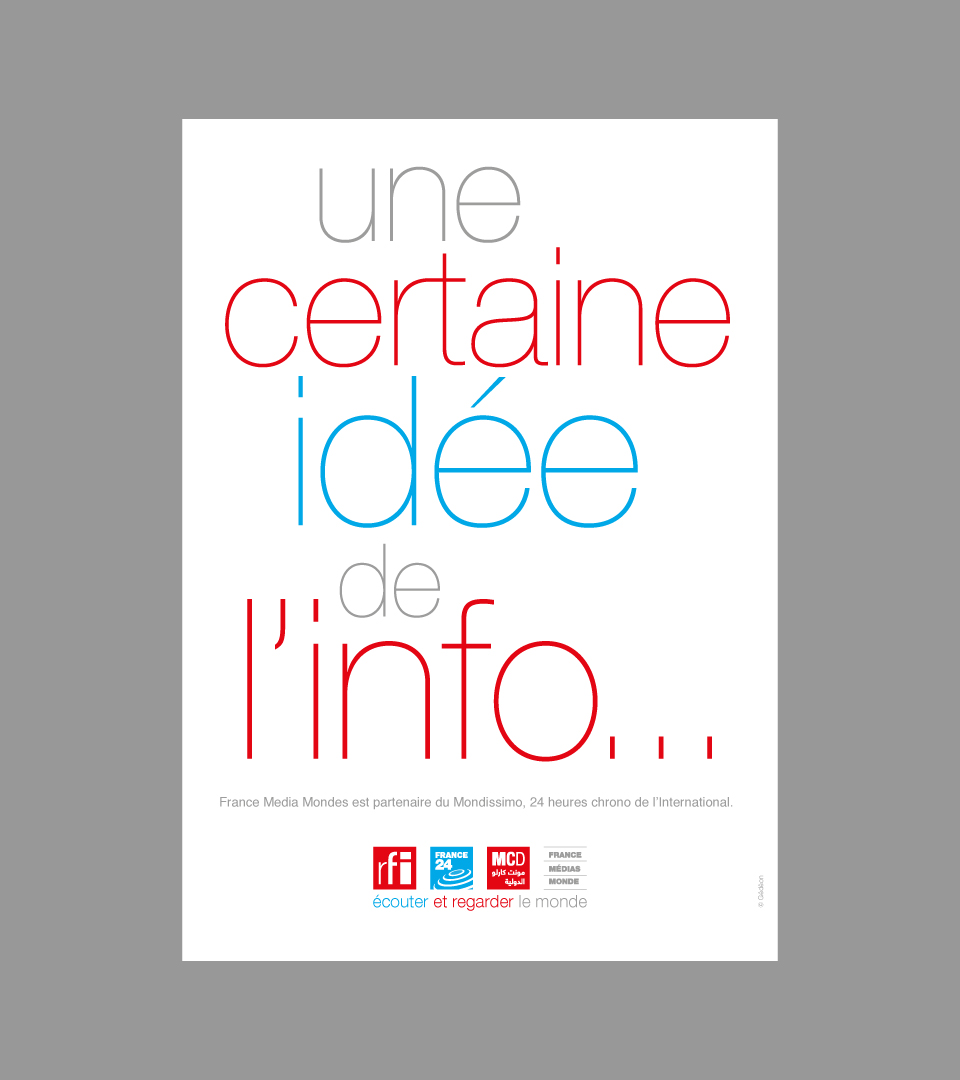
Witty phrases and playful typography make the message stick.
Witty phrases and playful typography make the message stick.
Witty phrases and playful typography make the message stick.
Witty phrases and playful typography make the message stick.
Witty phrases and playful typography make the message stick.
Witty phrases and playful typography make the message stick.
Witty phrases and playful typography make the message stick.
Witty phrases and playful typography make the message stick.
At the FMM headquarters, banners announced the merging of the three channels and a huge billboard adorned the glass facade.
Creative Director
Bernard Bréchet
Producers
Emmanuelle Lacaze
Eglantine Guitard
Graphic Designer
Natalie Bessard
share
Next Project
OCS - TV AD