FUN RADIO – VISUAL IDENTITY
FUN RADIO – VISUAL IDENTITY
The new identity of Fun Radio is all about movement. The variable typography vibrates as if ‘dancing’ to the rhythm of the music. The brand is lively, dynamic, and fun, just like its name. It is also perfectly adapted to new usages and all platforms (social media, video, digital…).
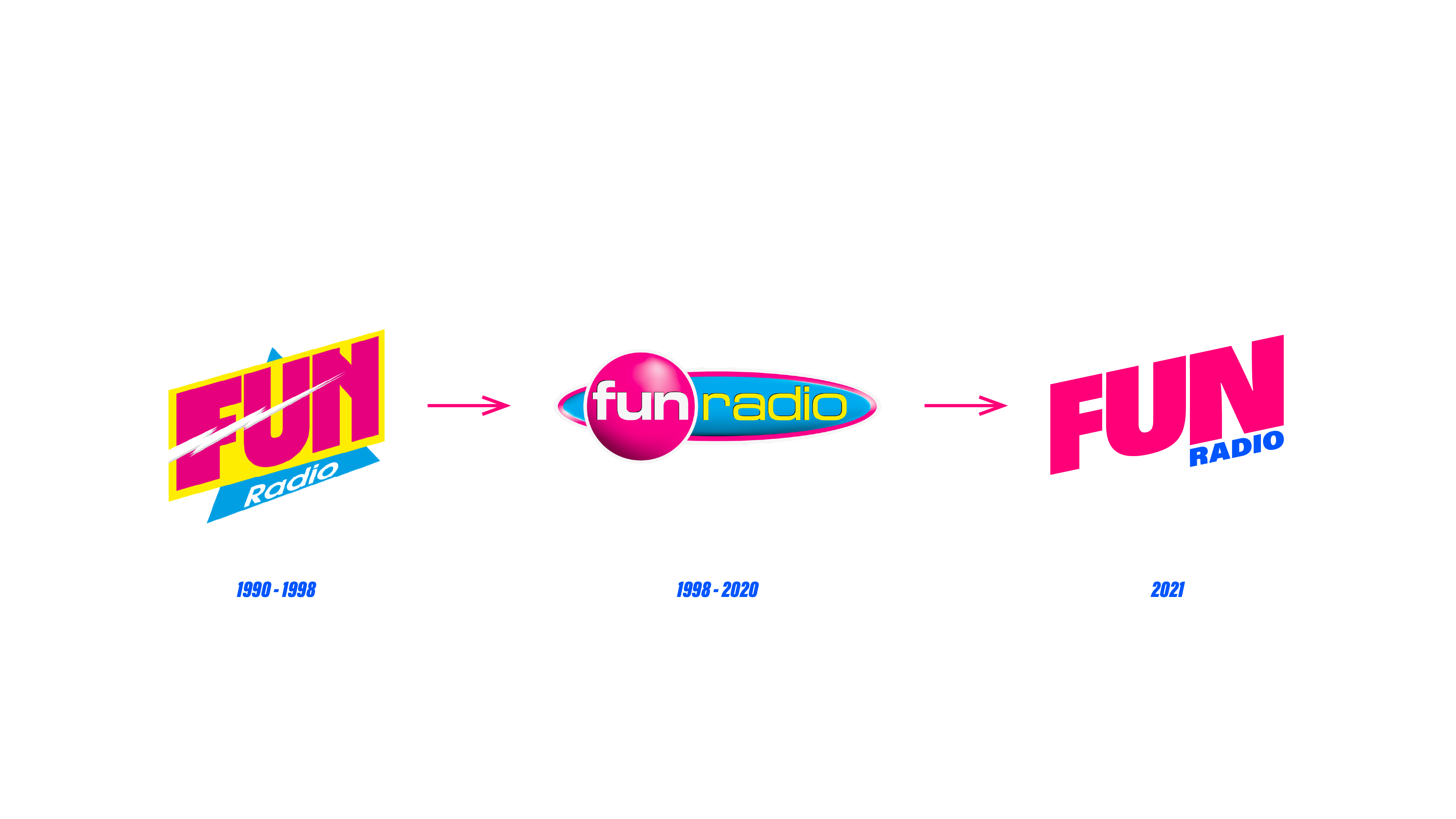
The brand’s dynamic nature is reinforced by the use of many different font weights. The typeface ranges from condensed to extended, giving movement to the word FUN. This typographic play accentuates the primary meaning of the word (fun) and perfectly reflects the spirit of the brand (positive, friendly, fun, energetic, close, connected).
This logo is the perfect illustration of the tagline “ENJOY THE MUSIC”, promoting the idea of letting go and being carried away by the music.
We freed the previous Fun Radio logo from its box, creating a new modern look that is simpler and more readable.
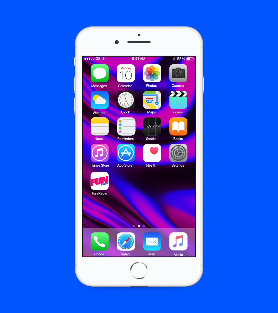
By using capital letters, we give the brand back its power. This also allows the logo to be adapted to digital usages, since it is more readable in small sizes (such as an app icon, co-branding, etc.…)
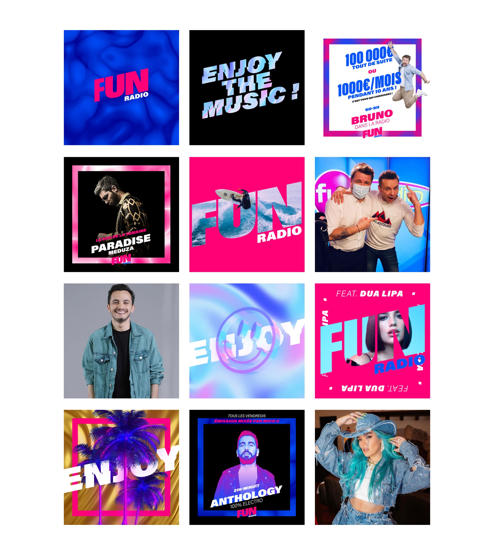
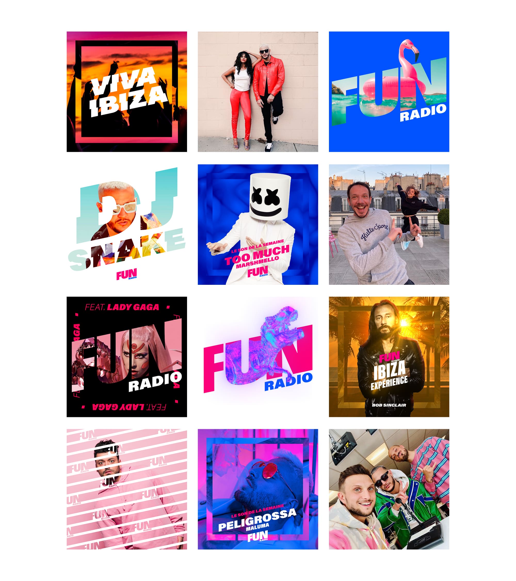
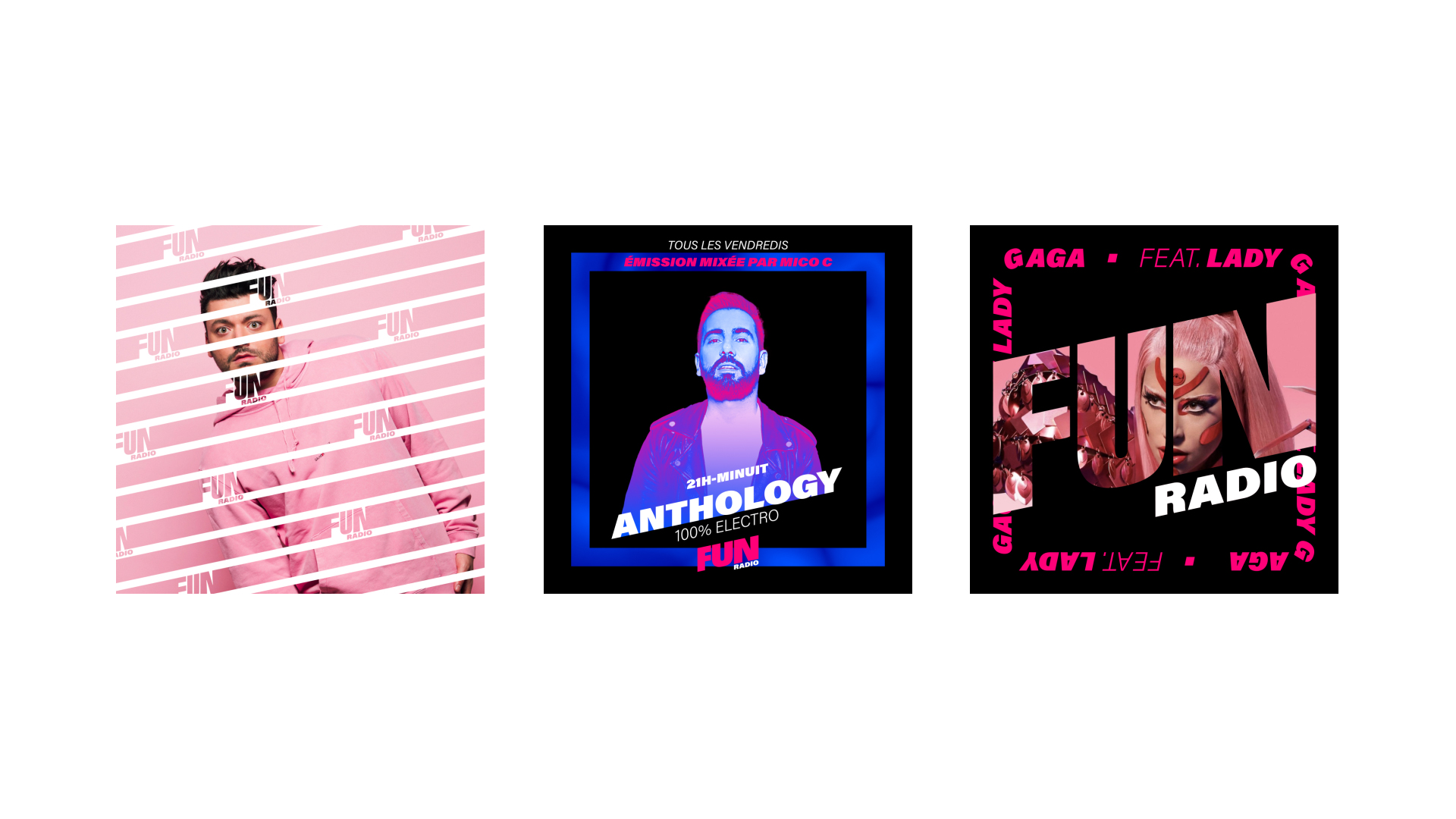
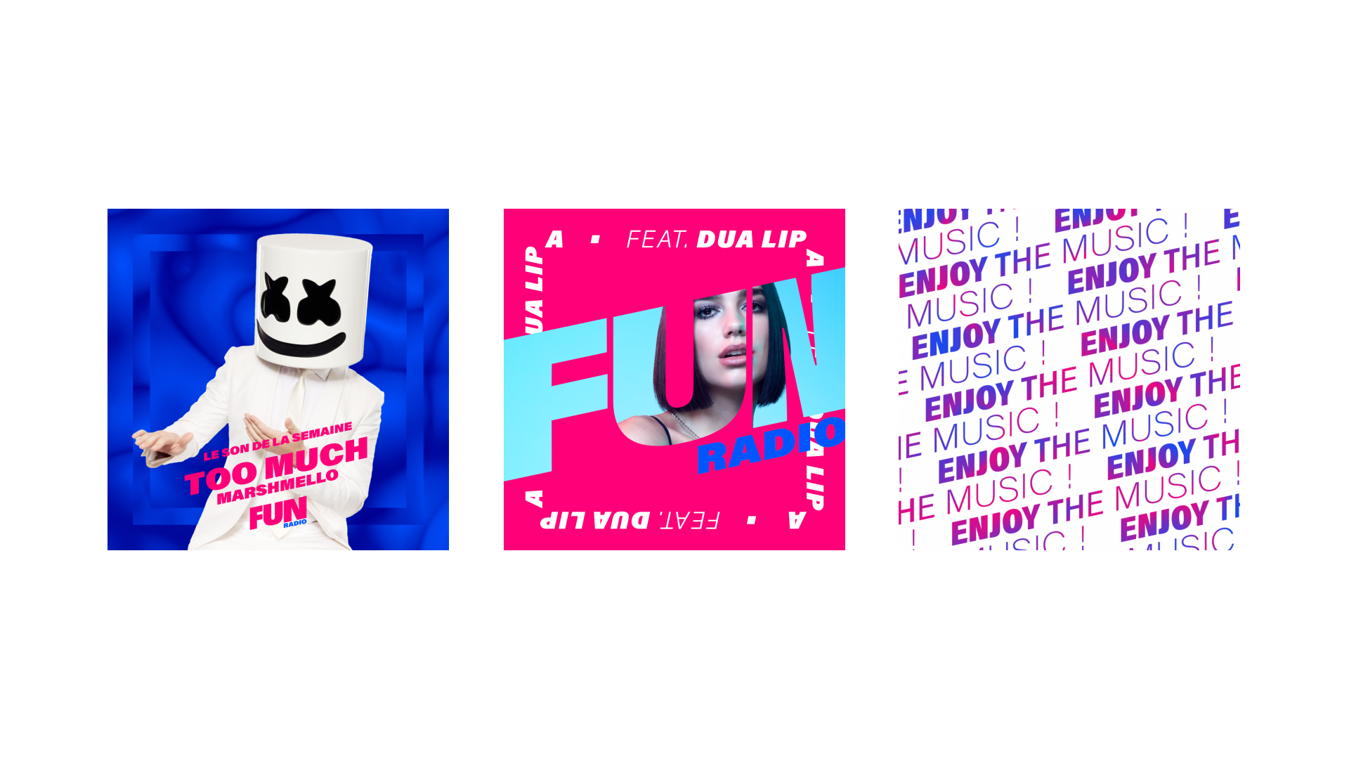
Inspired by the world of artists broadcast on Fun Radio, the musical theme of the station, and the colors of the logo, we decided to play with very bold colors and materials.
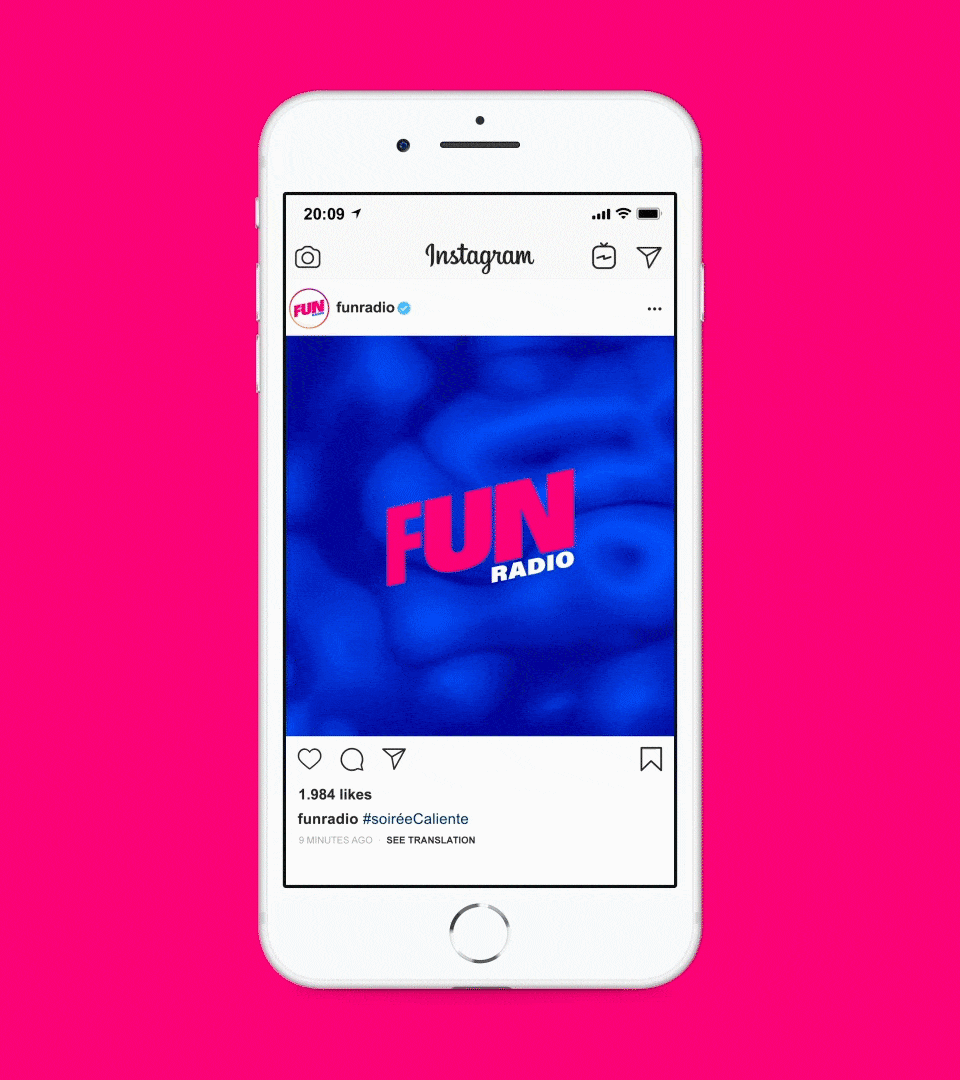
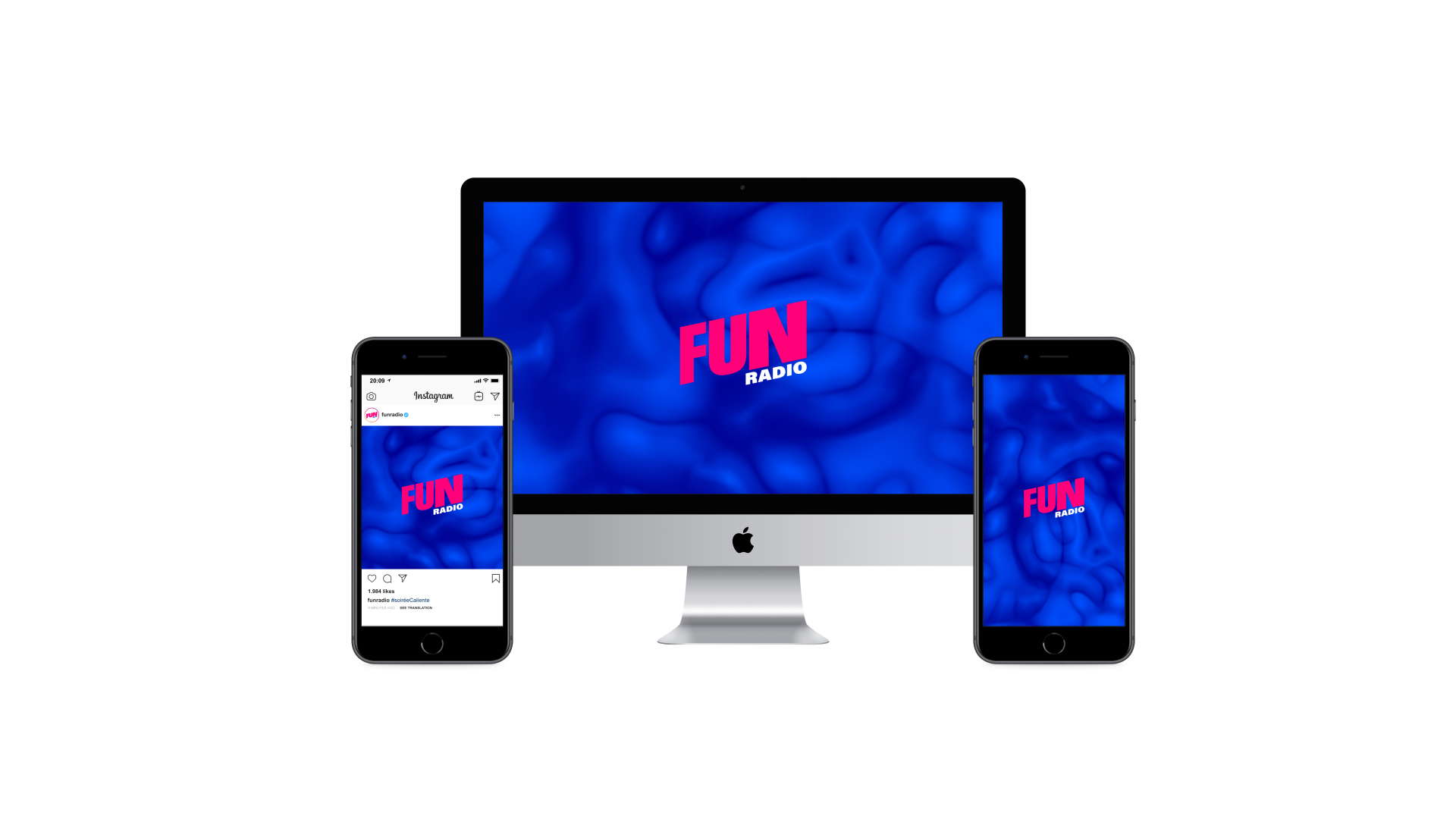
We play with the pink/blue two-tone color scheme that embodies the brand, as well as playing with fluid and holographic textures. These evoke the technological side of things, while also being pop and fun.
Inspired by the world of artists broadcast on Fun Radio, the musical theme of the station, and the colors of the logo, we decided to play with very bold colors and materials.
We play with the pink/blue two-tone color scheme that embodies the brand, as well as playing with fluid and holographic textures. These evoke the technological side of things, while also being pop and fun.
--:-- / --:--
--:-- / --:--
We developed a navigation and animation principle moving from left to right, always oriented upwards to accentuate the positive and dynamic spirit of the brand. This navigation follows the movement of the logo. We were inspired by the swipe movement of touch screens, taking it a step further by adding cut-out effects. This allowed us to make the transitions more fluid and organic, and to create strongly branded visuals.
By using these cut-out effects on both the image and font, we’ve created a very distinct and recognizable code that can also be used in print.
--:-- / --:--
PRODUCERS
Emmanuelle Lacaze & Eglantine Guitard
Motion Designer
Pierre-Baptiste Harrivelle
Creative Director
Nicolas Famery
Graphic Designer
Marine Bourdon
share