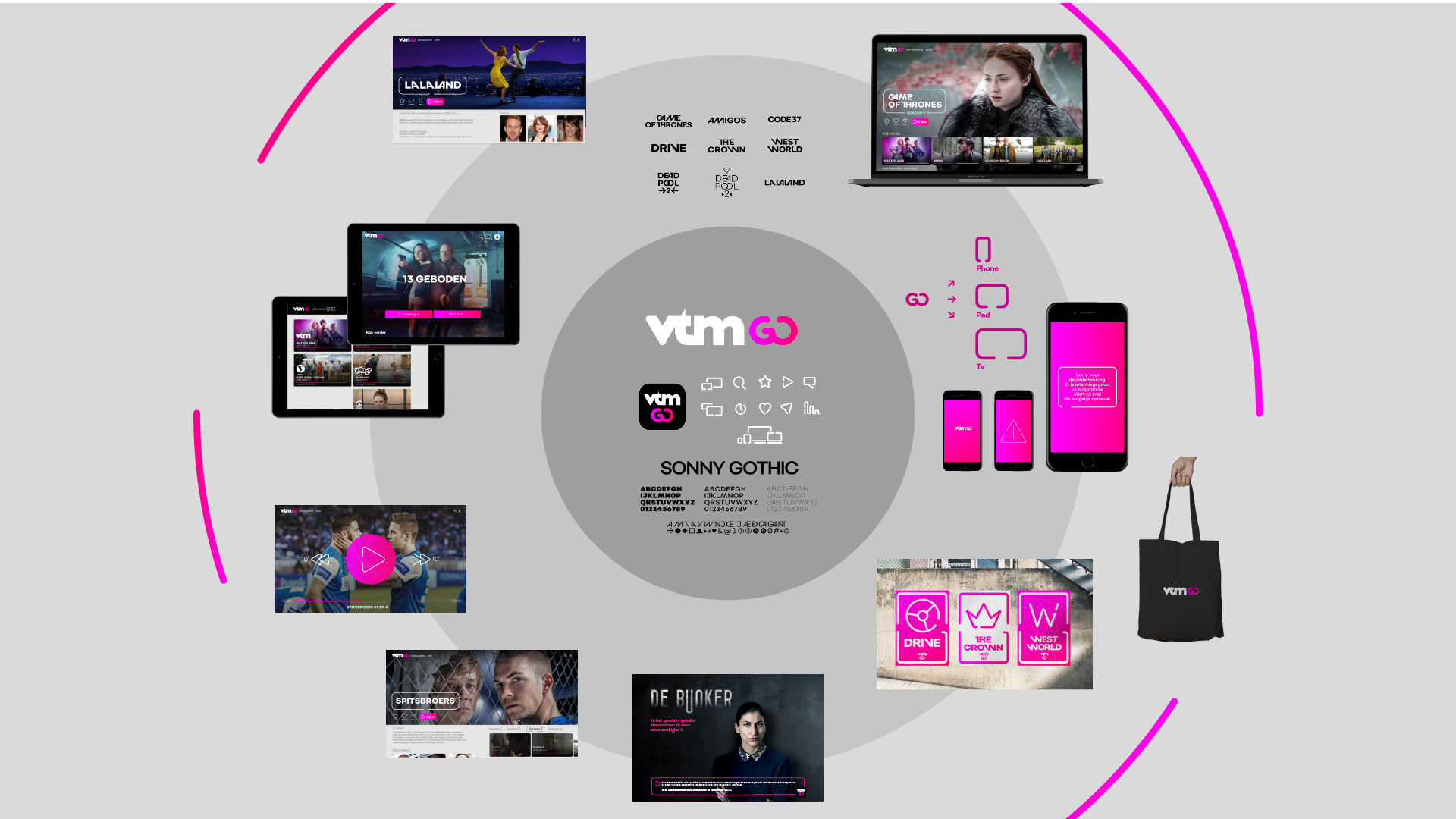
VTM GO – Design of the platform
VTM GO – Design of the platform
Gédéon has a long relationship with Medialaan and its flagship entertainment brand, VTM – providing fresh and engaging rebrands for them and also for VTM nieuws. Once again, Belgian’s leading multimedia group turned to Gédéon to create the visual identity for its new on-demand video platform, VTM GO. In an age of digitalized entertainment and in a market dominated by digital giants, the new brand identity reinforced VTM’s positioning as the home of entertainment for all.
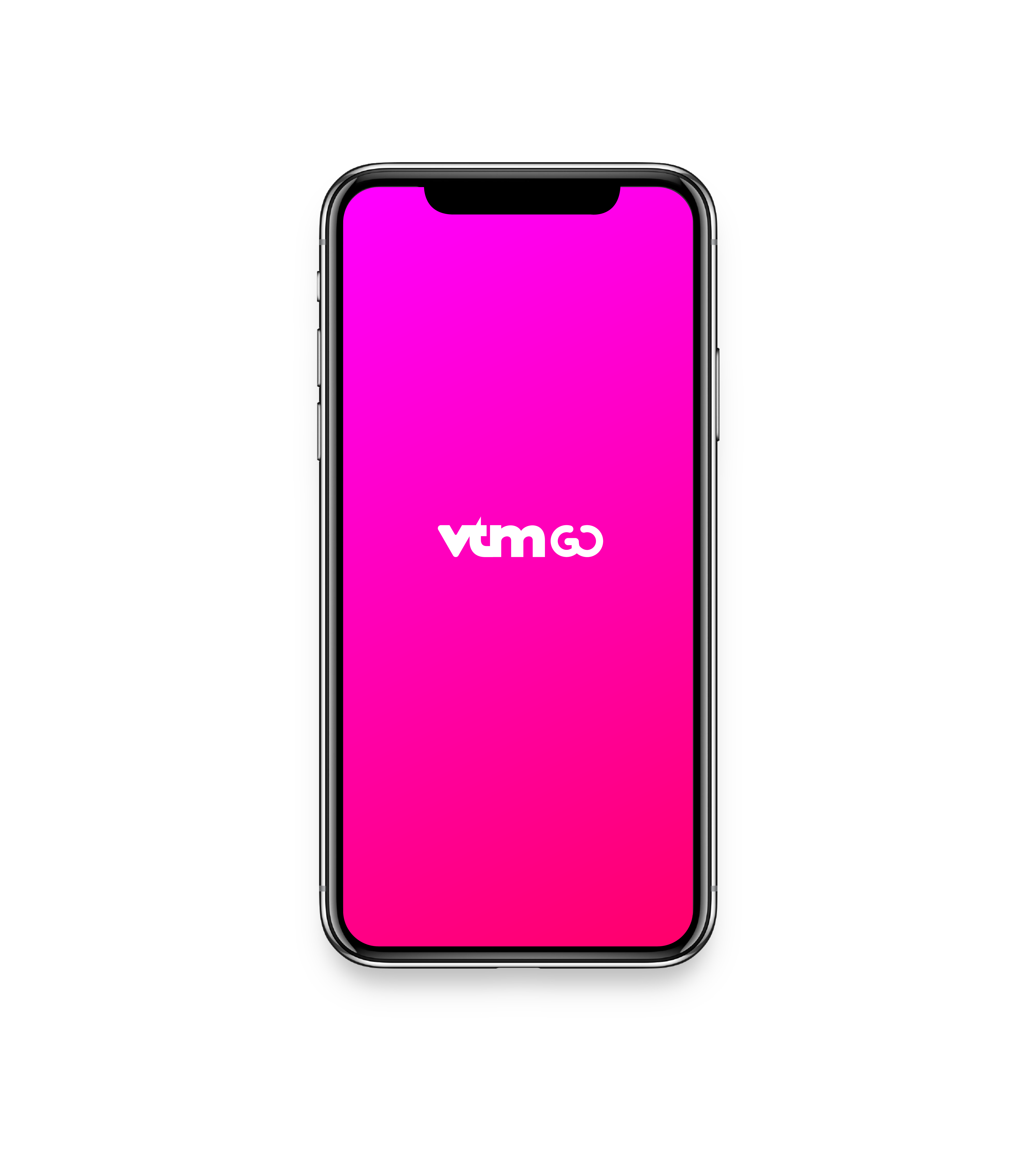
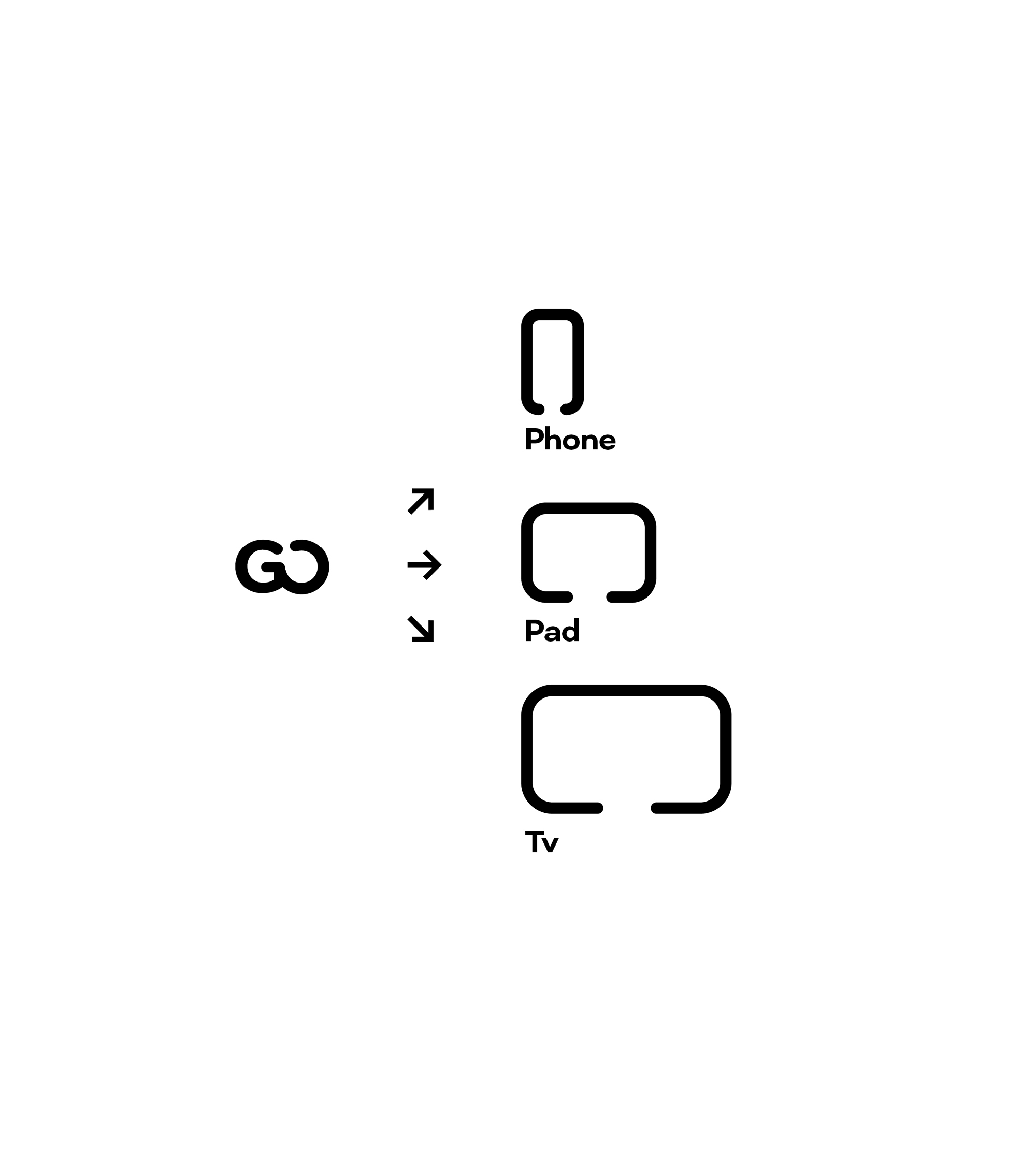
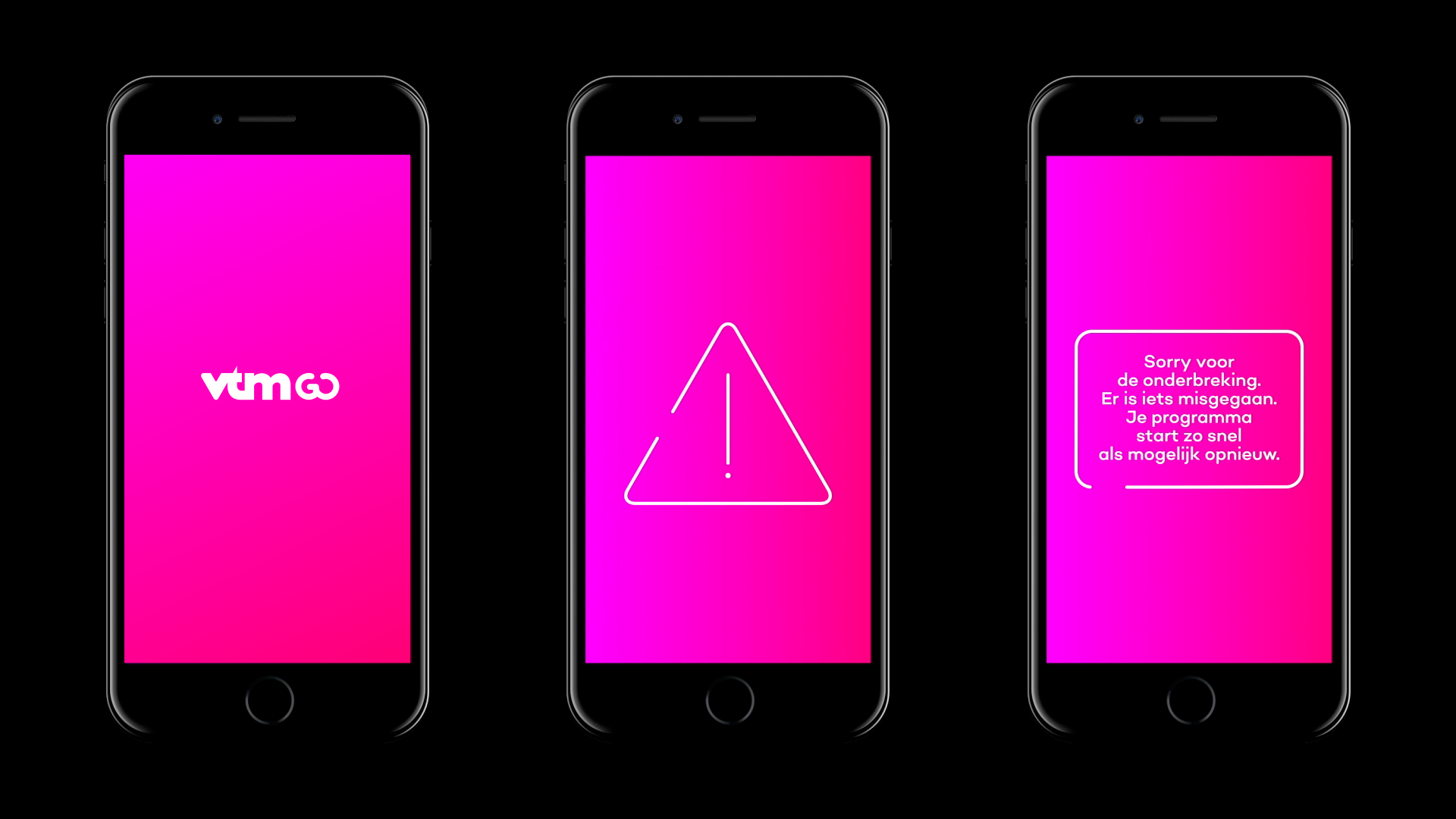
To match the multi-platform nature of the new service – not to mention modern audiences’ viewing habits – the logo’s construction prioritized recognizability and readability. The logotype typically appears as a single, horizontal line, but for the app icon it is written across two lines. This design and lettering was modified in terms of scale and ratio in order to make the GO logo more easily readable and distinct on smaller screens.
To match the multi-platform nature of the new service – not to mention modern audiences’ viewing habits – the logo’s construction prioritized recognizability and readability. The logotype typically appears as a single, horizontal line, but for the app icon it is written across two lines. This design and lettering was modified in terms of scale and ratio in order to make the GO logo more easily readable and distinct on smaller screens.
To match the multi-platform nature of the new service – not to mention modern audiences’ viewing habits – the logo’s construction prioritized recognizability and readability. The logotype typically appears as a single, horizontal line, but for the app icon it is written across two lines. This design and lettering was modified in terms of scale and ratio in order to make the GO logo more easily readable and distinct on smaller screens.
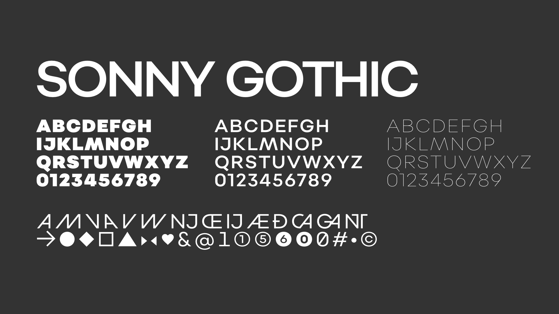
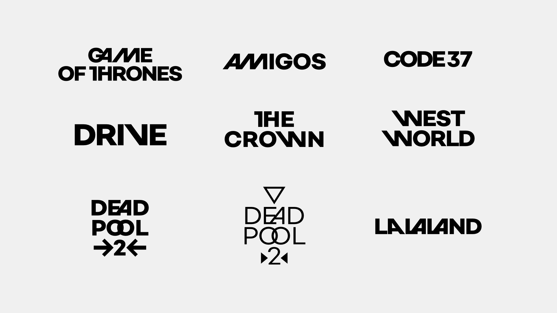
The Sonny Gothic typography is malleable and diverse, just like the service that VTM GO provides. The typography offers numerous characters, ligatures, fractions, symbols and extensive language support – making it perfectly suited for the many areas of graphic design. Designed with bold, yet elegant opentype features, the typography exists in three different weights, and when used in combination, they help prioritize on-screen information. For communication materials, the typeface can adopt different styles of ligature to suit the mood of individual programs. This versatile feature reflects the variety of VTM’s content.
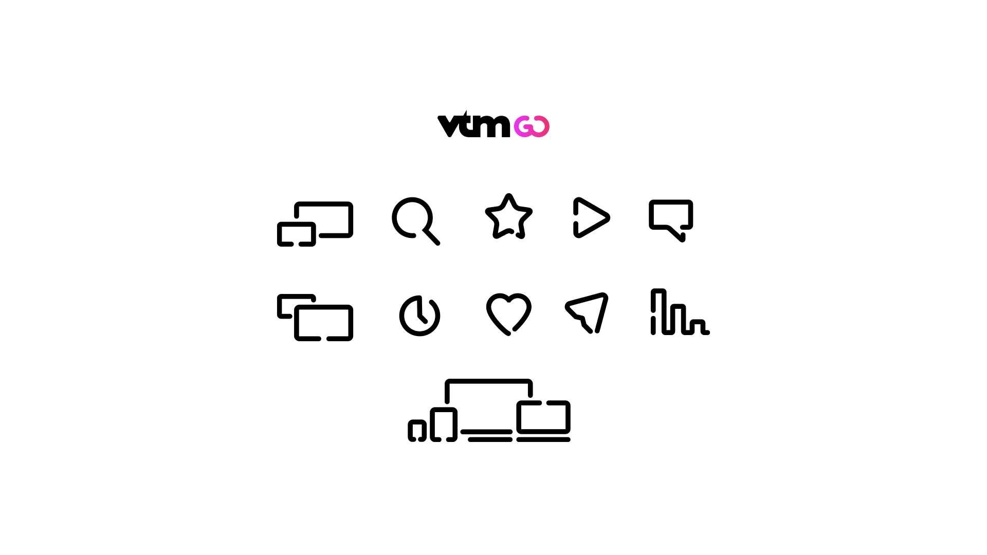
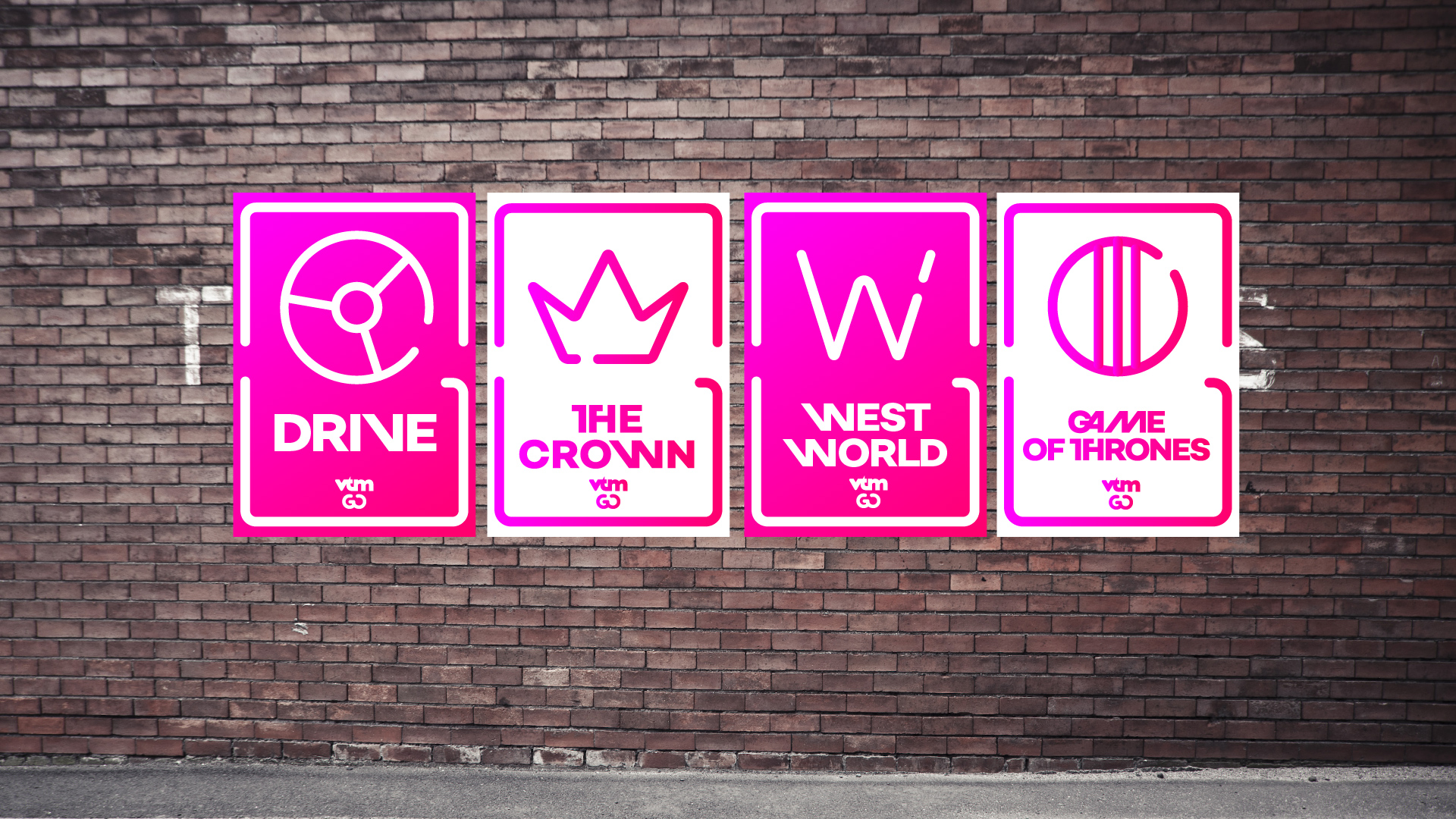
A unique grammar of pictograms with a simple, unfinished
one-line design makes them instantly recognizable and echoes the design of « GO » in the logotype itself.
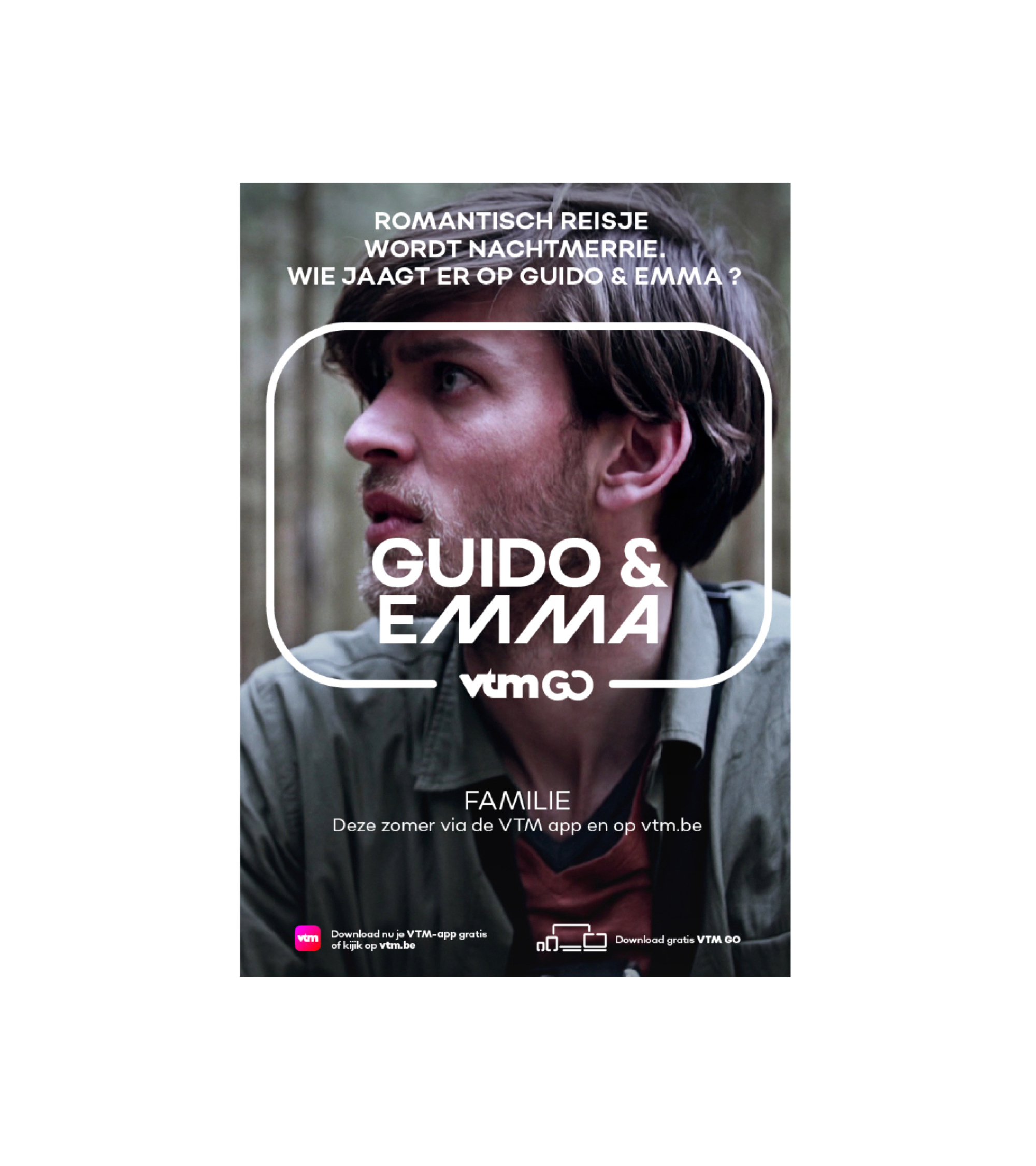
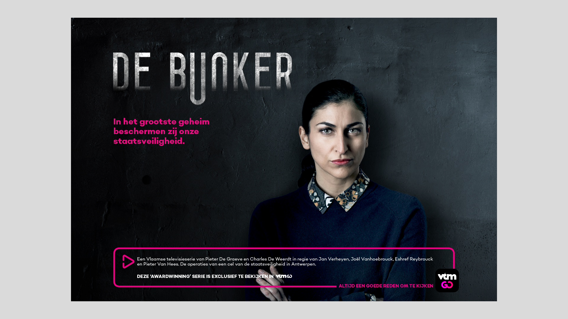
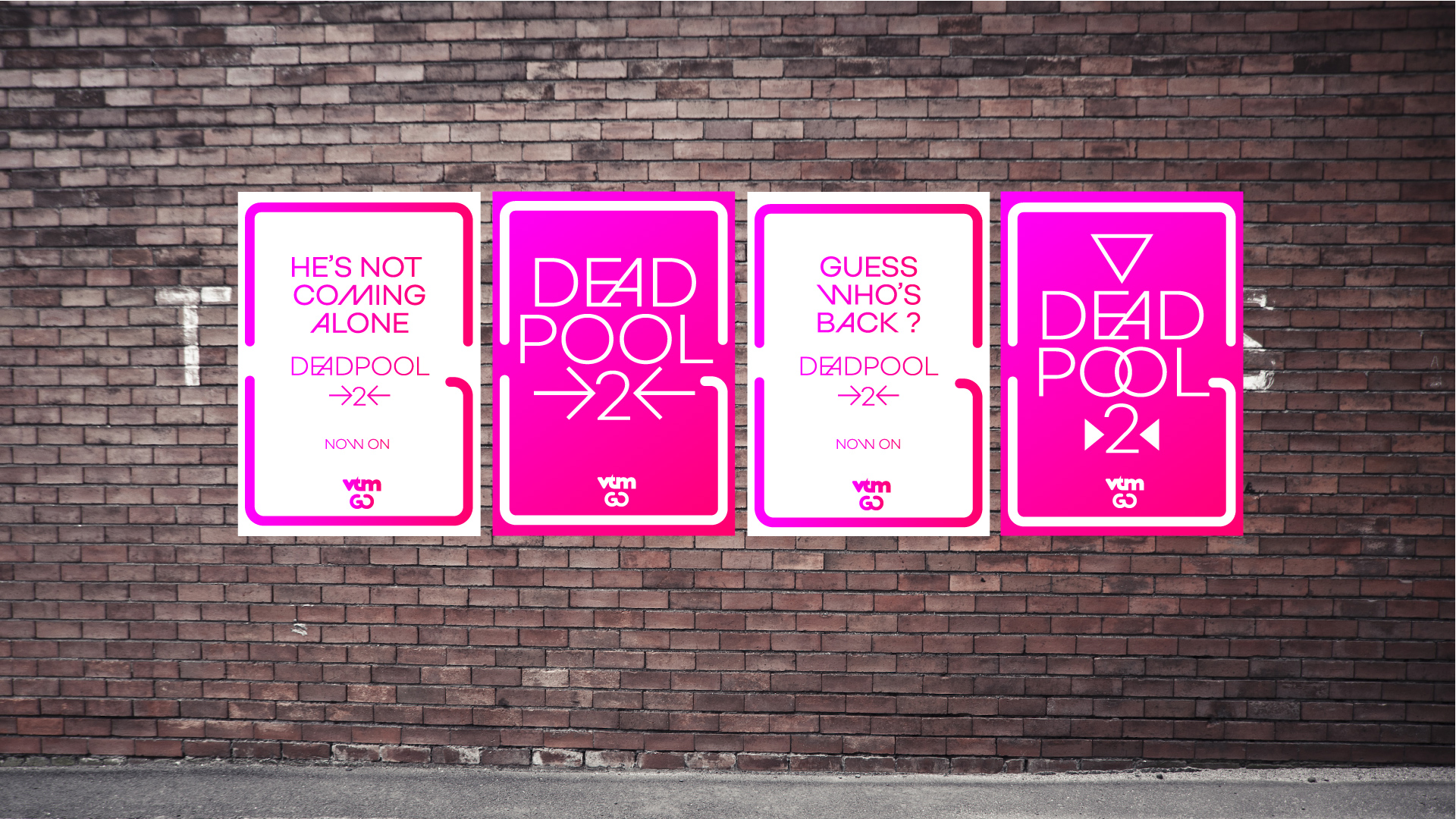
The design of print ads is inspired
by digital devices.
The design of print ads is inspired
by digital devices.
Producers
Emmanuelle Lacaze & Charlotte Vande Vyvre
Art Director
Maximilian Schwanse
awards
Media brand of the Year at the AMMA AWARDS 2020
share